Evans Transportation
Designed enterprise enhancements spanning shipment management, workflow configuration, and user wayfinding.
Please note: For confidentiality reasons, visuals and labels have been redacted or modified. I can share further details in conversation.
Background:
Evans Transportation is a third-party logistics provider that helps shippers and freight carriers manage freight operations through a web-based transportation management platform.
I joined an established product team and designed three platform enhancements that addressed friction across operational workflows for multiple user types.
My Role:
Information Architecture
Visual Design
UX Writing
UX Design
Interaction Design
Timeframe:
6-7 weeks
Stakeholders:
VP- Software Development
Sr. Business Analyst
Front-end Engineer
Back-end Software Engineer
Solutions Architect
Customers:
Operators, Shippers, and Carriers
Goal:
Design targeted enhancements to improve operational efficiency across Evans’ transportation management platform
Overview:
I designed solutions for three different types of users:
Operators: Evans employees executing administrative, operational, or booking tasks on behalf of clients.
Shippers: Businesses that have freight they need to move.
Carriers: Trucking companies or owner-operators offering to move the freight.
To address recurring friction across these user groups, I designed three net-new enhancements for Evans’ Transportation Management System (TMS for short):
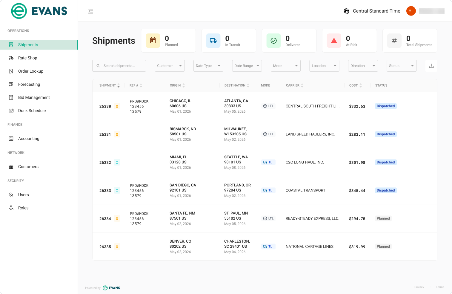
Shipment Filters: Added quick-view cards and advanced filtering to help users access shipment data faster.
Reference Number Configuration: Enabled Operators to configure client-specific reference types and document placement.
Persona Selection Page: Guided unauthenticated users to the appropriate workspace instead of a dead end.
Shipment Filters:
Problem:
Operators and Shippers relied on the Shipments page to monitor shipment status and locate shipment records. With all data presented in a single table and only a handful of filters available, finding desired shipments became increasingly inefficient as data volume grew.
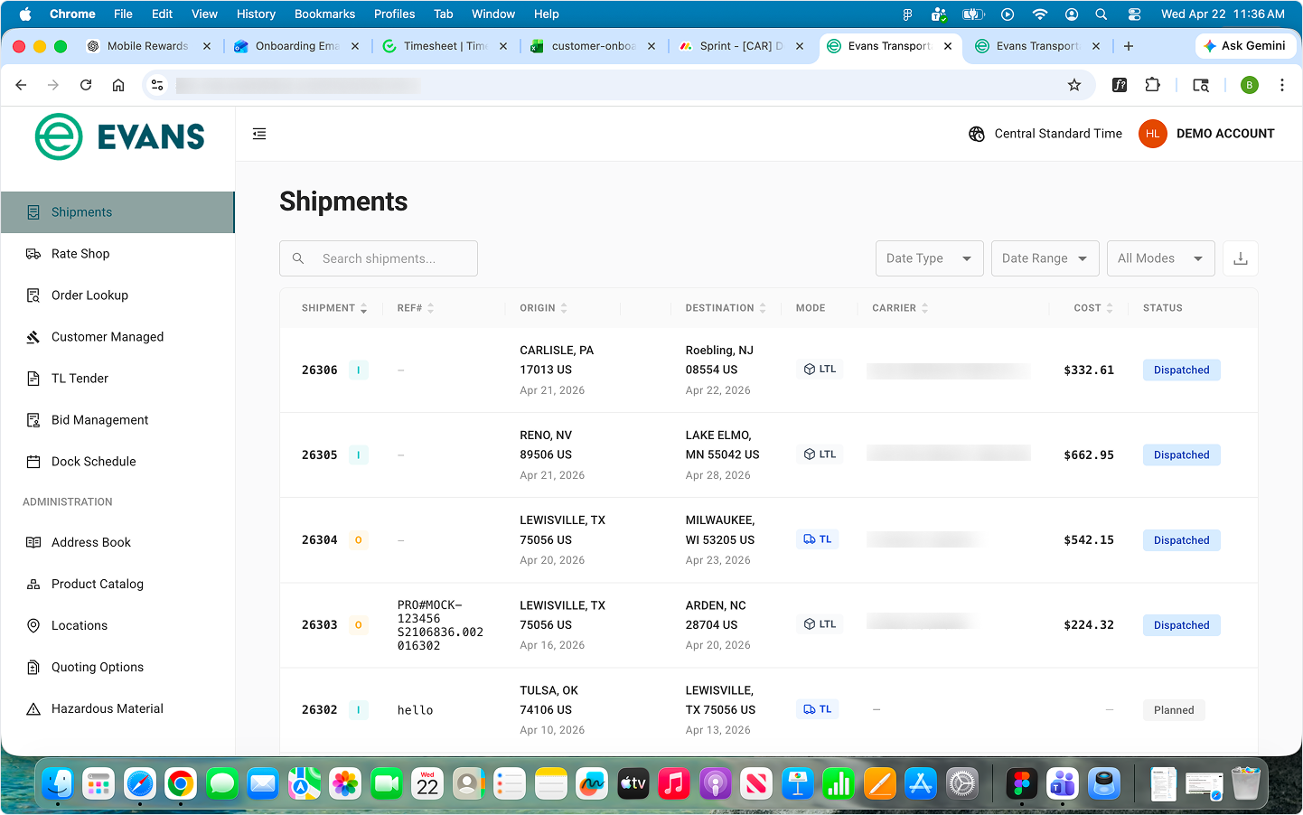
Original Shipments page with limited filtering and no high-level shipment overview. (Some details blurred for confidentiality)
The challenge was to surface high-value shipment data without adding unnecessary complexity to an already data-heavy interface. The business requested quick-view filter cards along with additional filtering controls, giving users both an at-a-glance status overview and more precise ways to narrow the shipment list.
Design Process:
Constraints:
The kick-off meeting established a few product constraints that guided my solution:
Reuse the existing status card pattern from the Dock Schedule page to maintain consistency across the platform.
Display four pre-defined shipment categories : Planned, In Transit, Delivered, and Total Shipments.
Include four additional filters: Customer, Location, Direction, and Status.
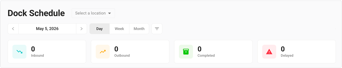
Existing status card pattern from the Dock Schedule page.
Initial Concept:
I was able to cleanly fit the four shipment status cards next to the page title. The primary challenge was fitting the new controls into an already crowded header without reducing readability or shrinking elements. To preserve the size and scanability of the controls, I moved the search field to its own row above the filters rather than compress the entire toolbar into a single row. I presented this first iteration for review:
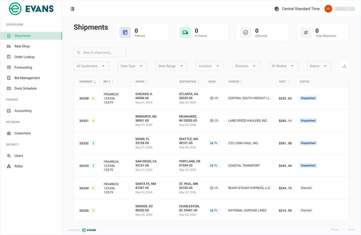
This first iteration drew a mix of positive feedback and opportunities for improvement.
What was working:
The composition and placement of the four shipment status cards.
The additional dropdown filters met business requirements.
Requested changes:
Consolidate all elements into one row. I proposed reducing the dimensions of the search field and the filters to allow everything to fit, which my stakeholders approved.
Update color treatments for select shipment status cards.
Second Iteration:
After incorporating the requested visual updates and refining the spacing and dimensions of the elements, I was able to fit all filters and the search field onto one row while preserving usability. Mid-sprint, I also received a request to add a fifth status card: At Risk.
I presented this second iteration for review:
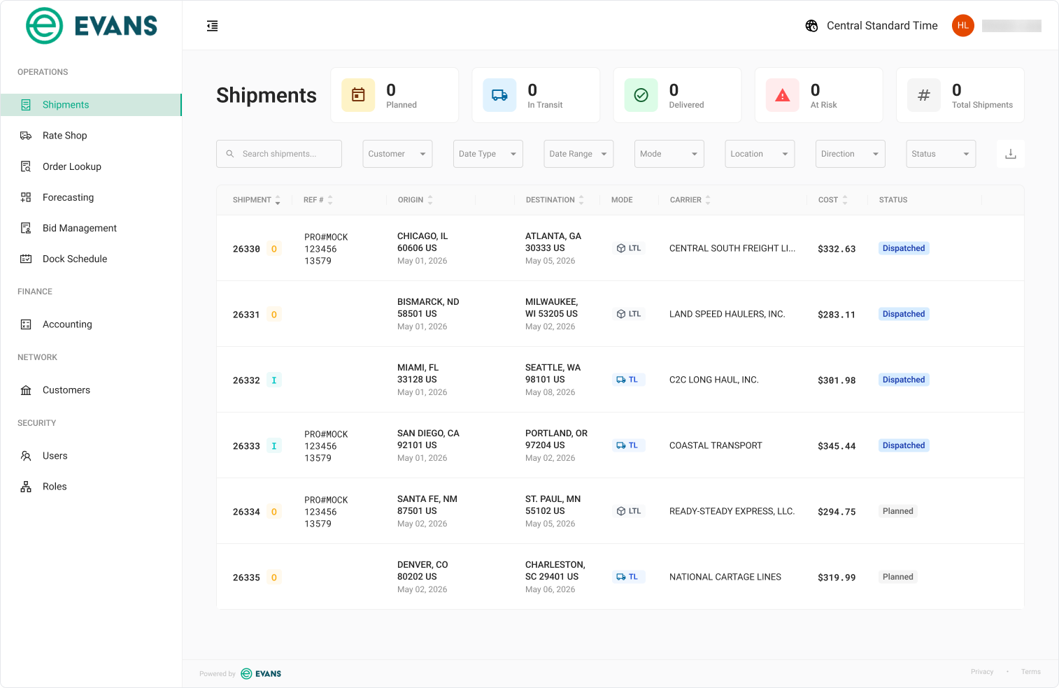
My design was approved for implementation. I collaborated with my Engineering partners to ensure the dashboard metrics rendered correctly and the interface matched the intended design. The team also planned to make the status cards clickable filters, but this enhancement was deferred to a later sprint due to competing priorities.
Reference Number Configuration:
Problem:
Reference numbers are customer-defined identifiers, such as a Delivery number or Order number, that are used throughout shipping records and documents.
Operators regularly coordinate freight bookings between Shippers and Carriers. A recurring source of friction was managing shipment reference numbers, with as many as eleven reference types used across different customers. Shippers and Carriers often required different reference types, labels, and placement in documents, forcing Operators to manually adapt each shipment’s reference information.
Because Shippers could also book freight directly with Carriers, they encountered the same coordination challenges without an Operator serving as an intermediary.
Design Process:
Constraints:
The kick-off meeting with my Business Analyst partner established some up-front constraints:
Shippers and Carriers often had different labels for the same reference type. Users needed editing control over how the reference name displayed in the shipment details.
Users needed to be able to customize if a reference type was required in the shipment details, if it was needed on the invoice, and if it was needed on the Bill of Lading (BoL).
Users needed the ability to create, edit, and delete reference configurations.
This new page had to be nested in the Customers section in the Operator portal, and in the Administration section of the Shipper portal.
The challenge was to accommodate complex reference number configurations in a way that remained intuitive for users and scalable across diverse customer requirements.
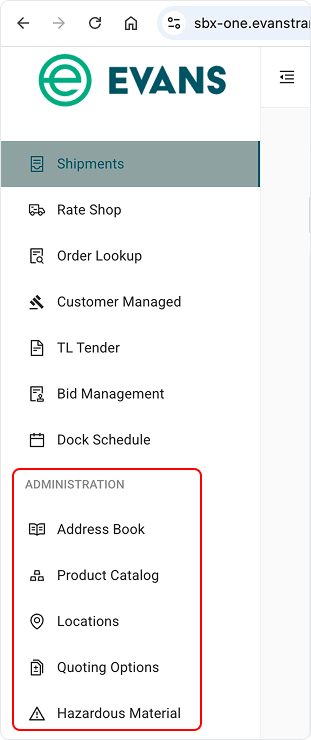
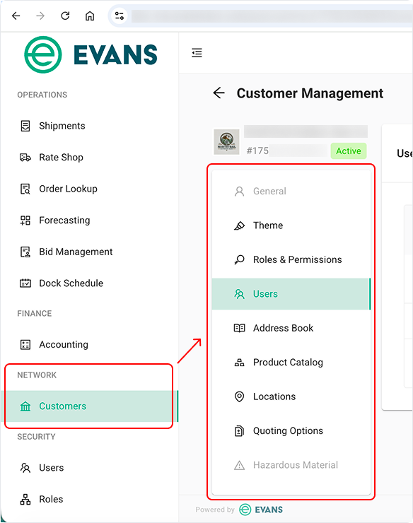
This new feature page had to be introduced in both portal architectures to support Shippers (left) and Operators (right), each with its own navigation hierarchy
Initial Concept:
Based on the established constraints and the user’s needs, I designed a shared page layout for both Operators and Shippers, placing it the needed spot within each portal’s existing navigation. The page allowed users to create, modify, and remove reference configurations while keeping each configuration visible and editable within a single workspace.
I presented this first iteration for review:
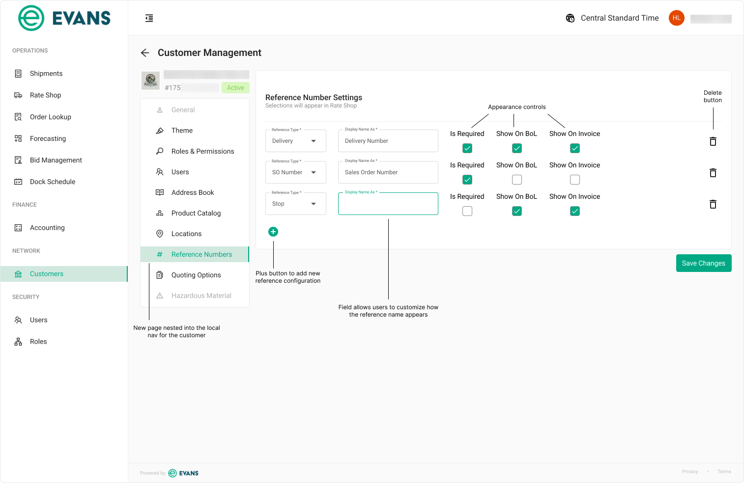
Operator view; annotations made on the frame.
The first review validated the overall concept while surfacing design refinements and updated business requirements.
What was working:
Stakeholders felt the page was intuitive and easy to learn.
The layout was neat, logical, and easy to scan.
Requested changes:
Stakeholders felt repeating labels above each checkbox would make the page increasingly data-dense as more reference configurations were added.
Requirement pivots:
The business shifted away from user-created reference configurations in favor of a predefined list of all eleven reference types, allowing users to configure only the settings for each type.
The Business Analyst presented new prioritization data showing that the Display Name field ranked lowest in importance for users. The field was still required, but stakeholders wanted it deprioritized in the layout.
Second Iteration:
To address the stakeholder feedback and incorporate the updated requirements, I removed the Add and Delete buttons, and then moved the Display Name field to the far right end of the menu. I preserved the table layout stakeholders preferred while listing all eleven reference types, and then I addressed the visual density by replacing repeated checkbox labels with shared column headers.
I presented this second iteration for review:
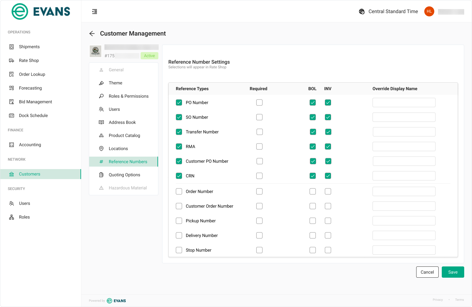
The revised design received positive feedback from the stakeholders and was approved for development.
Persona Selection Page:
Problem:
Evans’ three different user types (Operator, Shipper, and Carrier) each have a different URL provided by Evans to access their respective workspaces, and some of these users often worked across multiple workspaces. Additionally, it was common for these URLs to proliferate amongst employees at a client company.
Both of these factors created an issue where users were unknowingly using the wrong URL to access Evans’ ecosystem and they’d hit a 404 dead-end because they were not authenticated to access that workspace. This created a frustrating customer experience and Evans support staff received repeated complaints from customers that the system was down.
Design Process:
Priorities:
During the kick-off meeting, the team aligned on a solution: unauthenticated users would be routed to a Persona Selection page that acted as a waypoint- helping direct them to the correct workspace. The design centered around two informational priorities:
Help users understand they’re either in the wrong portal or not authenticated for the one they’re trying to access.
Provide clear, simple options for getting to the correct destination.
Initial Concept:
Before designing the page, I confirmed with Engineering that the system could dynamically identify the user’s workspace and update the copy accordingly. This meant a single design could support every scenario.
I presented this first iteration for review:
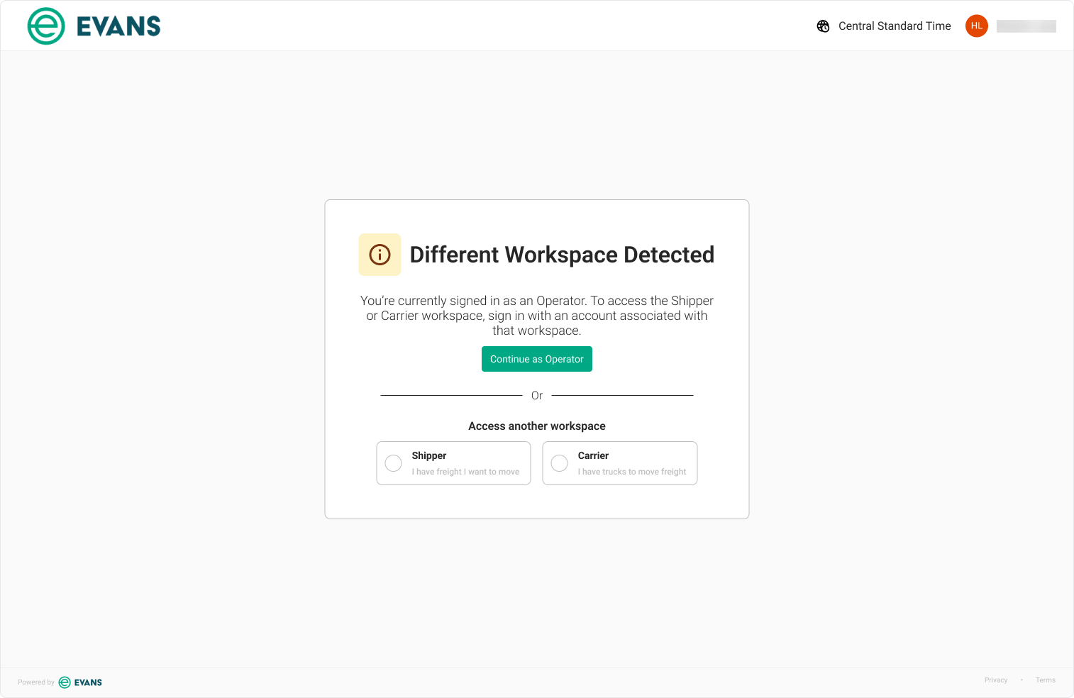
1 of 2: Persona Selection landing page guiding users to the correct workspace.
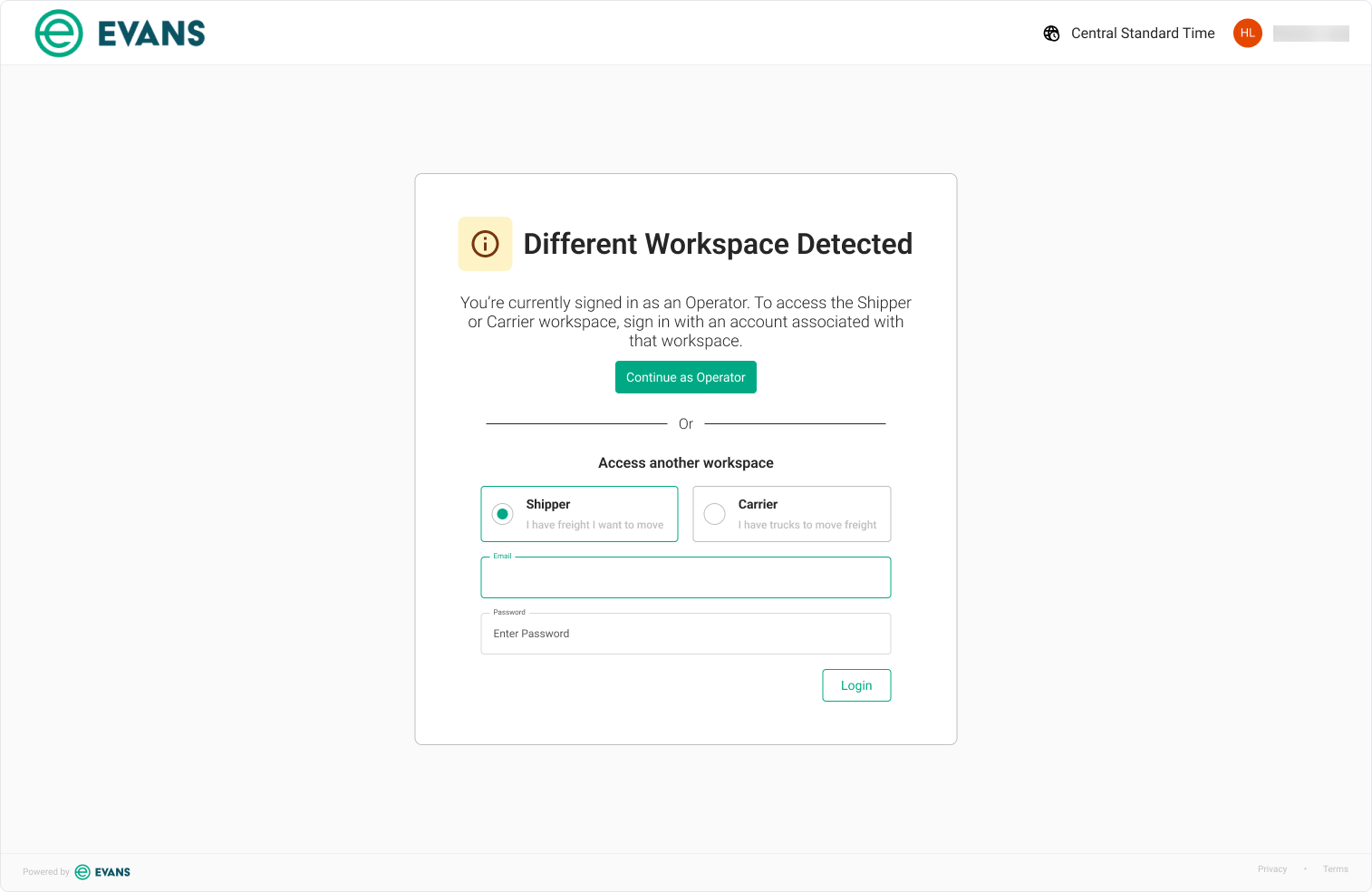
2 of 2: Selecting a different workspace expands the dialog in place, prompting the user to authenticate without losing context.
The first review validated the overall concept, but surfaced several product refinements. Alongside copy changes, the stakeholders chose to consolidate the Operator and Shipper options into a single portal selection and to decouple authentication from this experience- opting to handle login as a separate taskflow.
Second Iteration:
To address the stakeholder feedback, I removed the login fields, condensed the portal selection cards, and simplified the copy. I preserved the hover treatment on the portal cards from the first iteration.
I presented this second iteration for review:
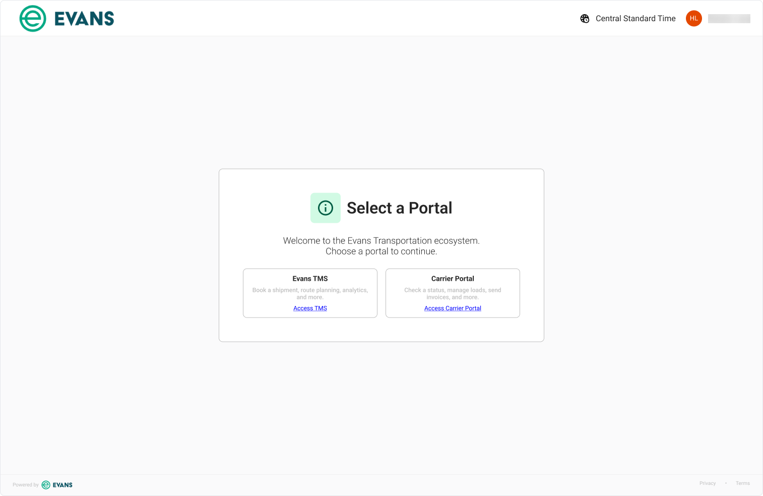
The revised design received sign-off from the stakeholders and was approved for development.
Impact:
During my time at Evans, I partnered closely with my Business Analyst and Engineering partners to translate user needs and evolving business requirements into production-ready designs. Each solution evolved through stakeholder review, cross-functional collaboration, and iterative refinement. These three features were approved for development and expanded Evans’ platform with solutions for operational visibility, customer configuration, and user routing.
Reflections:
Reflecting back on this project, a few key lessons stood out:
Design for evolving requirements: Good product design isn’t about defending an initial concept- it’s about building a solution that can adapt as requirements evolve.
Simplicity is harder than addition: Reducing complexity often requires more design effort than adding functionality. The final solutions contained fewer elements than the initial concepts while preserving the same functionality in a cleaner, more digestible experience.