Design System
Building a foundational design system for consistency and scale.
Please note: Due to NDA constraints, visuals and labels have been redacted or modified. I can share further details in conversation.
Background:
A Southeast U.S.-based casino operator engaged my team to design a concept for a new online social gaming platform. Following the concept phase, I was tasked with defining and building a foundational design system to bring structure and consistency to the product.
I independently led the end-to-end effort- conducting a full product audit, establishing system foundations, and creating a production-ready design system with supporting documentation.
My Role:
UX Audit
Foundations & Tokens
System Architecture
Component Library
Pattern Library
System Documentation
Timeframe:
2 months (DEC 2025-FEB 2026)
Stakeholders:
CEO
Design Lead
Customer:
Southeastern U.S. casino/gaming client (NDA).
Goal:
Establish a scalable, production-ready design system to unify inconsistent UI patterns and support future product growth.
Problem:
The product lacked a cohesive system for structure, reuse, and scale. UI patterns were fragmented, making it difficult to maintain visual consistency and inefficient to grow the product without reworking existing designs. Without a defined system, both design and engineering faced increased effort, slower iteration, and growing inconsistency as the product evolved.
Outcome: Defined and built a V0 design system to establish consistency and support scalable product development.
Design Objectives:
To ensure the system could support long-term product growth, I defined three core objectives:
Establish a production-ready system that design and engineering could reliably build from.
Create a scalable system that supports extension without rework.
Provide clear, actionable documentation to drive consistent adoption.
Design Principles:
Based on my design objectives, these principles guided my system design and decision-making:
Clarity Through Structure: Organized tokens, libraries, and documentation to support system usability and product growth.
Production-ready: Built the system to be immediately usable by design and engineering without additional setup.
Consistency At Scale: Defined tokens and patterns to ensure visual and functional consistency as the product evolves.
Approach:
Because the system was extracted from existing artifacts, I began with an exhaustive audit of the platform- documenting the UI as it existed at the time.
Audit breakdown:
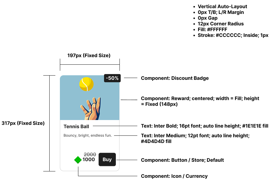
Card structure
The screens were largely finalized, creating an opportunity to structure the audit in a system-compatible format. Drawing from Brad Frost’s Atomic Design, I organized the audit from largest to smallest: Templates > Organisms > Molecules > Atoms- capturing patterns as they existed in the product.
This approach allowed the audit to serve as a direct foundation for system creation- capturing existing patterns first, then evolving them into a formal design system without rebuilding from scratch.
I began by documenting the templates:
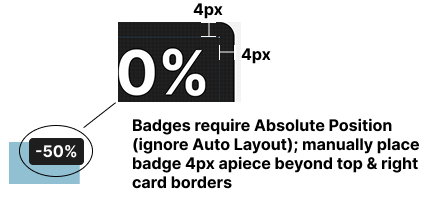
Badge positioning
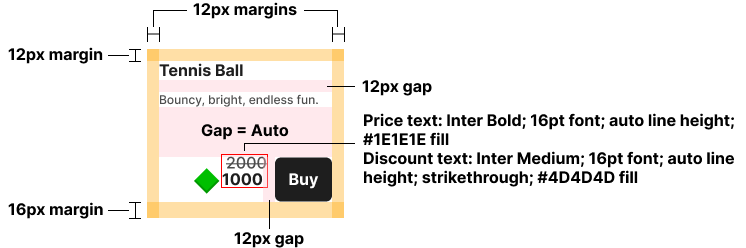
Content + spacing
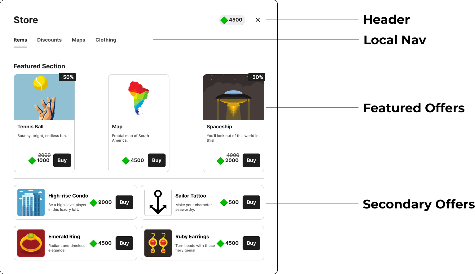
Template: Store page (audit)
From this structure, I broke components down across levels:
Organisms:
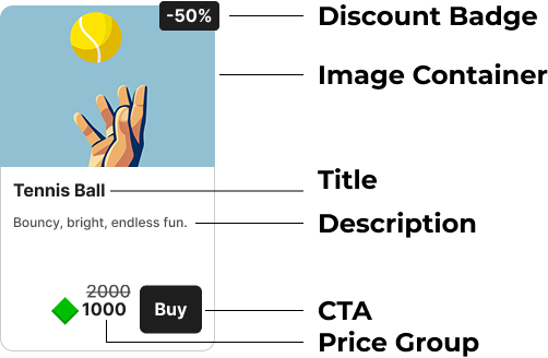
Product card
Molecules:

Pricing group
Atoms:

Primary button
In total, I audited:
8 pages
12 page sub-sections
296 individual components & variants
The audit delivered value in three key ways:
Inconsistency Capture: It revealed inconsistent applications of spacing, typography (color, size, etc.), color, and component usage across the product, which were flagged for resolution during system construction.
Foundation Setting: I documented the usage of color, typography, sizing, corner radius, and spacing across the product- directly informing tokens, text styles, and system foundations.
Library Acceleration: Because the product was largely finalized, I structured the audit so it could be duplicated and evolved into the pattern library- capturing current state first, then iterating to the ideal state without rebuilding from scratch.
System Foundations:
The audit provided a clear foundation for system construction.
I began by defining primitive tokens for color, radius, spacing, and typography. On top of these, I introduced semantic tokens for color, radius, spacing, size, typography, and key UI elements (badges, buttons, surfaces, etc.).
With tokens in place, I traced through the product again to ensure consistent token application across all elements, and finalized the system’s text styles. The diagram below illustrates how primitive values map to semantic tokens that are applied across the UI.
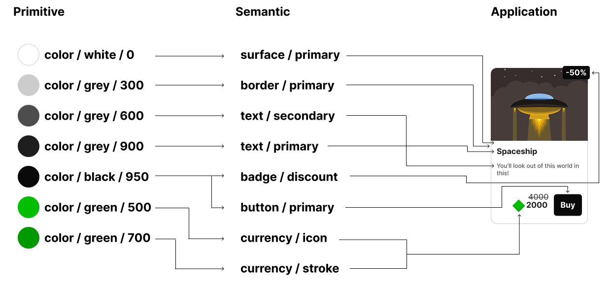
Token hierarchy: primitives > semantics > application
After constructing tokens and text styles and binding them across the product, I created comprehensive documentation to enable designers and developers to build system-adherent pages with minimal ramp time. This included:
Color: Palette, philosophy, usage guidelines, token tables (primitive + semantic) with clear application guidance.
Radius: Primitive values, token labels, and usage examples.
Typography: Primitive tables (family, size, weight, line height, letter spacing) and role-based definitions (usage, hierarchy, and application).
Spacing: Primitive scale and token tables, along with comprehensive spacing logic for key screens (grid, padding, section spacing, navigation, badge positioning, and hierarchy).
Color documentation example:

Color tokens mapped to semantic roles and real UI usage
Radius documentation example:

Radius tokens mapped to UI components
Typography documentation example:
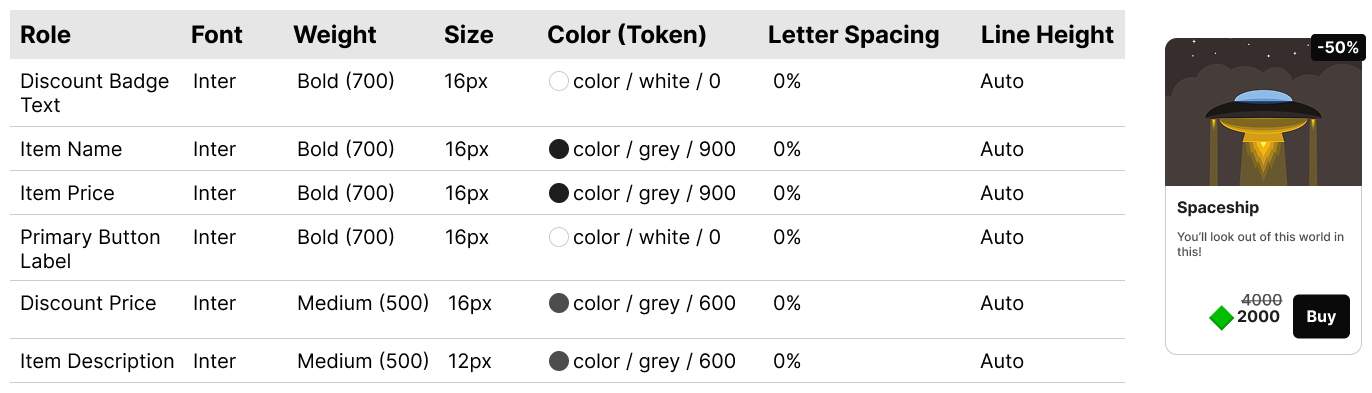
Typography roles mapped to UI usage
Spacing documentation example:
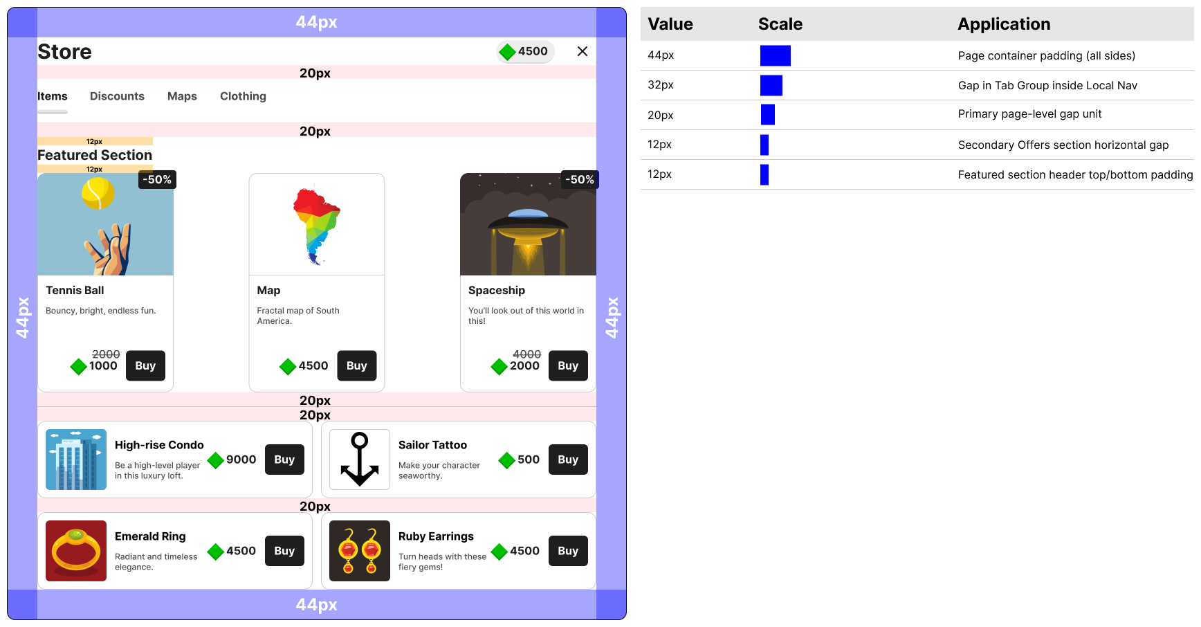
Spacing scale mapped to layout behavior
Components:
After building the system, we created new product screens. I developed some new components and added them to the library.
The component library was organized into a clear hierarchy of reusable UI elements, enabling scalable development and faster adoption.
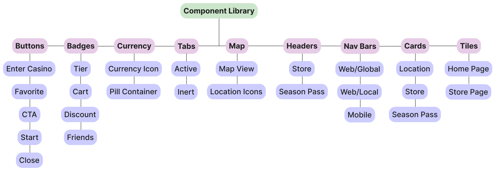
Component library categorized by type, with variants organized for scalable reuse across the product
Usage:
After the system was established, I published the library and integrated it into the team’s working file used for ongoing product development.
I continued ownership of the system post-launch- governing updates, maintaining consistency across new components and tokens, and managing all library additions and publications.
Impact:
After publishing the system and integrating it into the working file, three key outcomes emerged: consistency, speed of production, and production readiness.
Consistency: As new pages were built, inconsistencies were effectively eliminated. All UI elements adhered to defined tokens and system standards, resulting in a cohesive and predictable product experience.
Speed of Production: With a fully tokenized system and reusable component library in place, new screens could be designed and built significantly faster. We were able to assemble pages using pre-defined patterns rather than recreating UI from scratch.
Production Readiness: The system was immediately validated through use. Newly built screens were fully tokenized, system-compliant, and free of inconsistencies- demonstrating the system was robust, scalable, and ready for immediate client adoption.
Reflections:
This project marked a significant milestone in my growth as a designer. It was the first time I had taken on a system of this scale and complexity, and successfully building a fully functional design system from the ground up reinforced my ability to think systematically and execute end-to-end.
Reflecting on this project, there are a few takeaways I have:
Deep Dives Pay Off: When I encountered unfamiliar systems or patterns, I paused to deeply understand how they worked and why they existed. Investing that time upfront reduced friction later, enabling faster and more confident system construction and application.
Becoming a System Resource: Building the end-to-end system independently gave me deep functional expertise, which allowed me to guide decisions, expand the scope of my contributions, and support the team in adopting and applying the system effectively.