Lathr
Designed an e-commerce experience for organic hygiene products.
Background:
Lathr is a conceptual e-commerce marketplace for organic hygiene products. I independently conceived and designed the experience end-to-end, focusing on simplifying product discovery and supporting informed purchasing decisions.
This project explored how clearer information architecture and guided decision-making could reduce friction in online product selection.
My Role:
UX Design
UX Research
Usability Testing
UI/Visual Design
Prototyping
IA
Timeframe:
6 months (FEB-JUL 2023)
Stakeholders:
SVC instructors
Customer:
Shoppers who purchase and use organic hygiene products.
Goal:
Design a simple, end-to-end purchasing experience to help users confidently evaluate and buy organic hygiene products.
Problem:
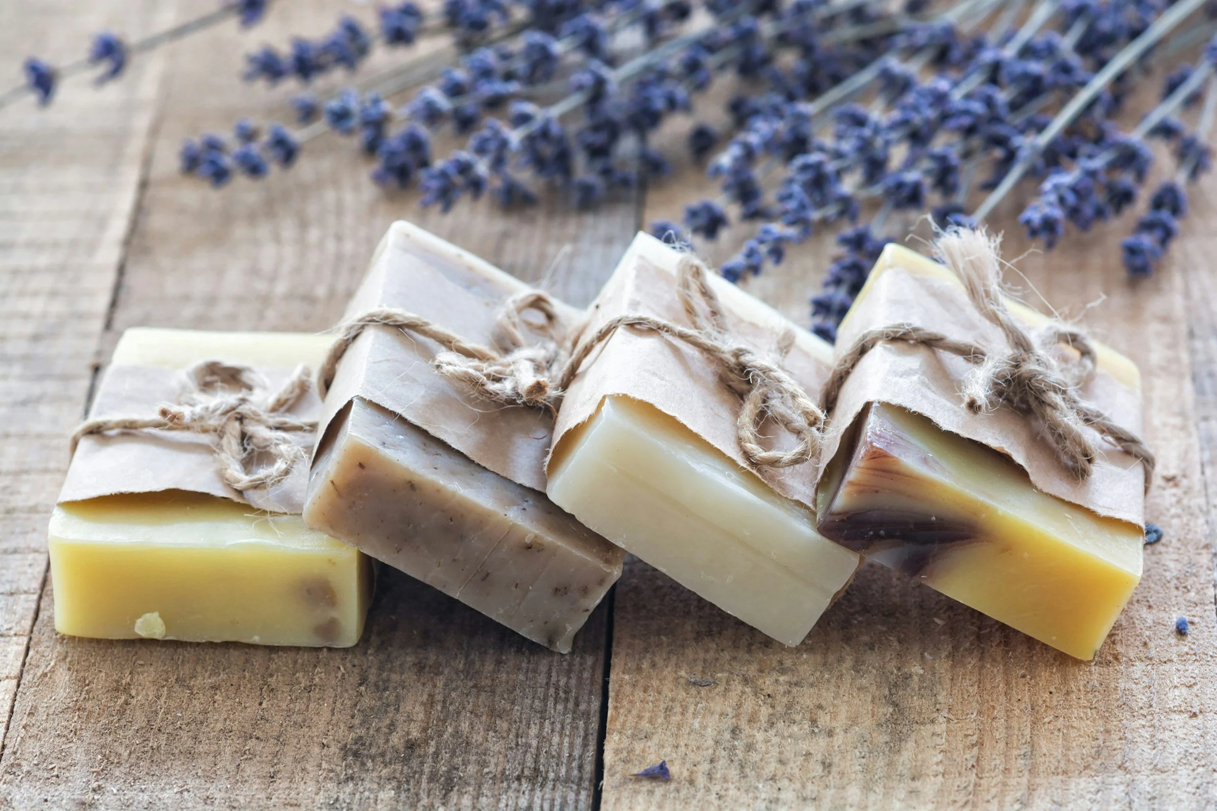
Consumers who purchase organic soap are motivated by two primary concerns: their personal health and the environmental impact of their consumption choices.
However, most online soap retailers present long, complex ingredient lists with little context about what those ingredients are, why they’re included, or how they’re sourced. In addition, information about sustainability and environmental impact is often vague or missing altogether.
This lack of clarity increases cognitive load during browsing and makes it difficult for customers to determine whether a product aligns with their health and environmental values- leading to hesitation and low-confidence purchasing decisions.
Outcome: Designed an e-commerce experience that clearly explains ingredient purpose and environmental impact- enabling confident, values-aligned purchasing decisions.
Clarifying the Problem:
Before designing a solution, I needed to better understand:
How customers evaluate soap products when shopping online
What information builds — or undermines — trust during purchase decisions
How health and environmental values influence buying behavior
These questions guided my initial research.
User Research:
To validate these assumptions, I conducted a short exploratory research sprint over six days. I used a nine-question survey distributed via Reddit alongside in-person interviews to gather both quantitative and qualitative data points.
When the survey was removed shortly after publishing, I pivoted and increased the number of interviews to five. Despite the constraint, I was able to gather meaningful insights that informed the direction of the product.
Survey questions (excerpt)
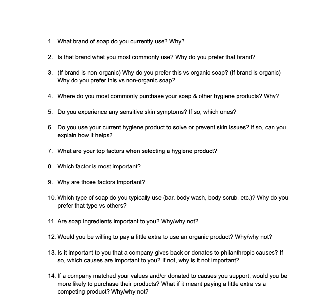
Interview discussion guide (excerpt)
Research Insights:
After synthesizing my data, three key insights emerged about the challenges customers face when buying soap online:
Customers can’t evaluate scent before purchasing: Unlike in-store shopping, customers can’t smell the product before buying it online. Because scent is a major factor in product satisfaction, this creates uncertainty and increases hesitation during purchase decisions.
Customers struggle to understand environmental impact: Organic soap buyers care deeply about sustainability, but product pages rarely explain how ingredients are sourced or what environmental tradeoffs exist. This makes it difficult for customers to determine whether a product aligns with their values.
Ingredient lists are difficult to interpret: Ingredient names are often technical or industry-specific, making it hard for customers to understand what they are, why they’re included, and what impact they have on health or the environment.
Design Objectives:
These insights informed three core design objectives:
Convey the products’ scent profile clearly.
Provide digestible information about environmental impact.
Break down ingredients into understandable components (purpose, source, benefits).
Design Principles:
Based on the research insights and deign objectives, three principles guided the design decisions throughout this project.
Clarify complex information: Translate ingredient lists into clear, digestible explanations so customers can quickly understand what ingredients are, why they’re included, and their impact.
Support value-driven purchasing decisions: Surface sustainability and sourcing information clearly so customers can evaluate environmental impact.
Reduce purchase uncertainty: Provide clear cues about scent and product characteristics to help customers make confident buying decisions.
Information Architecture:
Once the core user needs were clear, the next challenge was determining where key product information should live within the experience.
To understand user expectations, I conducted a lightweight card sorting exercise to see where participants would expect to find details about scent, ingredients, and environmental impact.
After synthesizing the results, 75% of participants expected to find this information on the Product Detail page. Participants consistently grouped scent and ingredient information together on the product page, with most also expecting environmental impact details to live there as well.
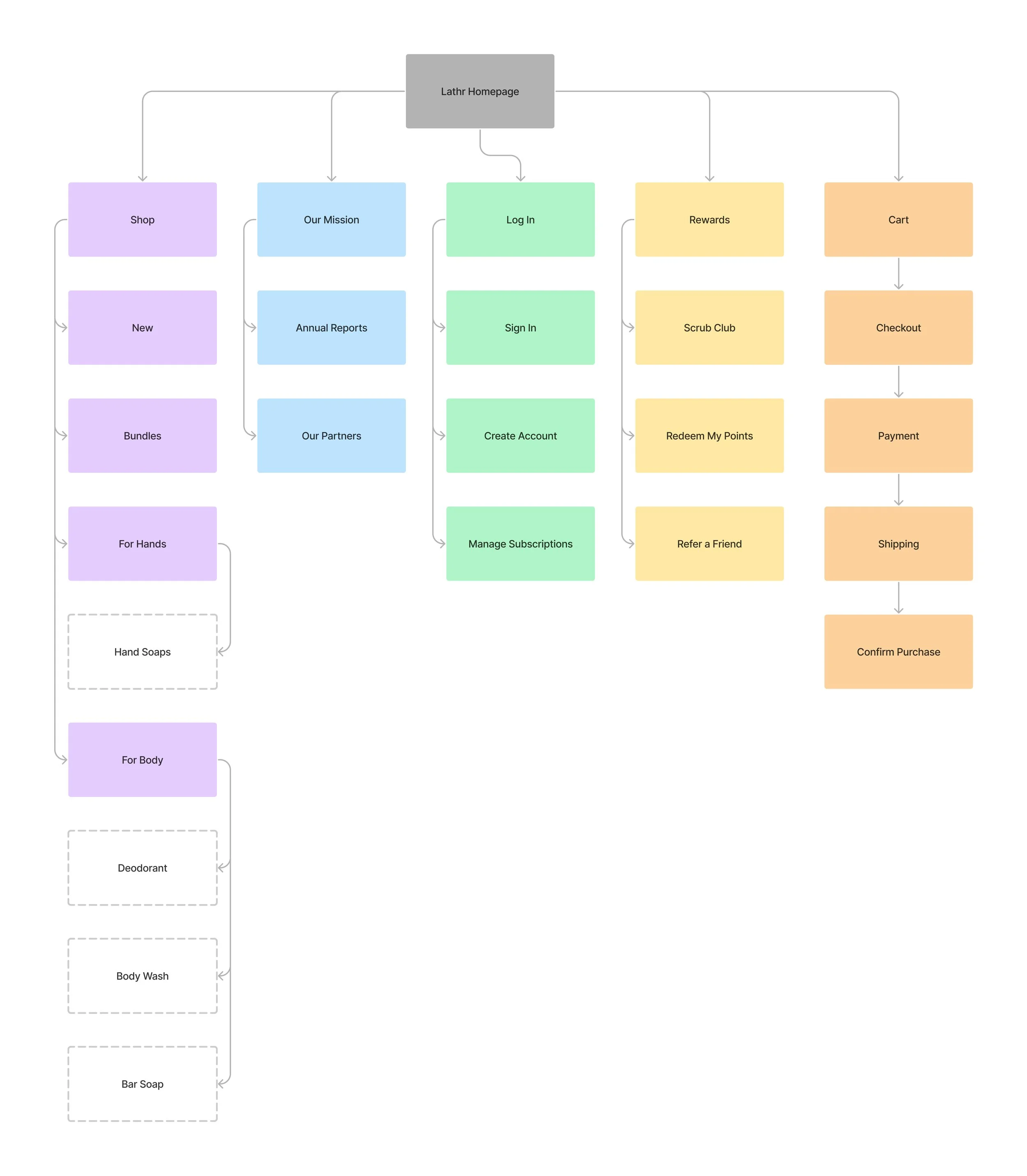
Based on these insights, I structured the site’s navigation and key user flows into the following sitemap.
Competitive Analysis:
To understand common design patterns in this category, I analyzed three established competitors: Pacha, Dr. Squatch, and Native. Comparing these sites revealed structural similarities across global navigation, landing pages, product detail pages, and checkout flows.
Global Navigation: All three sites place the logo centrally within the header and position the cart and login controls on the right side. Pacha and Dr. Squatch also include a “Rewards“ link in this area.
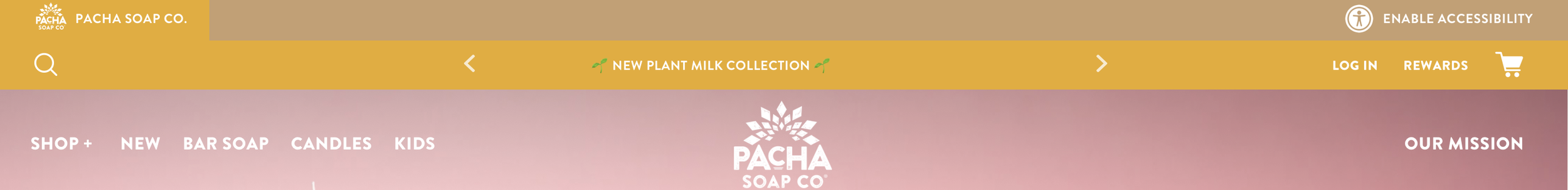
Pacha: Global Navigation

Dr. Squatch: Global Navigation

Native: Global Navigation
This consistent structure suggests that users expect key navigation elements to follow familiar e-commerce patterns.
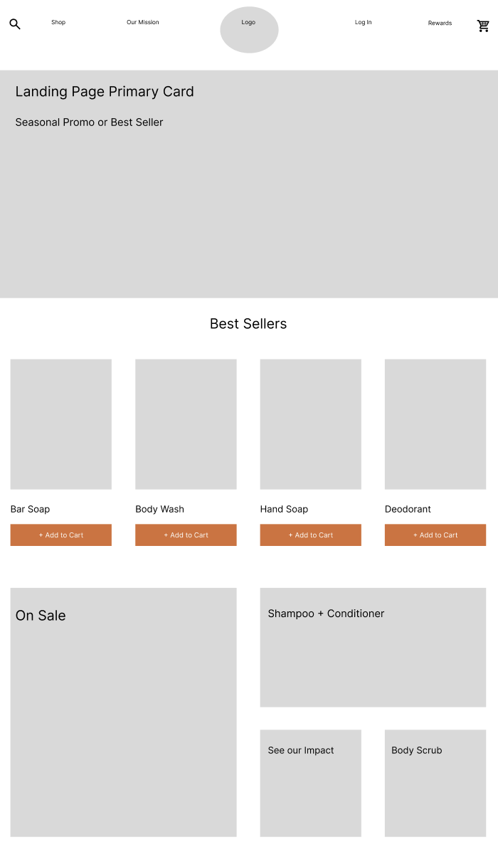
Landing Page Structure: Each site features a large primary promotional card directly below the global navigation. Beneath this, a row of secondary product cards surfaces key categories. Pacha and Dr. Squatch present these cards in a carousel, while Native displays them in a static row.
Primary Promotional Cards:
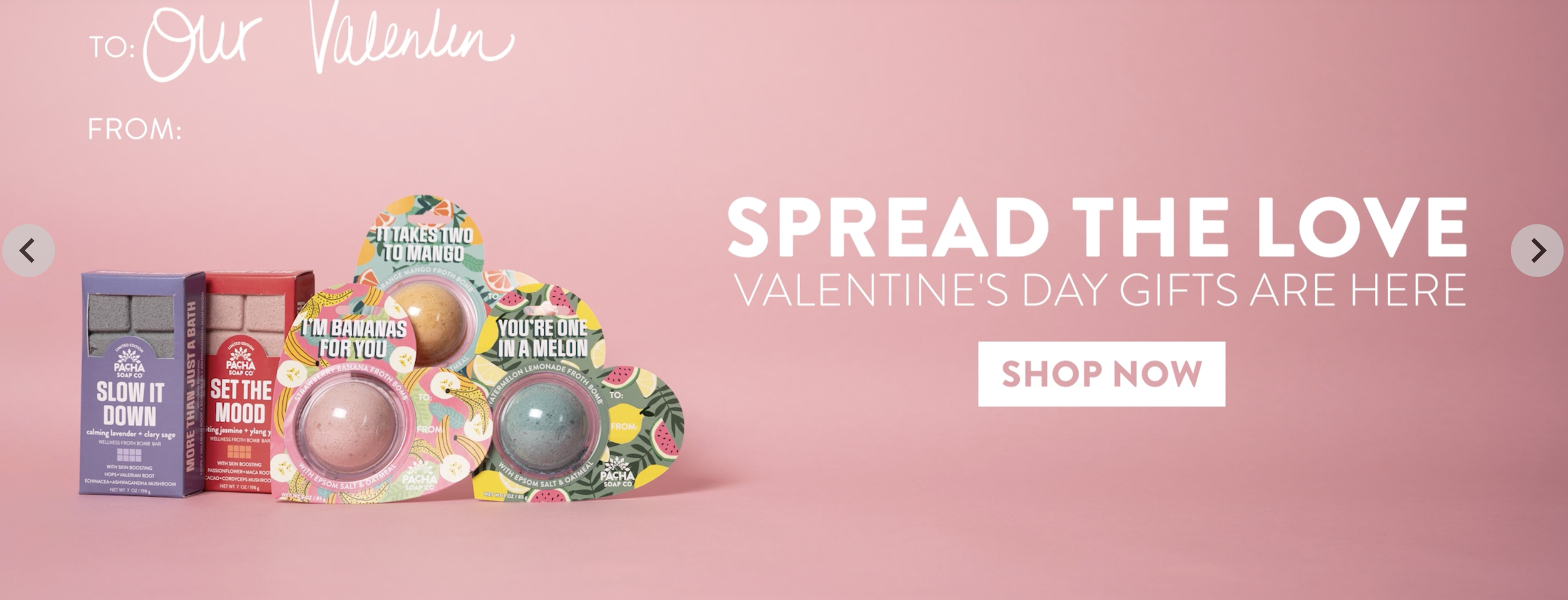
Pacha: Primary Card
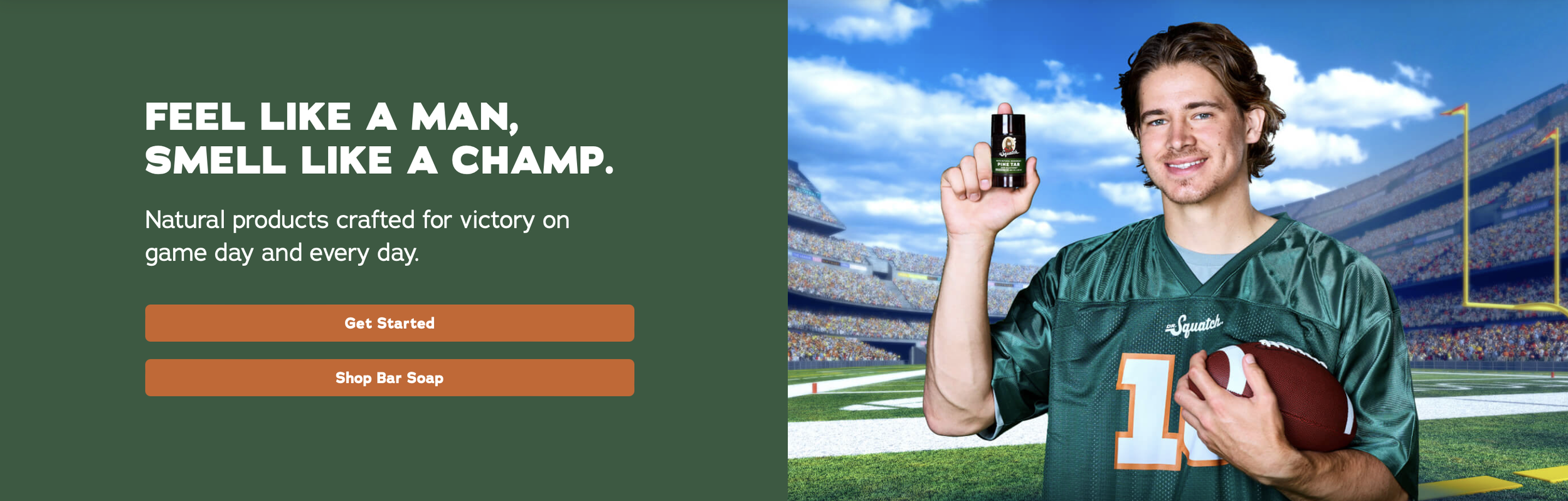
Dr. Squatch: Primary Card
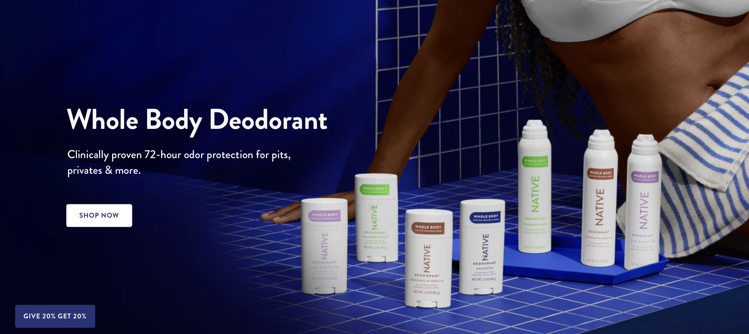
Native: Primary Card
Secondary Category Cards:
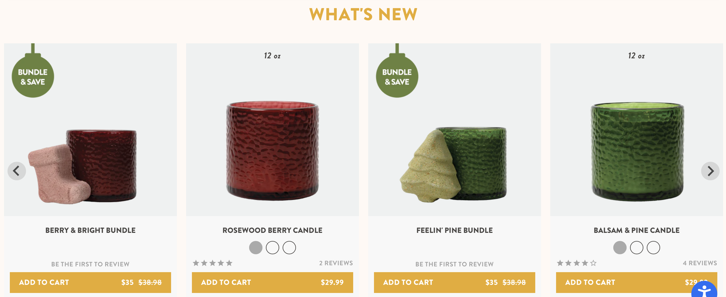
Pacha: Secondary Cards
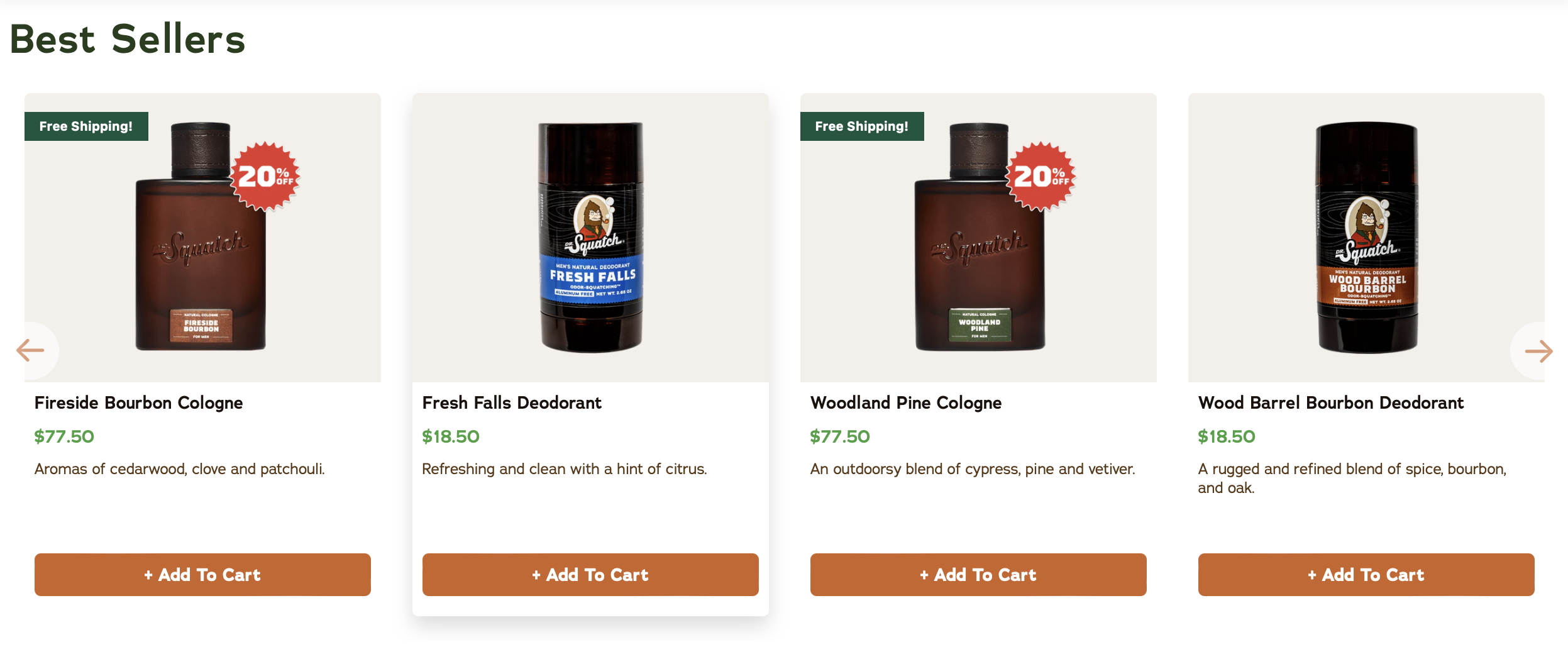
Dr. Squatch: Secondary Cards
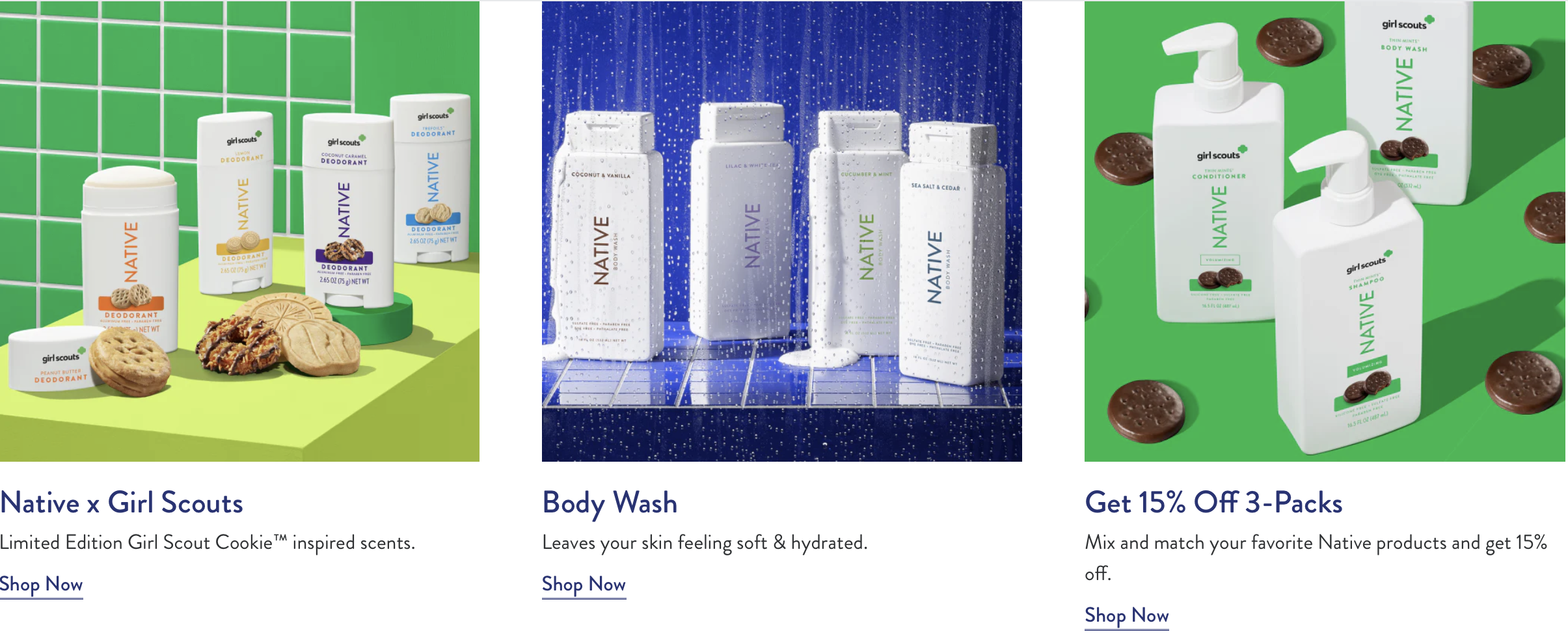
Native: Secondary Cards
This pattern informed the decision to prioritize a large promotional card followed by scannable category cards in the final design.
Checkout: All three sites use the same three-step checkout structure: Information > Shipping > Payment.
Checkout- Information Step:
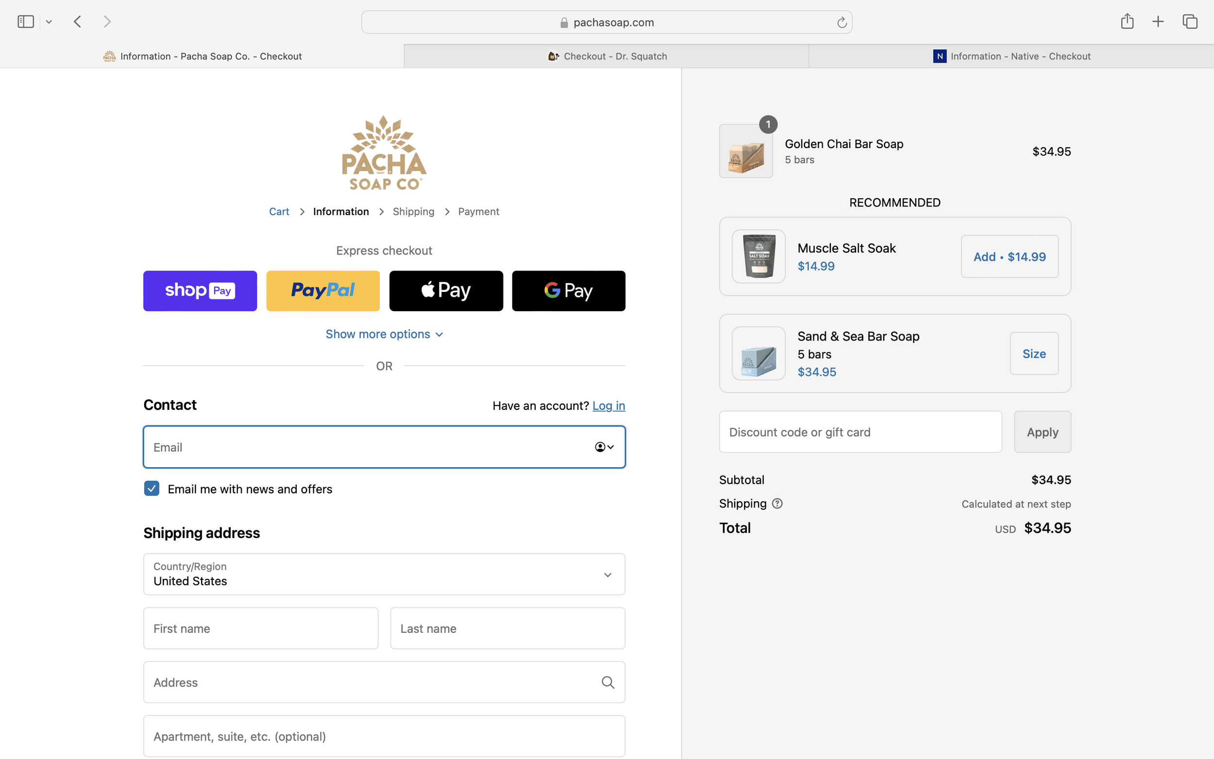
Pacha: Information Step
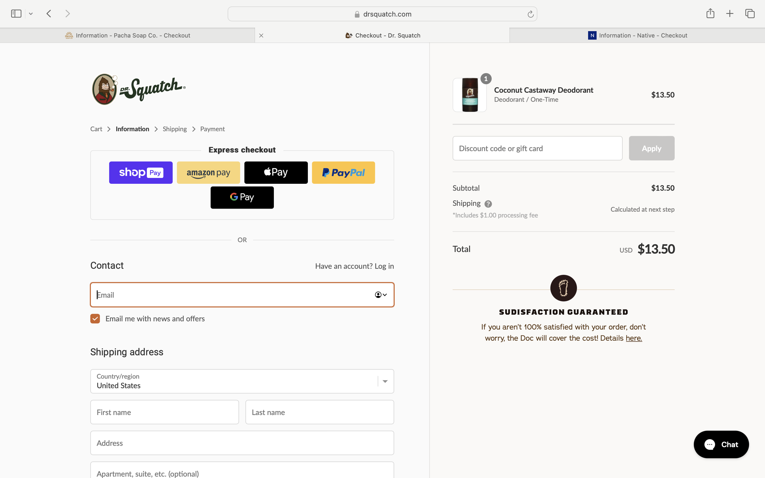
Dr. Squatch: Information Step
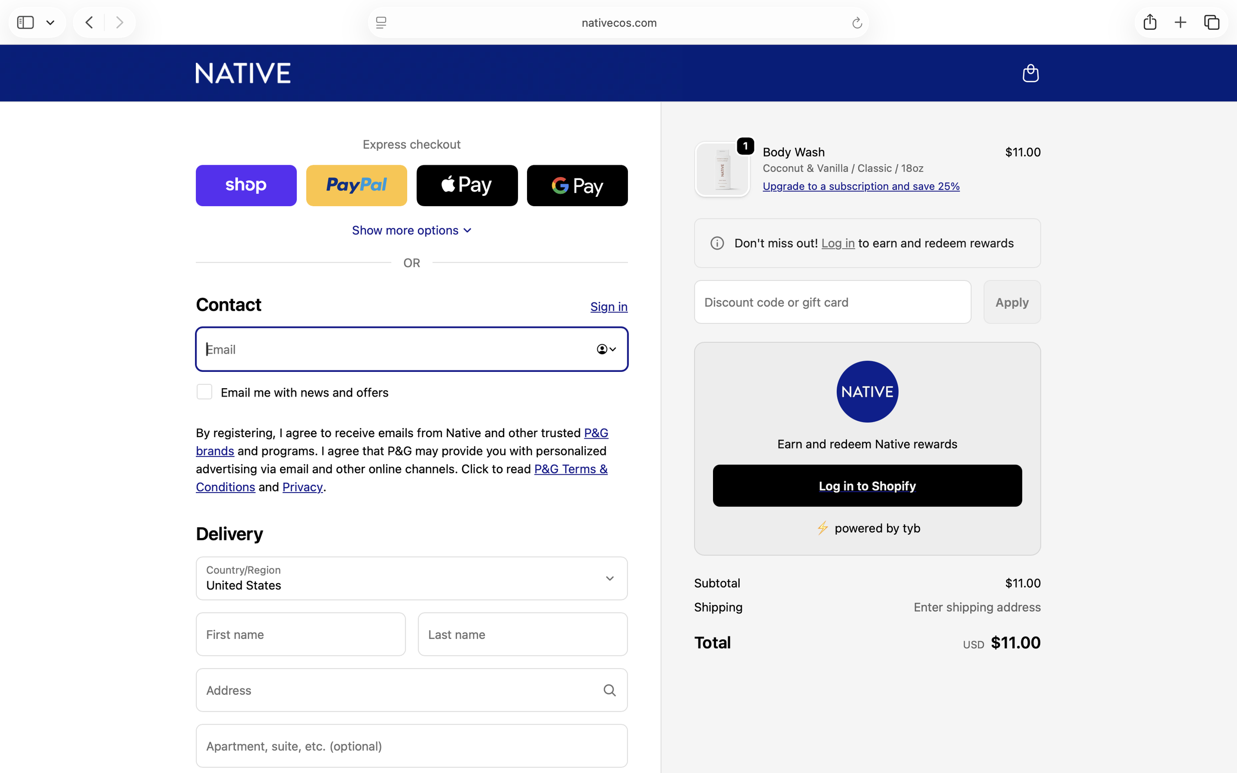
Native: Information Step
Across all three sites, the Information step follows the same pattern: express checkout options at the top, a two-column layout with contact and shipping forms on the left, and the order summary on the right.
Checkout- Shipping Step:
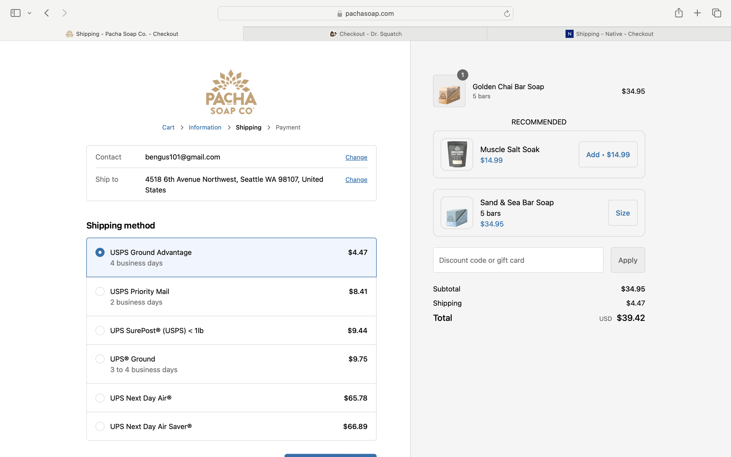
Pacha: Shipping Step
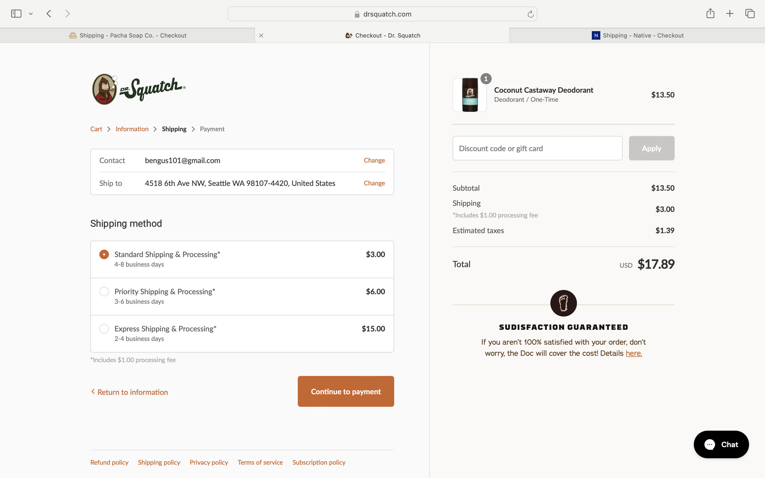
Dr. Squatch: Shipping Step
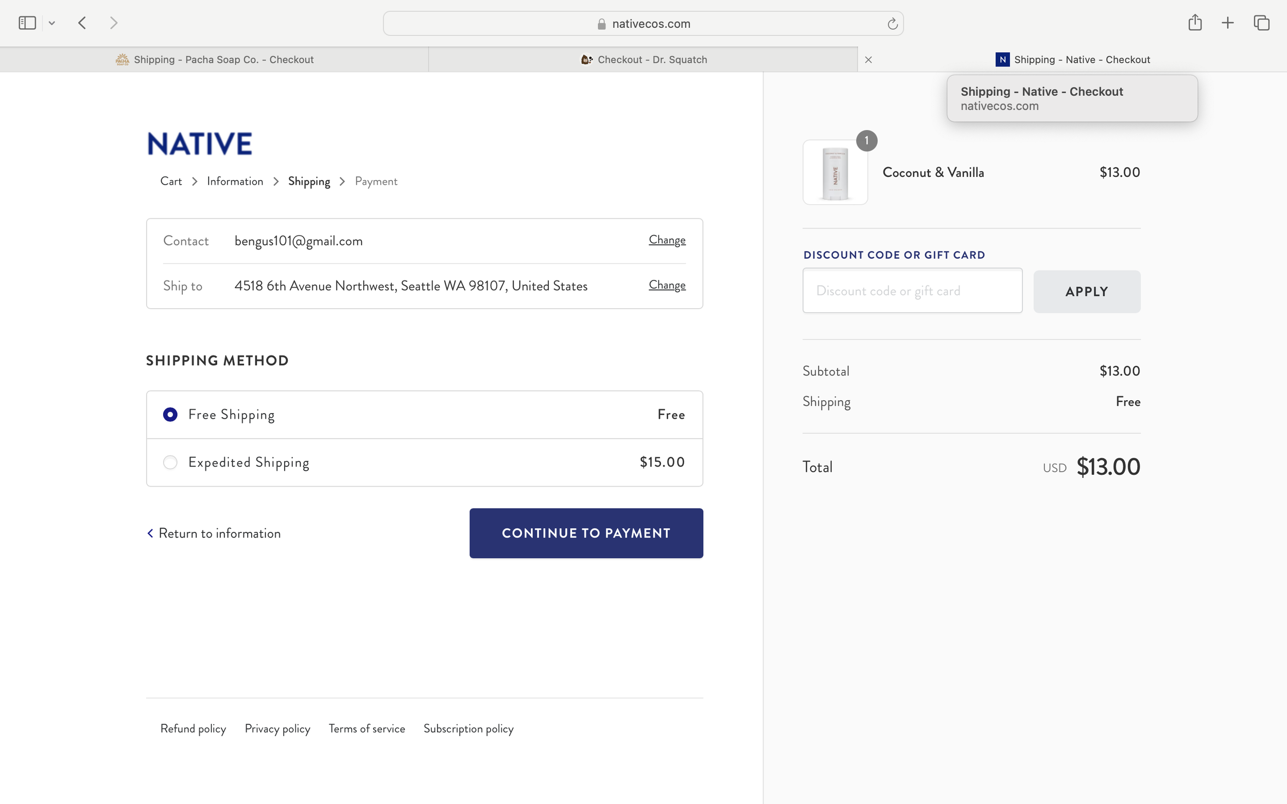
Native: Shipping Step
The Shipping step continues the same structural pattern introduced in the Information step. A summary of the customer’s details appears at the top, followed by selectable shipping methods. The two-column layout persists, keeping the order summary visible alongside the form.
The primary difference between sites is how shipping options are presented. Some brands offer multiple delivery tiers with varying prices and speeds, while others simplify the decision with fewer options, reducing cognitive load during checkout.
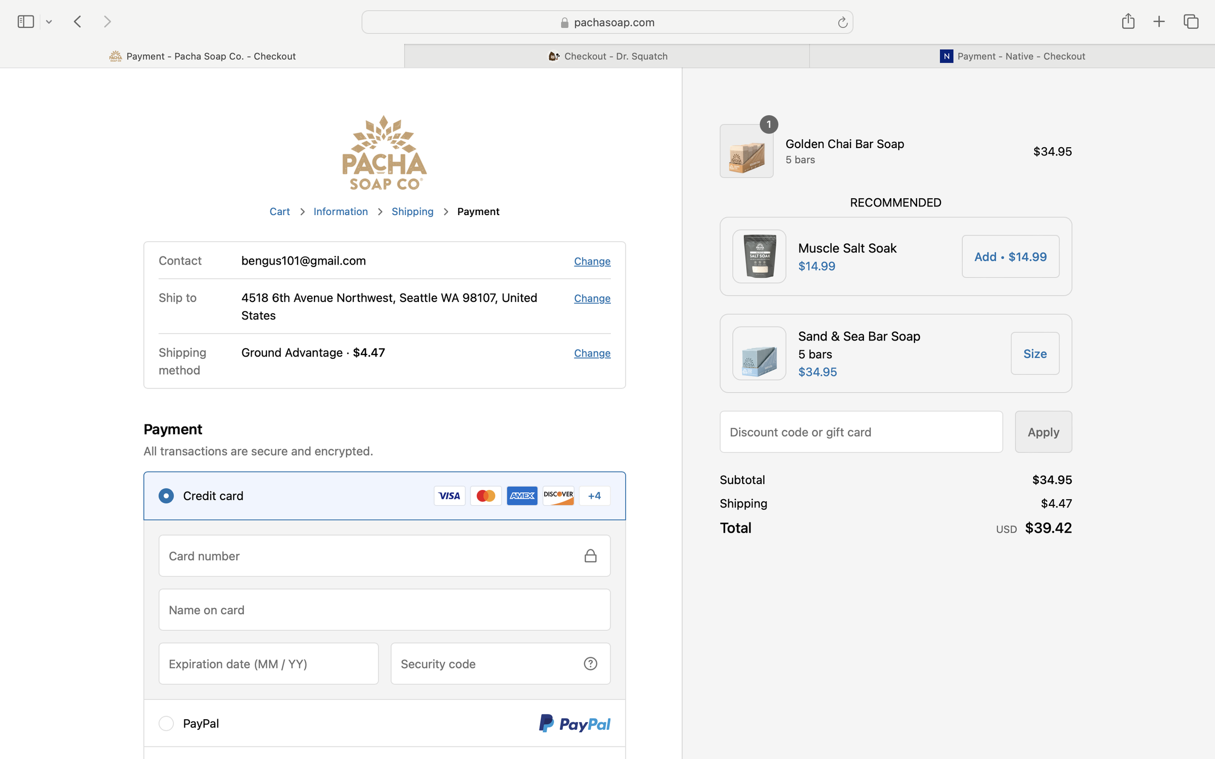
Checkout- Payment Step:
Pacha: Payment Step
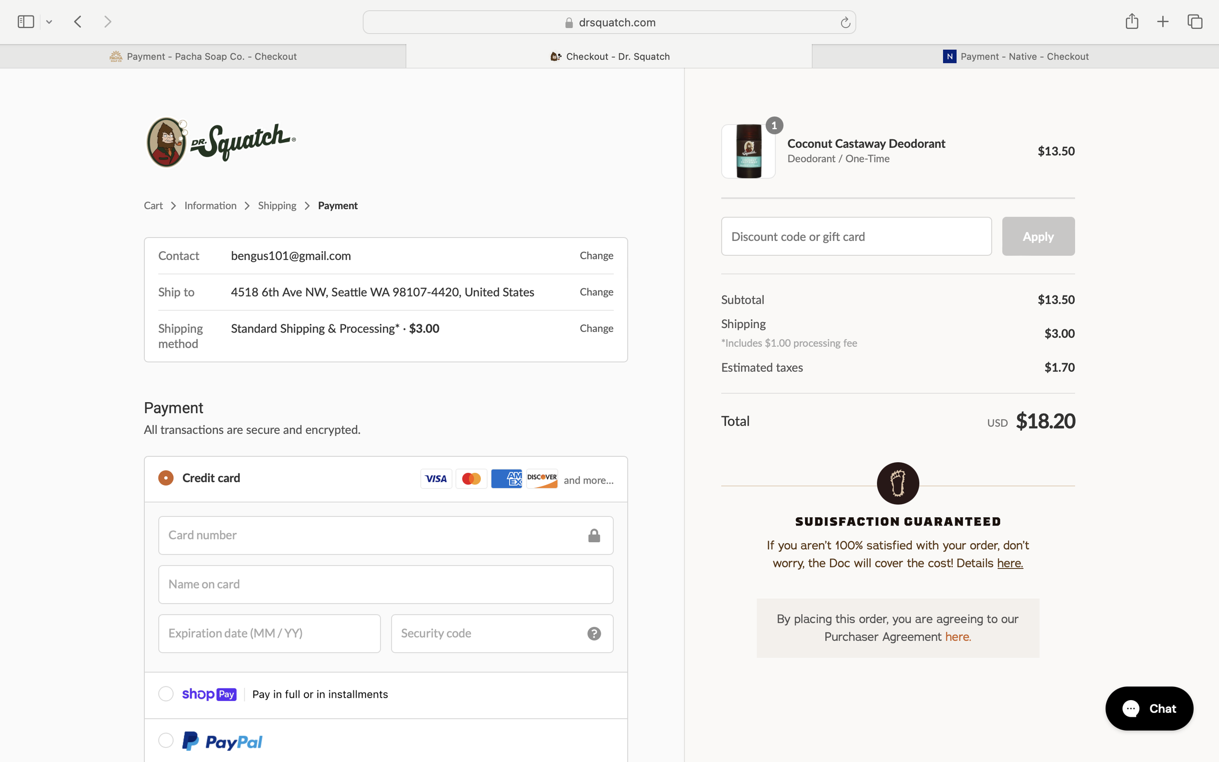
Dr. Squatch: Payment Step
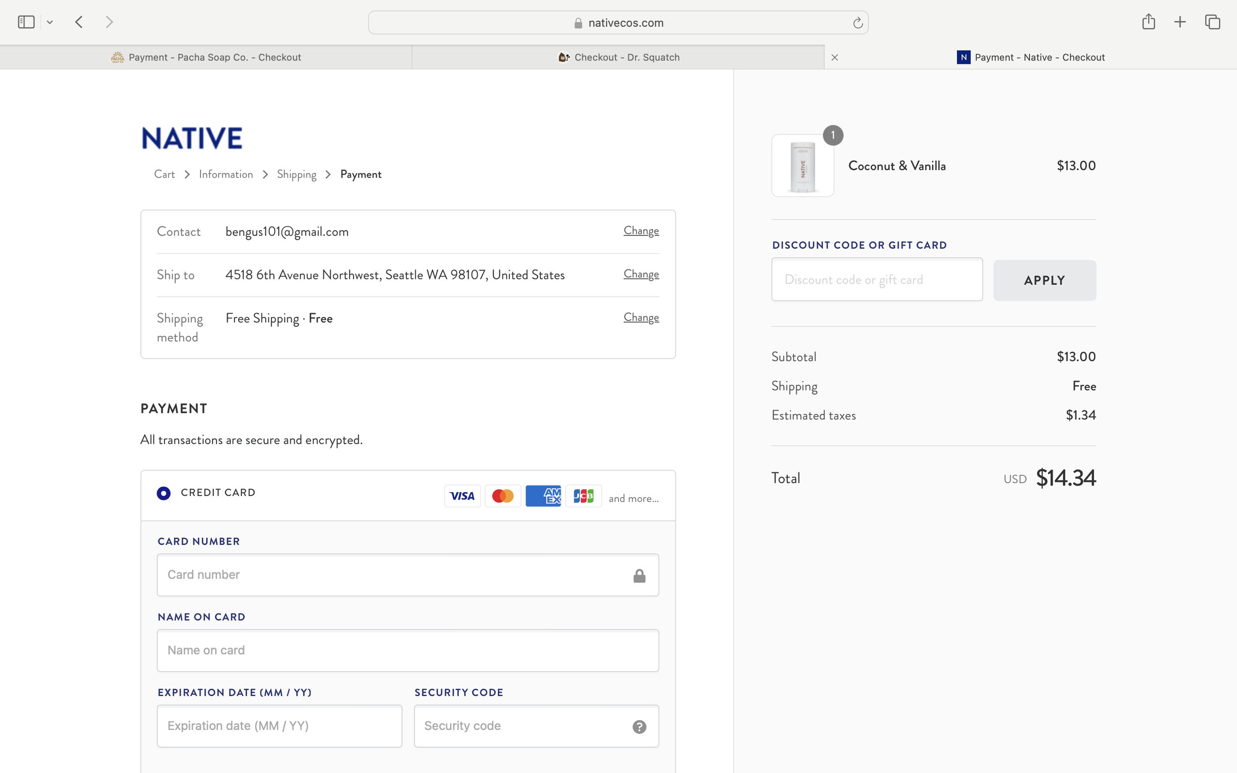
Native: Payment Step
On the Payment pages, the summary under the breadcrumbs updates with the selected shipping method. Below it is the form for entering credit card information, while the two-column layout and order summary remain consistent. At the bottom of the page, users confirm whether their billing address matches their shipping address before completing the purchase.
Analyzing the patterns across the three sites provided helpful reference points patterns about information hierarchy, content organization, and checkout flow. Combined with my card sorting results, these insights informed how Lathr’s content should be structured.
Concept Sketches:
To explore how research insights might translate into product features and page structure, I created a series of quick concept sketches.
Ingredient Transparency
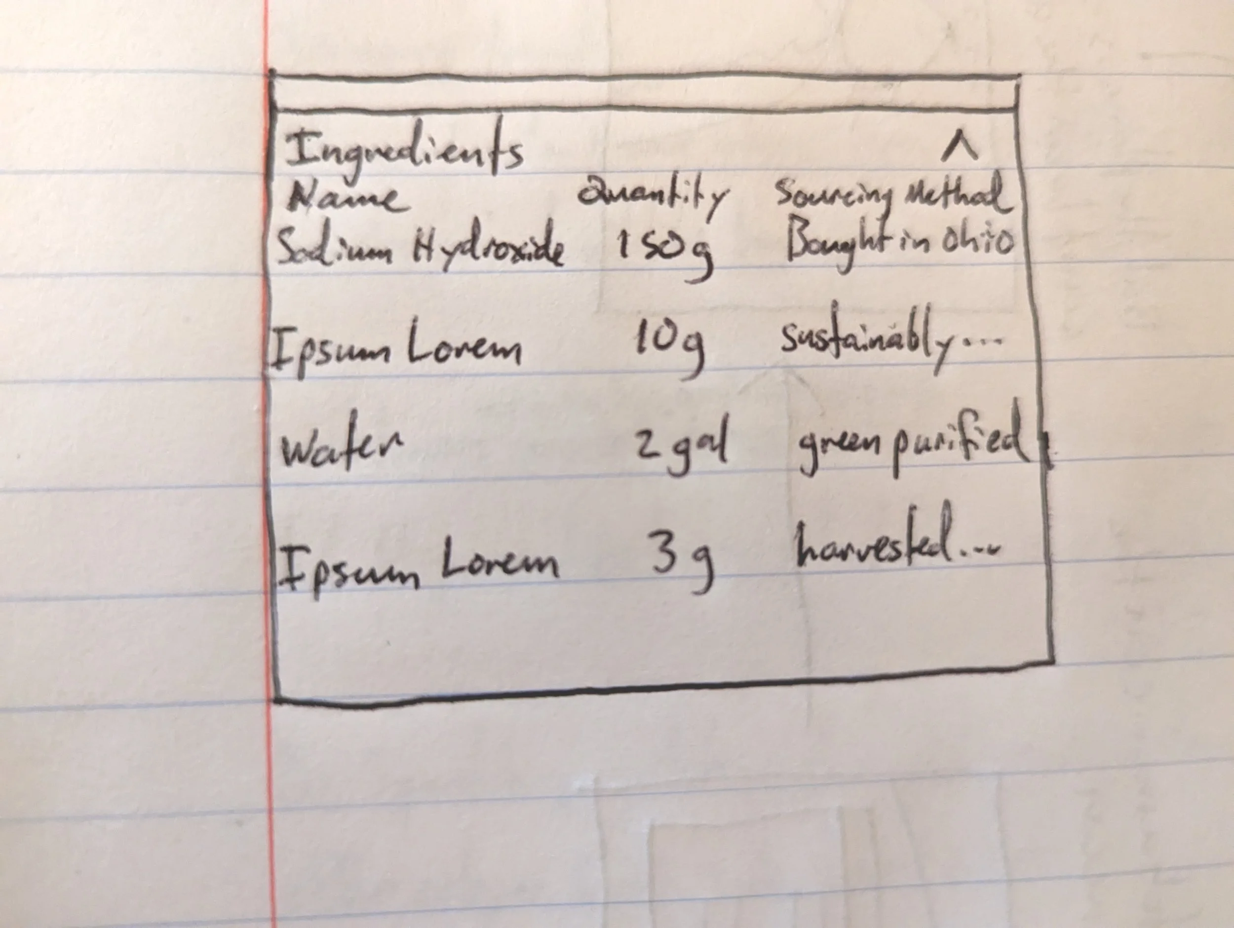
Exploring how ingredient quantities and sourcing could be presented
Product Experience
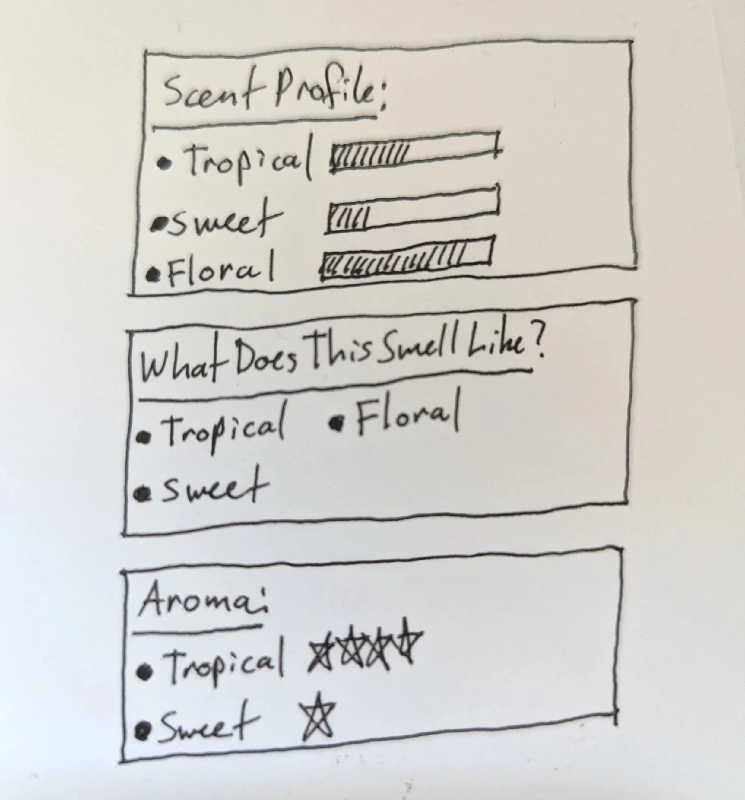
Exploring ways to communicate scent characteristics on the product detail page
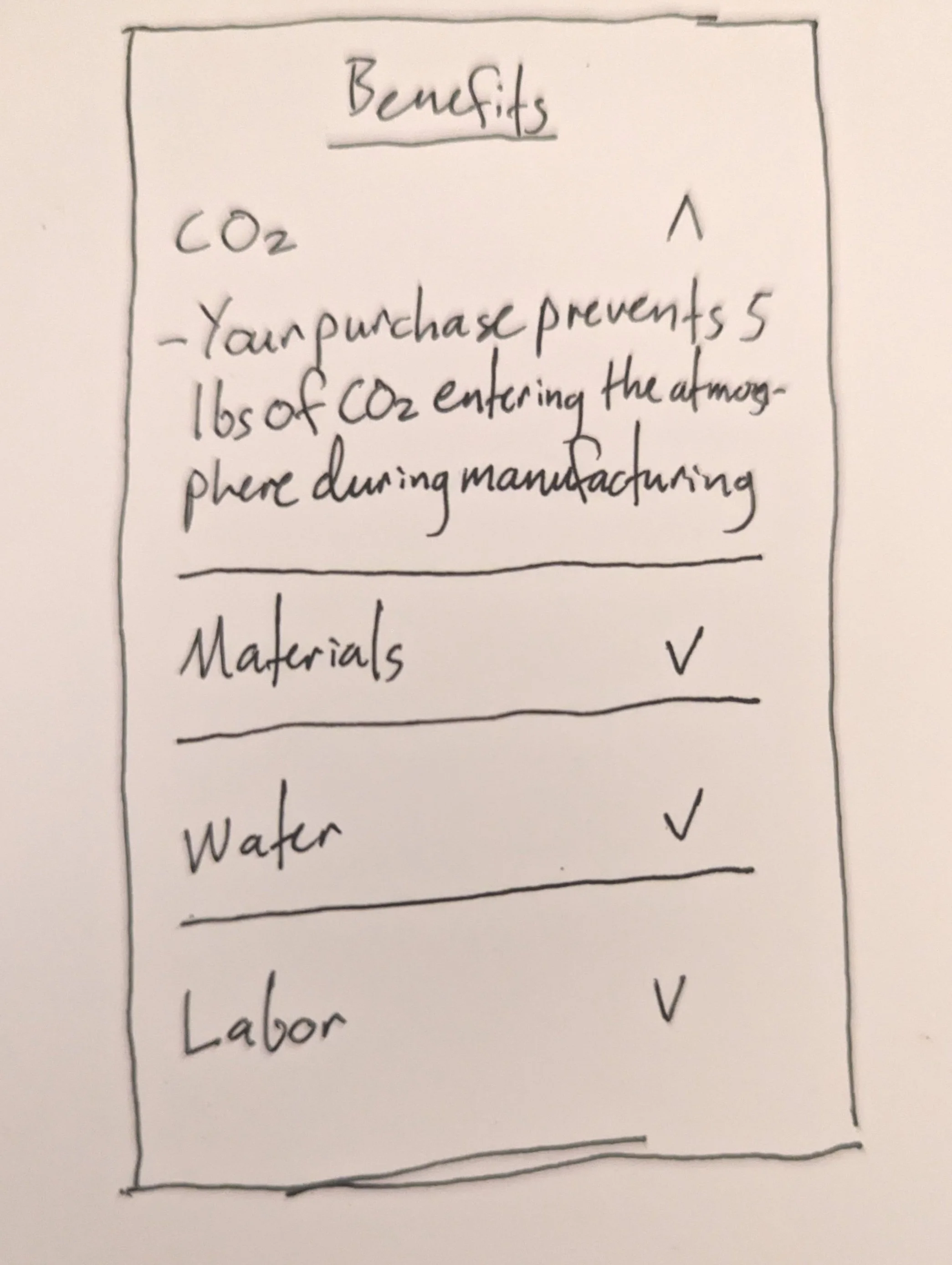
Environmental Impact
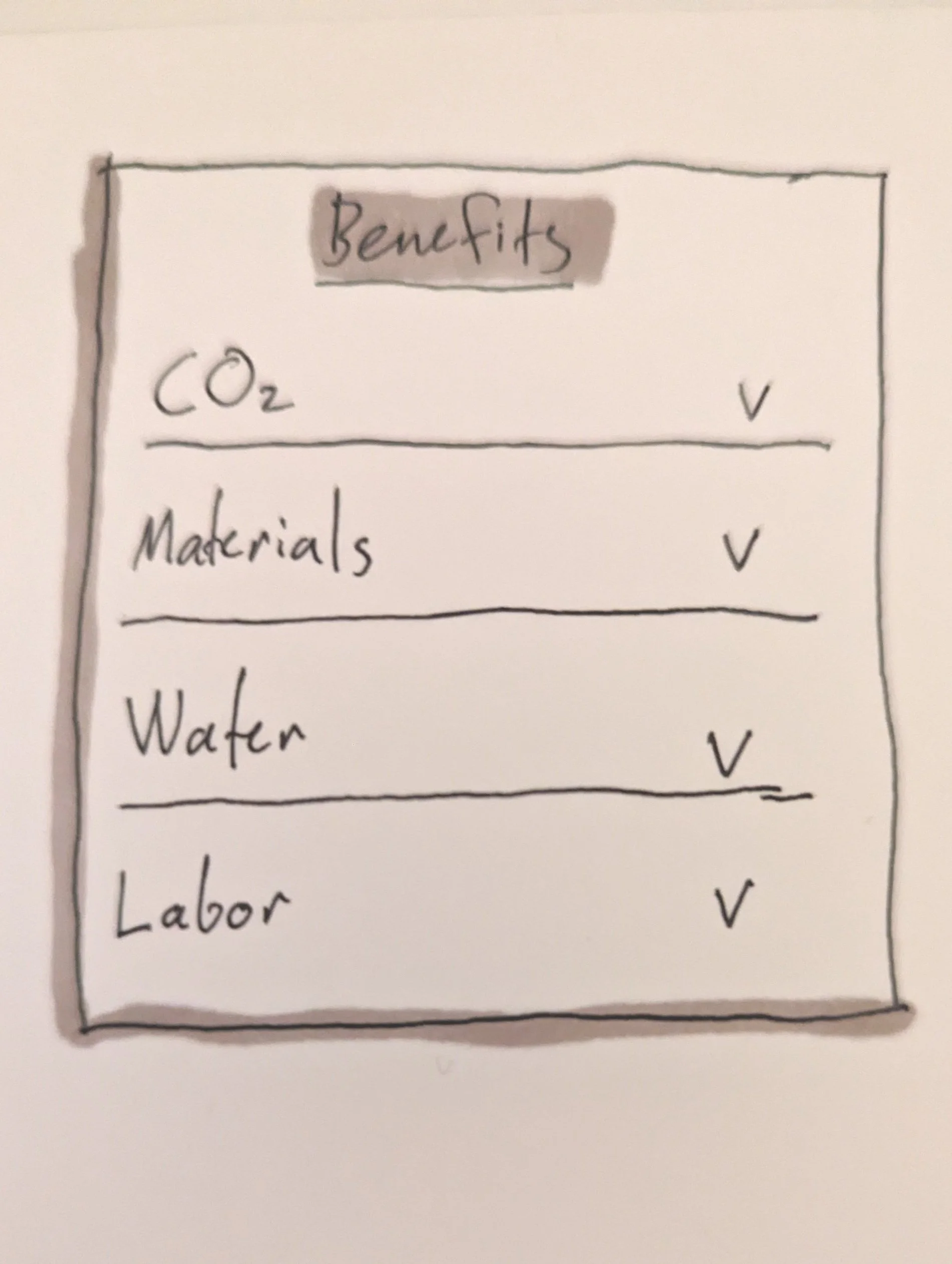
Exploring ways to surface environmental impact information, such as carbon footprint, materials, water use, and labor
Early Page Structure
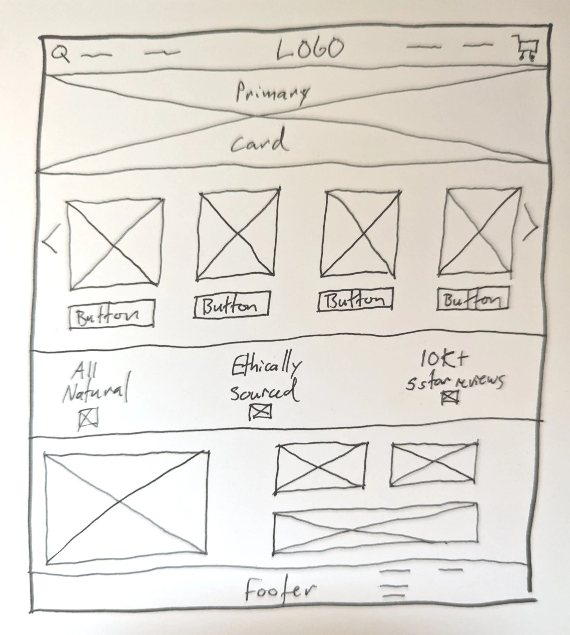
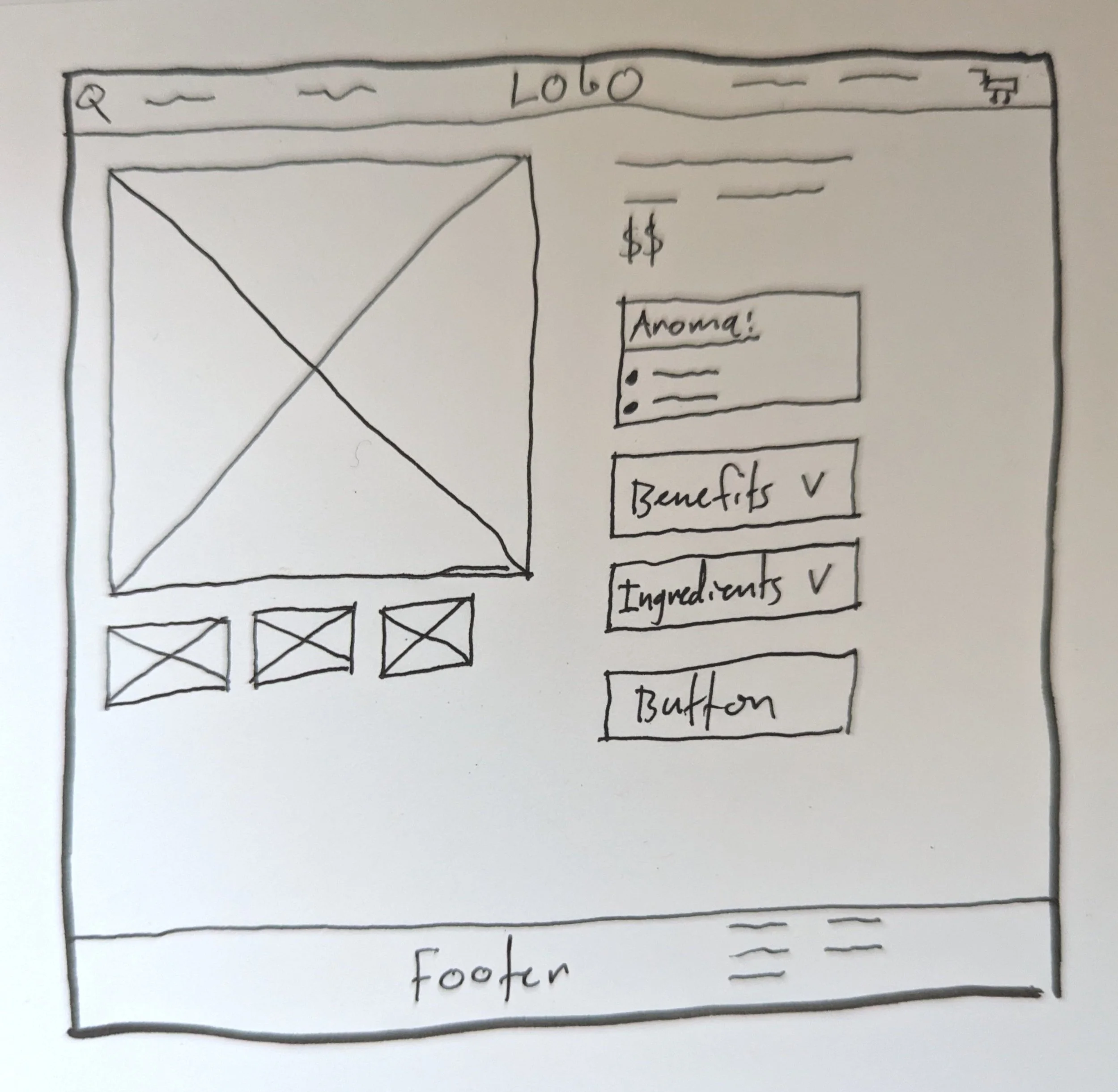
Exploring the structure of the landing page and product detail page
Lo-fi Wireframes:
Using the site map, competitive analysis, and UX research data as reference points, I created lo-fi wireframes to explore the site’s structure and core product experience.
These wireframes focused on three key areas: product discovery, product evaluation, and communicating product transparency.
Shop Listing Page
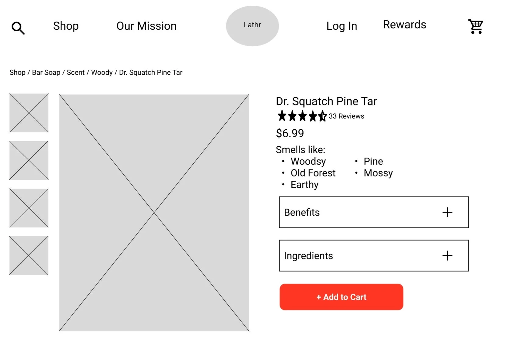
Exploring the product detail page layout, integrating scent profile, environmental impact, and ingredient transparency
Landing Page
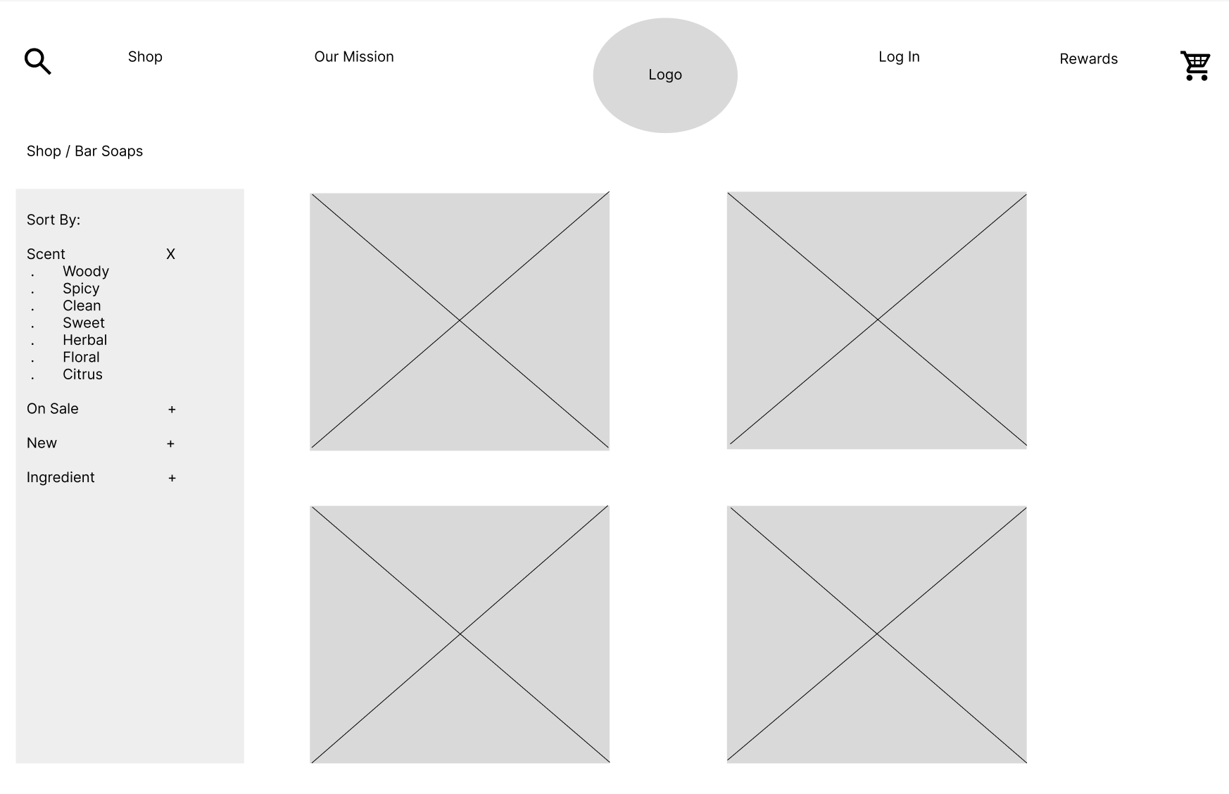
Exploring the shop listing page, including scent filtering and product browsing
Product Detail Page
Exploring the landing page layout and product discovery patterns
Color Palette:
Because Lathr’s products are 100% organic and all-natural, I aimed for a palette that evoked natural elements while meeting accessibility standards. I explored several palettes built around a primary color, two secondary colors, and a complimentary CTA color.
Color Exploration
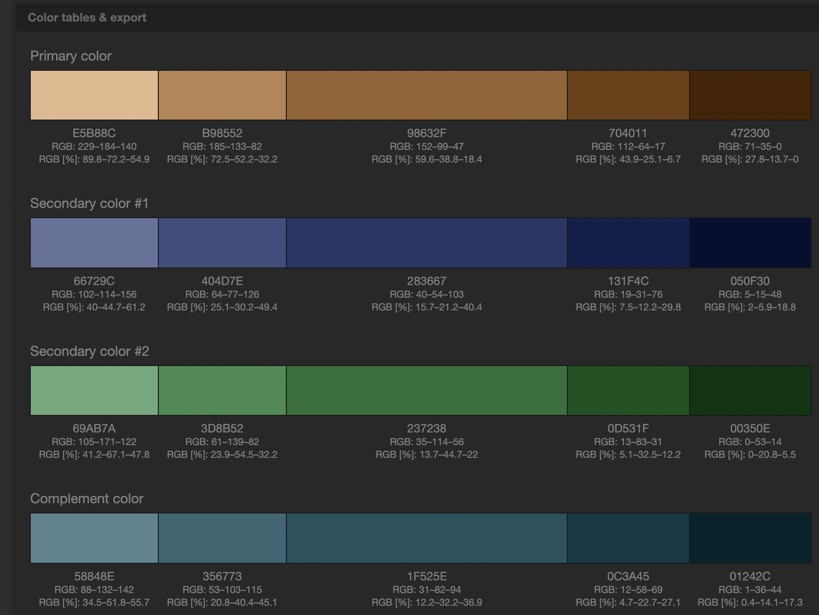
Palette #1: Natural brown baseline
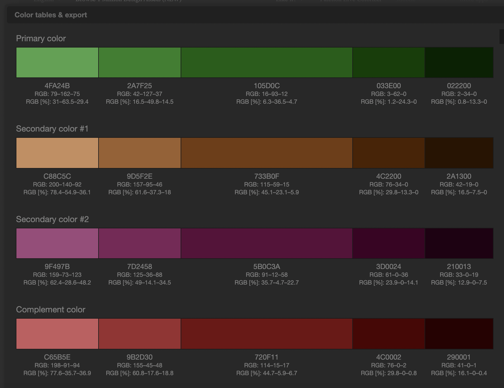
Palette #3: Green-forward alternative
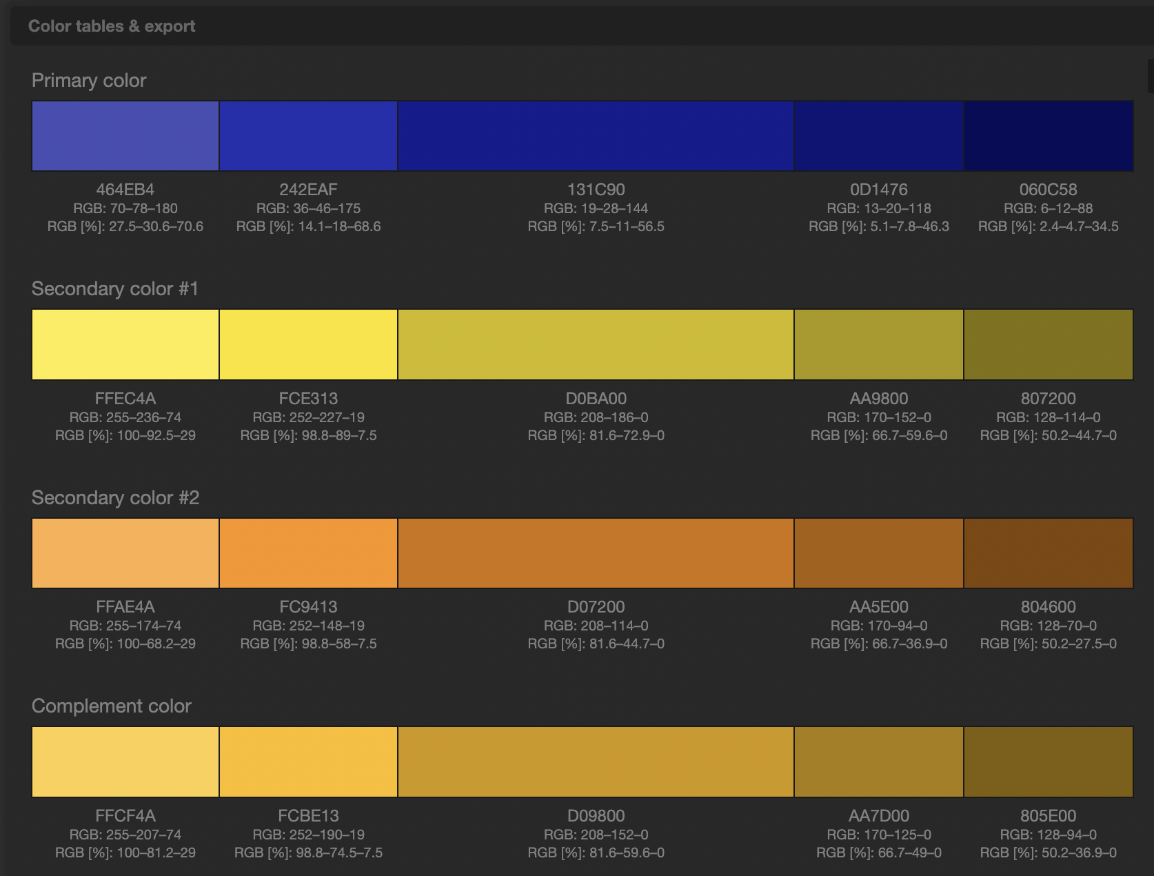
Palette #4: High contrast and bold
After testing multiple options, I selected palette #5. A Sr. Visual Designer reviewed the prototype and flagged that my light brown secondary color created accessibility concerns. Based on her feedback, I darkened the brown and resubmitted the prototype, which was approved.
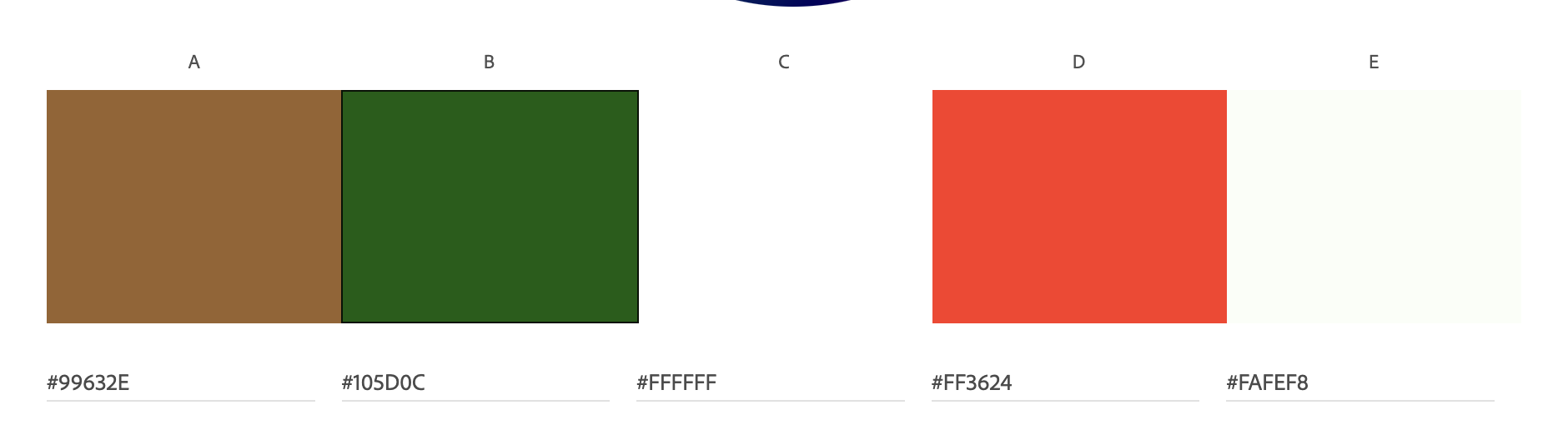
Final color palette after accessibility review
Hi-fi Prototype:
Due to project time constraints, usability testing was conducted after the hi-fi prototype was completed. To guide the design, I relied on insights from earlier user research and competitive analysis.
I created a hi-fi prototype to validate the visual system and key shopping flows. The screen records below show the landing page and shop browsing experience.
Landing page prototype showing product discovery and featured items
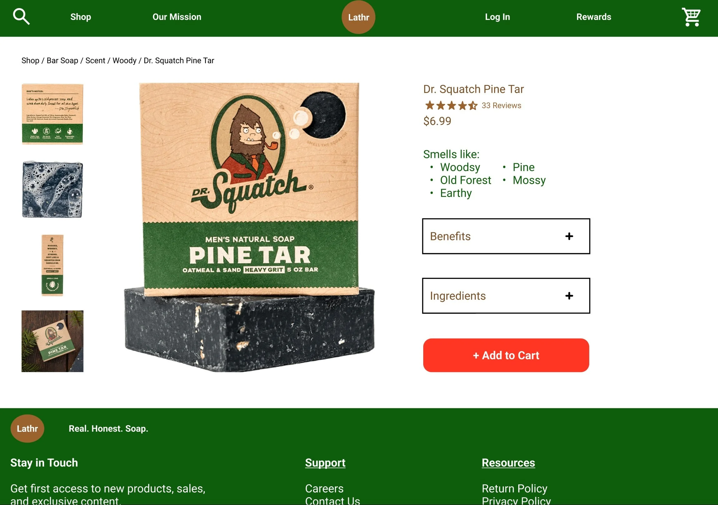
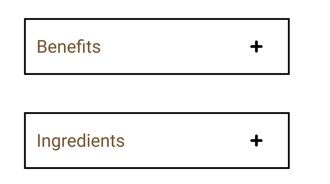
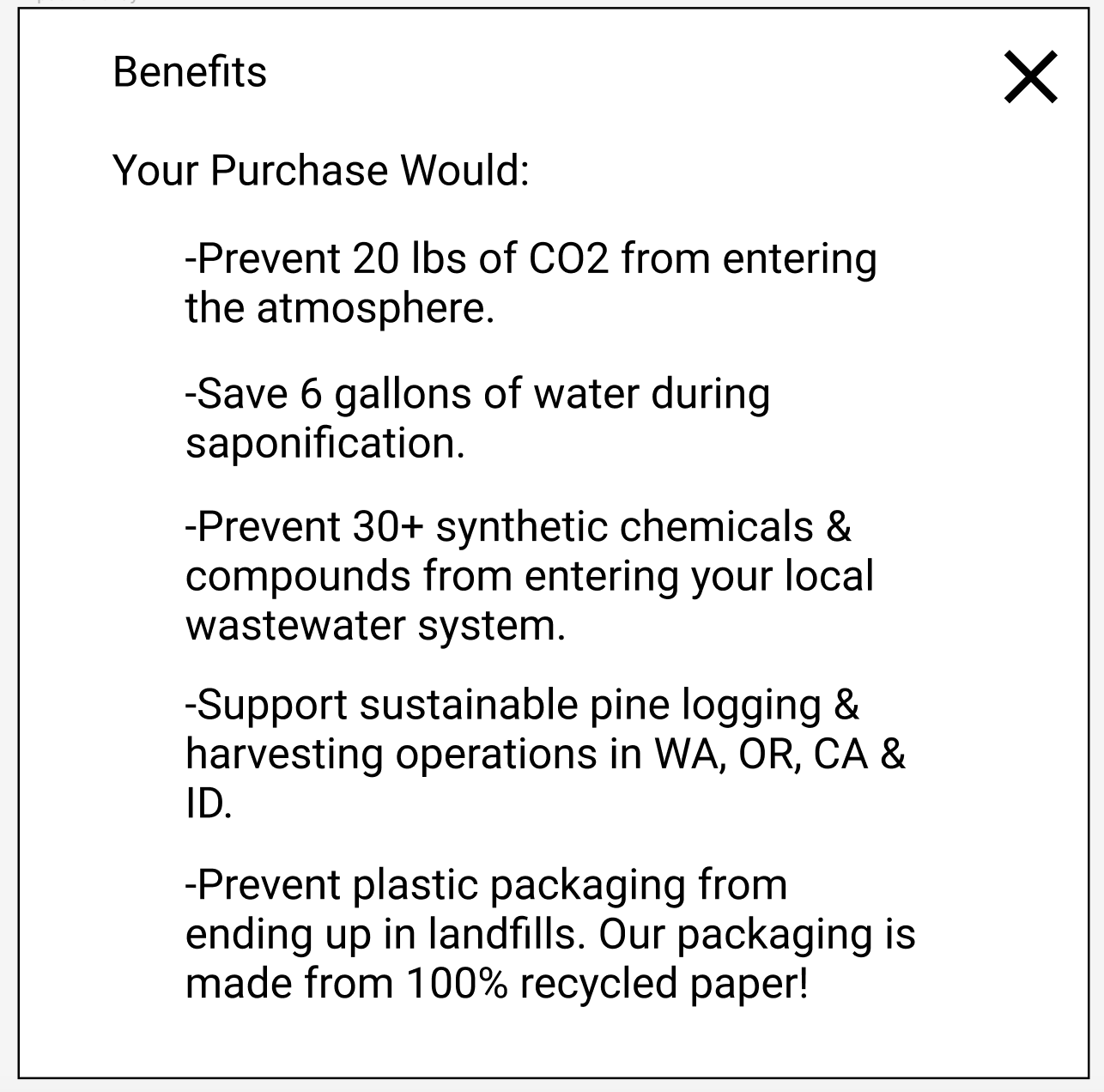
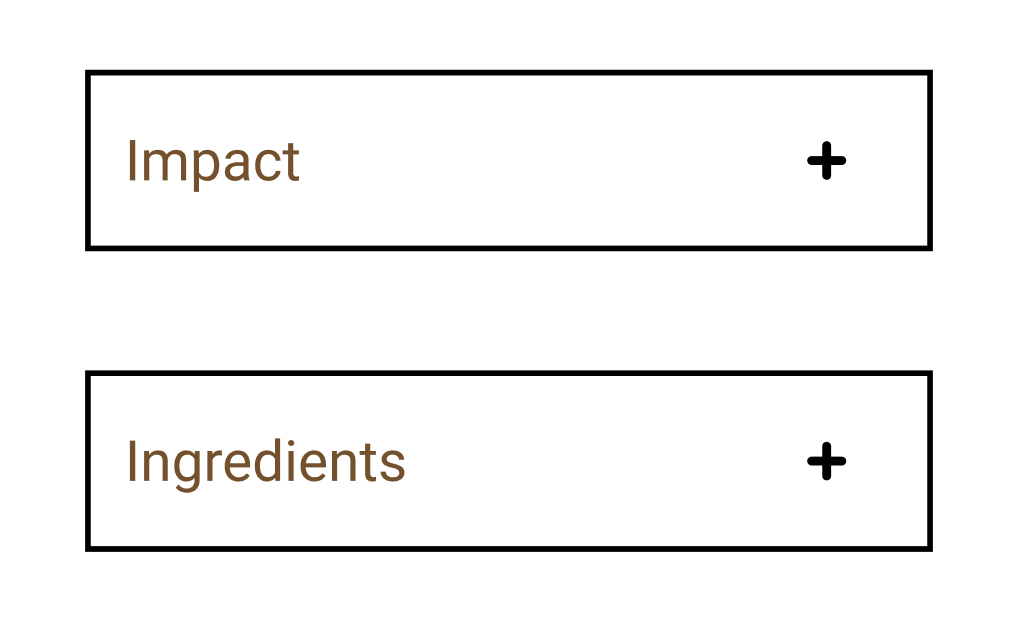
Product detail page highlighting scent profile, environmental impact (“Benefits“), and ingredient transparency (highlighted)
Shop browsing prototype with filtering and product cards
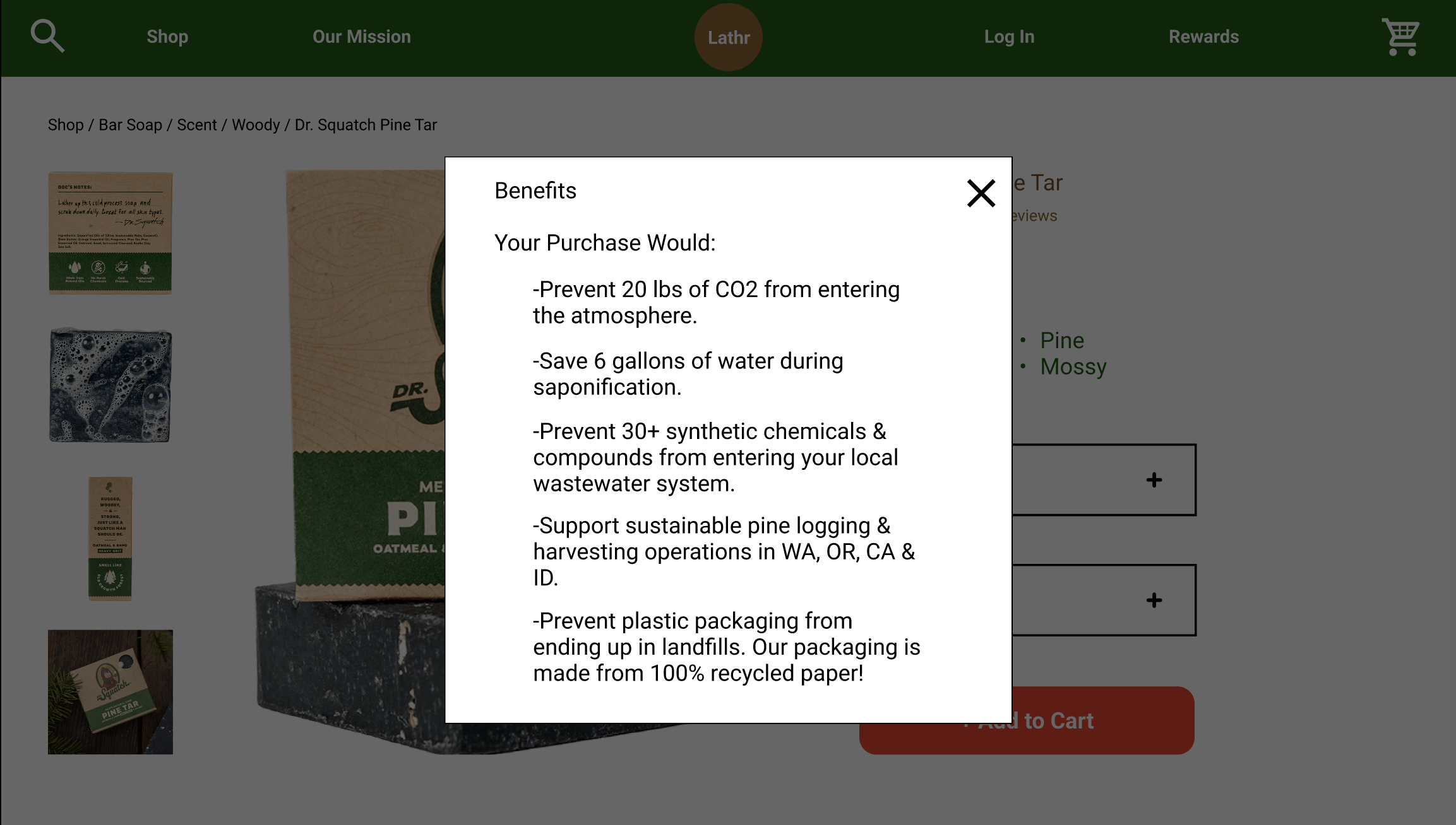
Selecting “Benefits“ opens an overlay explaining the environmental impacts of the purchase
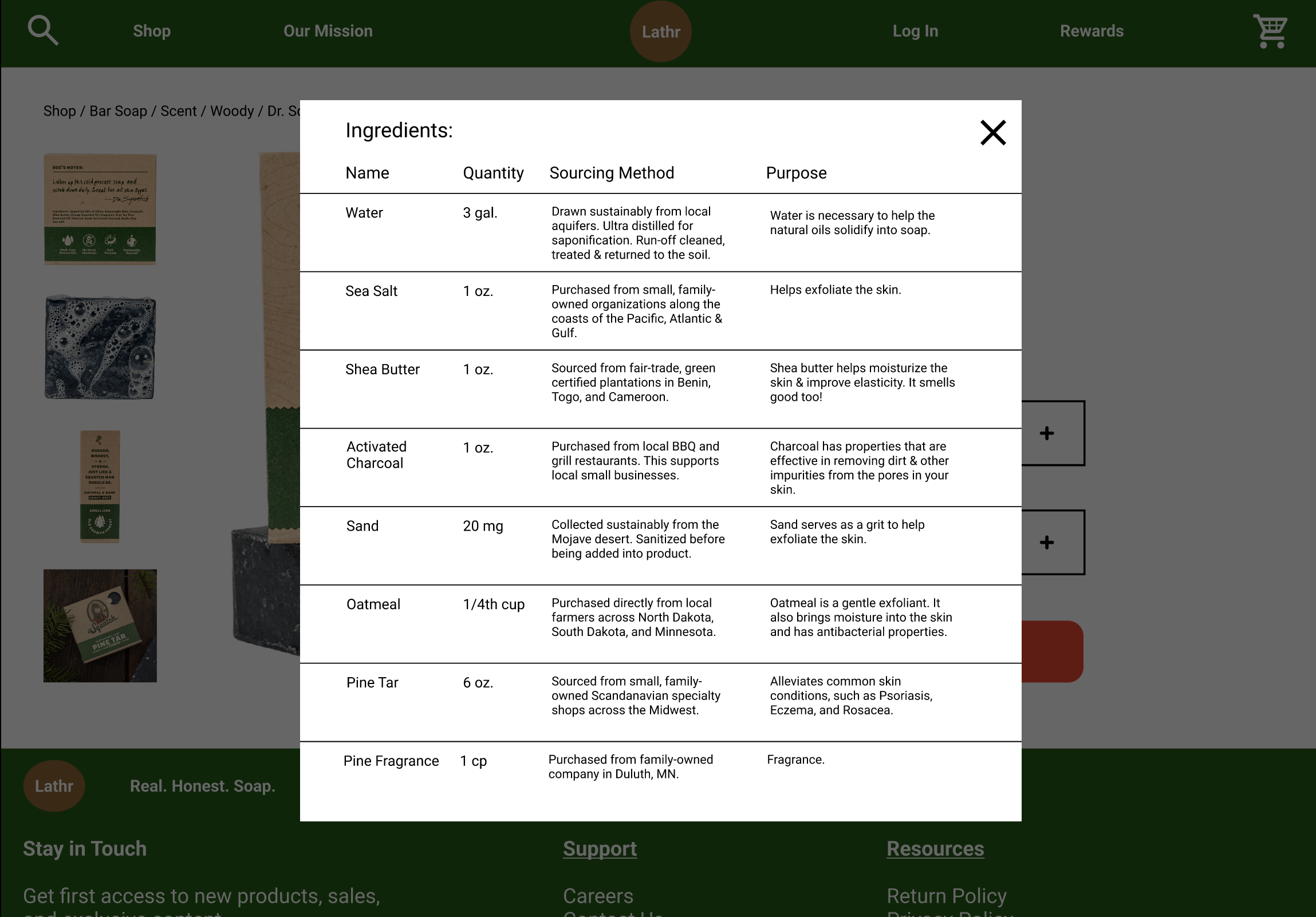
Selecting “Ingredients“ opens an overlay listing ingredient names, quantities, sourcing methods, and their purpose in the product
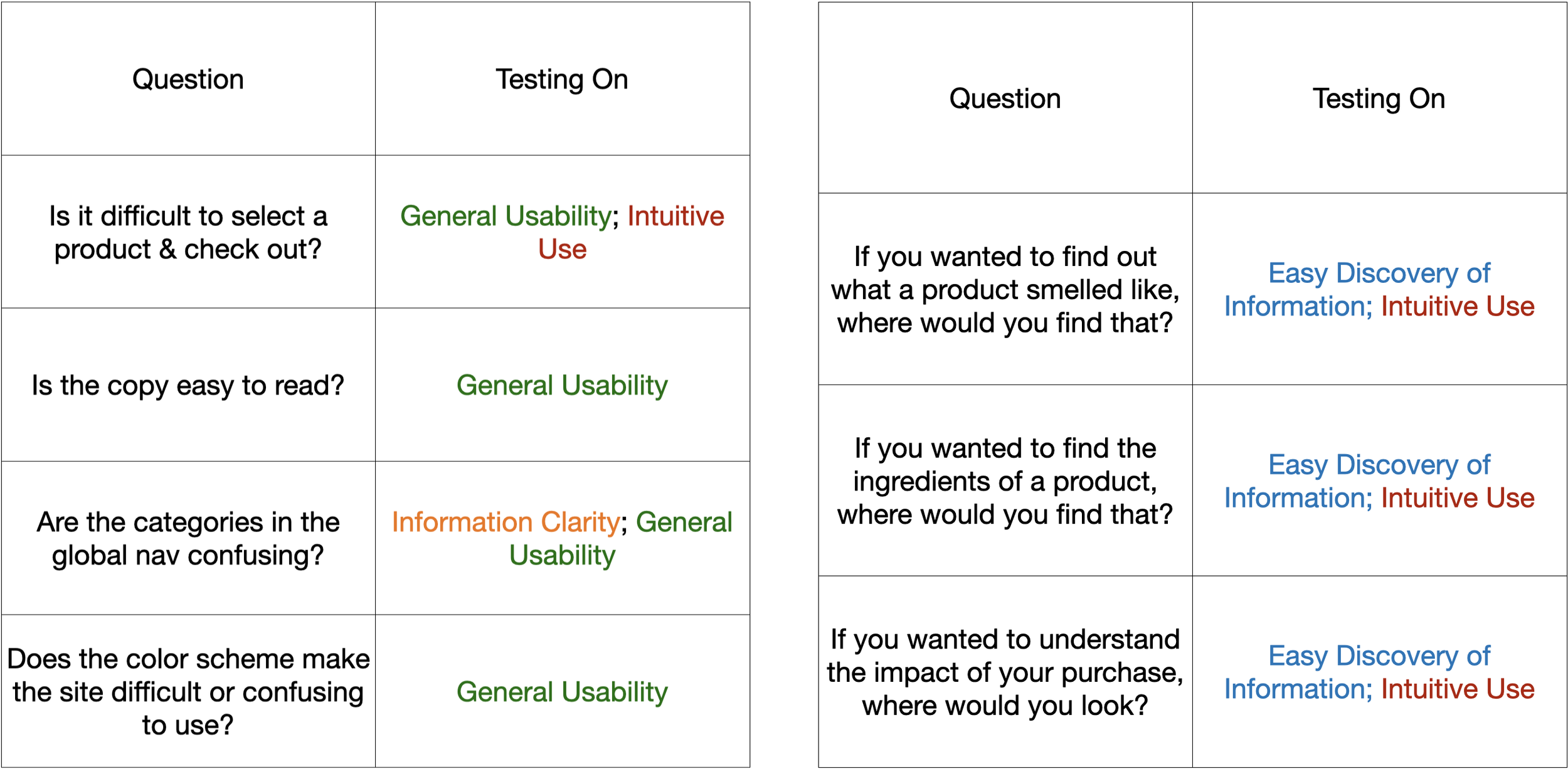
Usability Testing:
With the prototype completed, I conducted five 30-minute one-on-one usability testing sessions. The goal was to evaluate how effectively the design addressed the three key research priorities, while also gathering feedback on four broader usability themes:
Overall Usability
Intuitiveness of Key Flows
Clarity of Information
Discoverability of Key Information
Each question was designed to evaluate how easily users could discover product information, understand the environmental impact messaging, and navigate the purchasing flow.
Usability Testing Questions
Testing Results:
After synthesizing the testing data, three key insights emerged:
Define “Benefits”?: The label “Benefits“ was interpreted differently by participants. There was a disconnect between what I intended the section to communicate and what users expected it to contain.
Two for Three: Participants were able to easily discover and understand two of the three key priorities: the scent profile and product ingredients.
Less Isn’t Always More: I built one happy path to demonstrate the user journey. This backfired- users became confused when they clicked secondary features that were not yet functional in the prototype.
These findings directly informed the final design revisions.
Final Ideation:
Usability testing revealed both strengths and areas for improvement. While two of the three key research priorities performed well, feedback highlighted confusion around the “Benefits“ label and the lack of supporting interactions. I implemented the following revisions in response:
Define “Benefits“?:
To reduce confusion, I changed the Product Detail page label from “Benefits“ to “Impact“, and expanded the overlay title to “Environmental Impact“.
Before: The Product Detail Page button and overlay used the term “Benefits“.
Less Isn’t Always More:
I added additional supporting functionality, including a Support page, Cart, Rewards page, and Login flow.
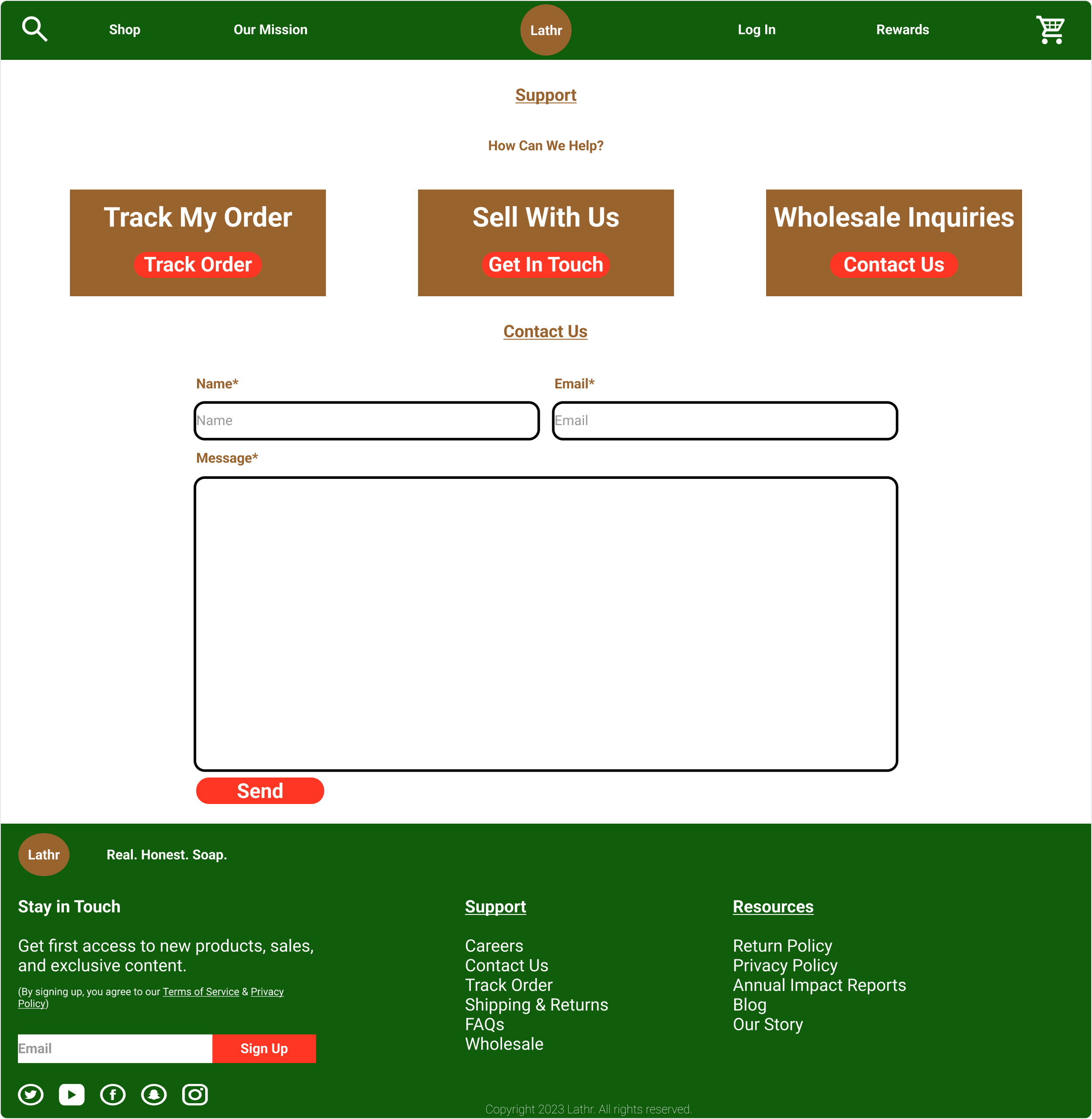
Support Page: order tracking, wholesale inquiries, customer contact
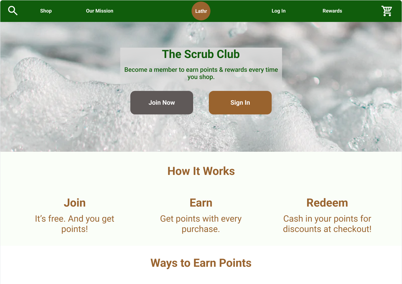
Rewards Program: loyalty points system
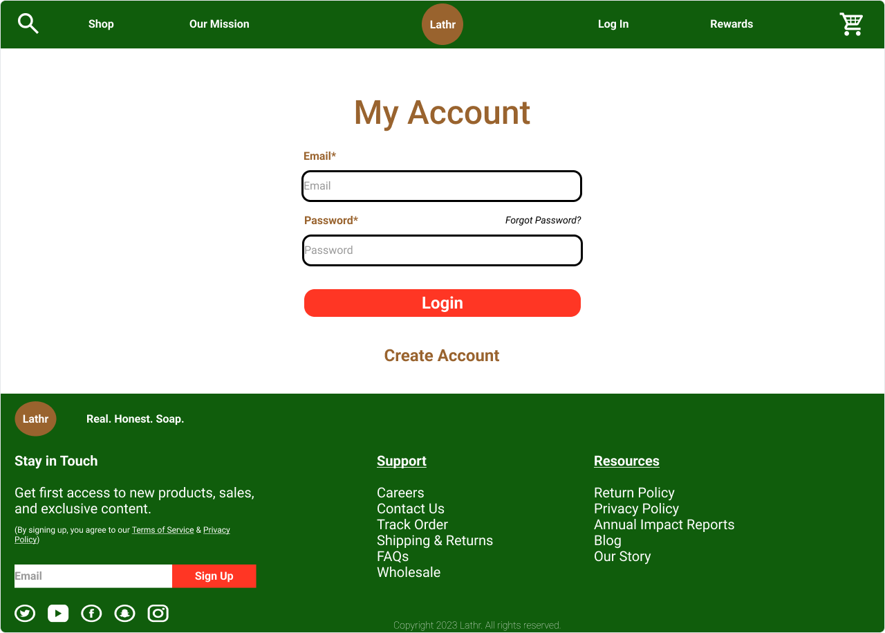
Account Login: user authentication
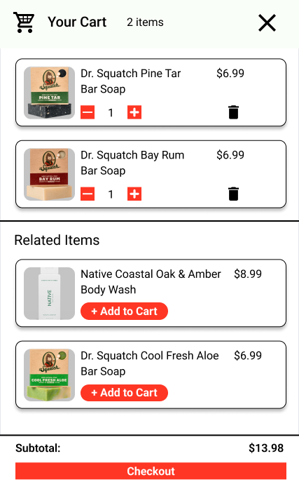
Cart: item management and related product suggestions
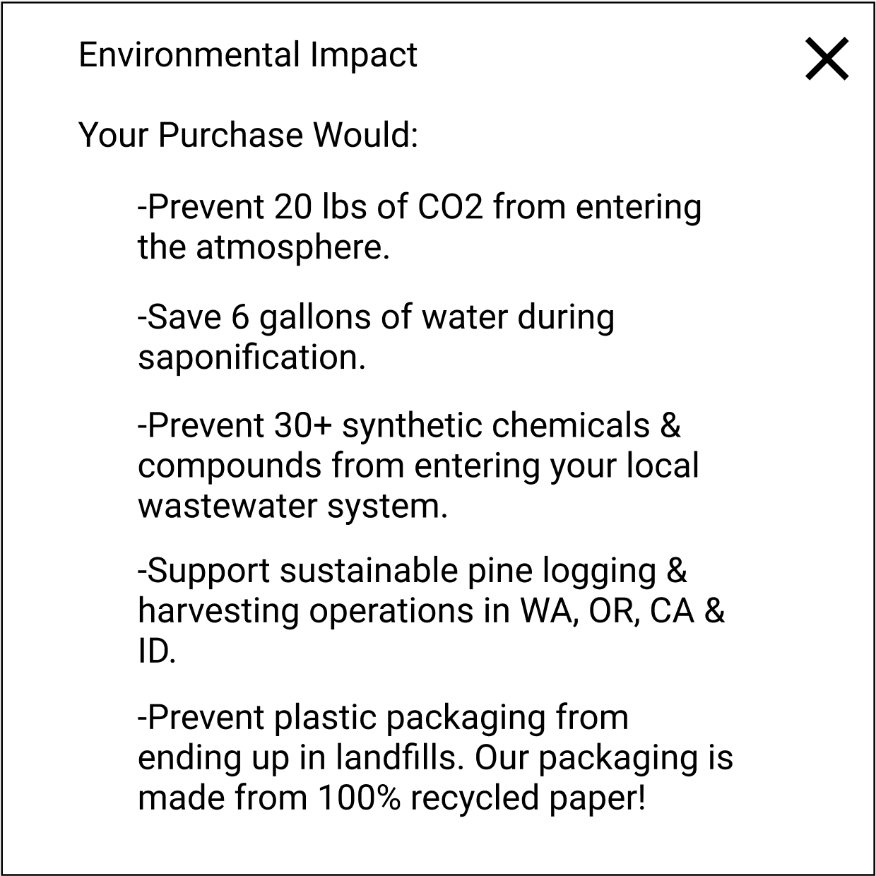
After: The button label was changed to “Impact“, and the overlay title was expanded to “Environmental Impact“.
Reflections:
Looking back on this project, three key lessons stood out:
Build the prototype for your own machine: My early prototype was designed for a screen size bigger than the laptop I was building on. This caused scaling issues and I had to redo parts of it. If I repeated this project, I would start mobile-first, then scale up to desktop.
Plan for extra research: When my survey was taken down, I had to quickly schedule additional interviews to fill the gap. In the future, I would monitor research tools more closely and schedule backup interviews from the start.
Build a more comprehensive prototype earlier: Going into usability testing with only a single happy path and a stripped-down prototype created confusion- especially when users clicked features that didn’t respond.