
Amazon
Led the design of new enterprise features for Amazon’s sourcing engine to help recruiters find candidates faster.
Please note: Due to NDA constraints, visuals and labels have been redacted or modified. I can share further details in conversation.
Background:
Amazon has a proprietary applicant tracking and sourcing platform used globally by its’ recruiters to review candidates, track hiring progress, manage interactions, and more. The sourcing engine allows recruiters to search internally for candidates across roles and teams
I led the design of two new features aimed at reducing repeated candidate reviews during sourcing. Working alongside a UX Lead, UX Manager, Product Managers, and Engineering leadership, I focused on improving recruiter efficiency within high-volume workflows.
My Role:
Workback Planning
Usability Testing
Interaction Design
Stakeholder Collaboration
Accessibility
Timeframe:
6 months (APR-OCT 2024)
Stakeholders:
UX Lead, UX Manager, Software Development Manager, 2 Principal Product Managers
Customer:
~5900 Recruiting and HR professionals.
Goal:
Enable recruiters to hide previously viewed candidates within the Sourcing engine.
Problem:
To fill open roles, recruiters use Amazon’s internal sourcing engine to search for and review candidates- often reviewing hundreds of profiles per day. A common issue emerged: recruiters frequently encountered the same candidates multiple times, but had no clear indication whether they had previously viewed them or when.
This placed significant cognitive load on recruiters, slowed decision-making, and led to wasted time during high-volume sourcing workflows.
Outcome: Designed and shipped a recruiter workflow that improved candidate management clarity and introduced scalable controls for hiding and revisiting prospects.
Clarifying the Problem:
During kick-off, I met with the UX Lead and two Principal Product Managers who owned the sourcing platform. The PMs shared a Business Requirements Document (BRD) informed by prior user research, which highlighted two primary recruiter pain points:
User Problem #1: Recruiters review hundreds of profiles per search, but cannot easily track who they’ve viewed, leading to repeated profile reviews and wasted time.
User Problem #2: Recruiters encounter lots of unqualified candidates, but lack a way to mark them as unfit or filter them out of the search results, which creates clutter.
Design Objectives:
Based on these findings, I defined two design objectives:
Provide a clear visual indicator for previously viewed profiles.
Give recruiters control to mark and hide unqualified candidates from search results.
Design Principles:
Based on early research and stakeholder alignment, four principles guided my design decisions throughout this project:
Clarify activity ownership
Preserve recruiter control
Reduce cognitive load during sourcing
Maintain recoverability of hidden candidates
Planning:
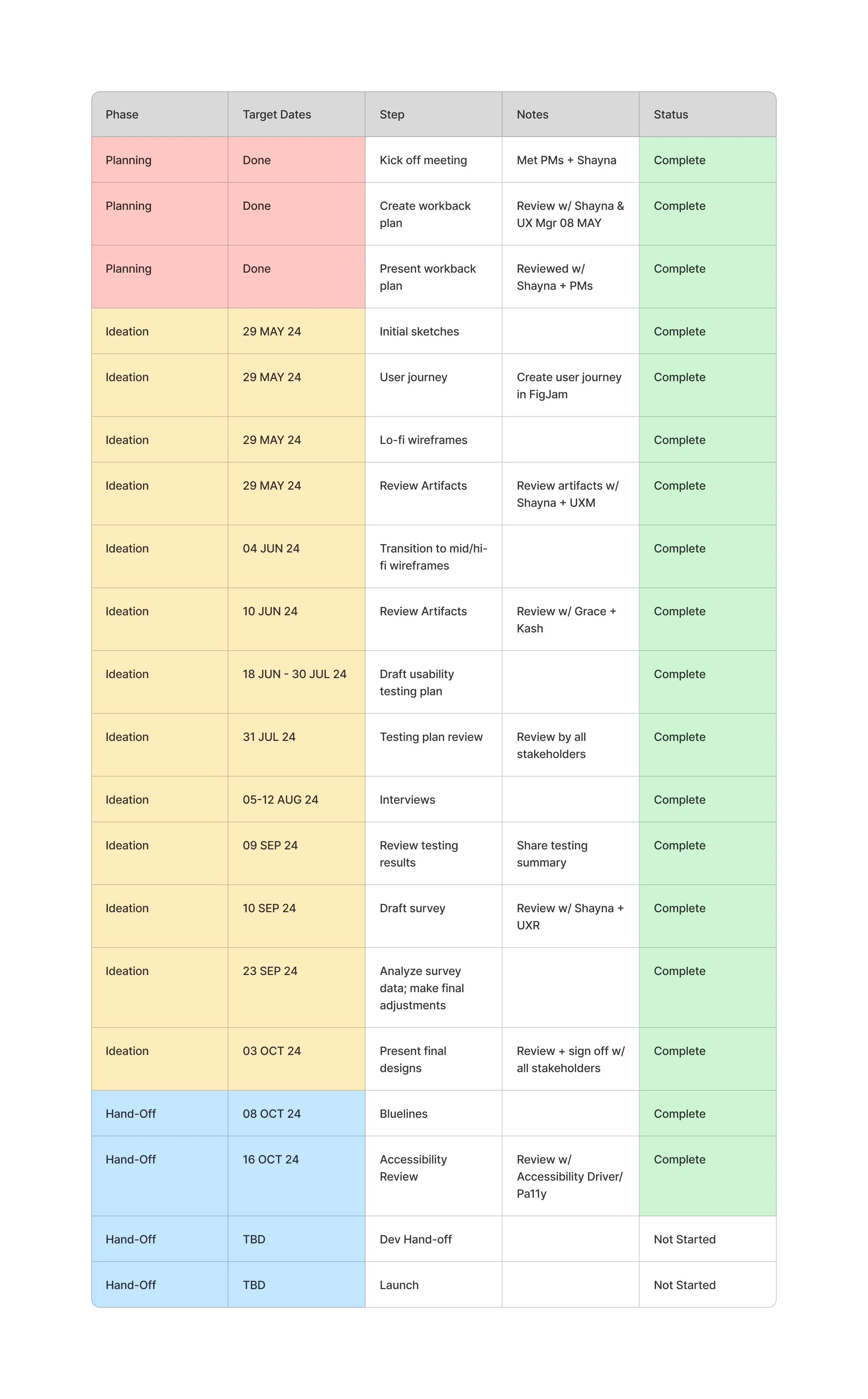
To align stakeholders and manage delivery timelines, I created a work-back plan outlining milestones, reviews, and UX deliverables (shown to the left).
Because user research had already defined the core problems, I moved directly into ideation while maintaining structured checkpoints for stakeholder feedback and validation.
My proposed workflow included:
Ideation and early concept exploration
UX stakeholder reviews
Cross-functional reviews (Product & Engineering)
Testing and validation
Final design handoff
After validation from my UX Lead, my plan was shared with stakeholders and approved as the execution roadmap.
First Ideation:
User Journey:
To understand where recruiters experienced friction during sourcing, I mapped the end-to-end user journey. This exercise helped surface key decision points, including moments when recruiters revisited profiles and needed ways to track prior views or remove unfit candidates from search results- which revealed where design intervention could reduce user cognitive load.
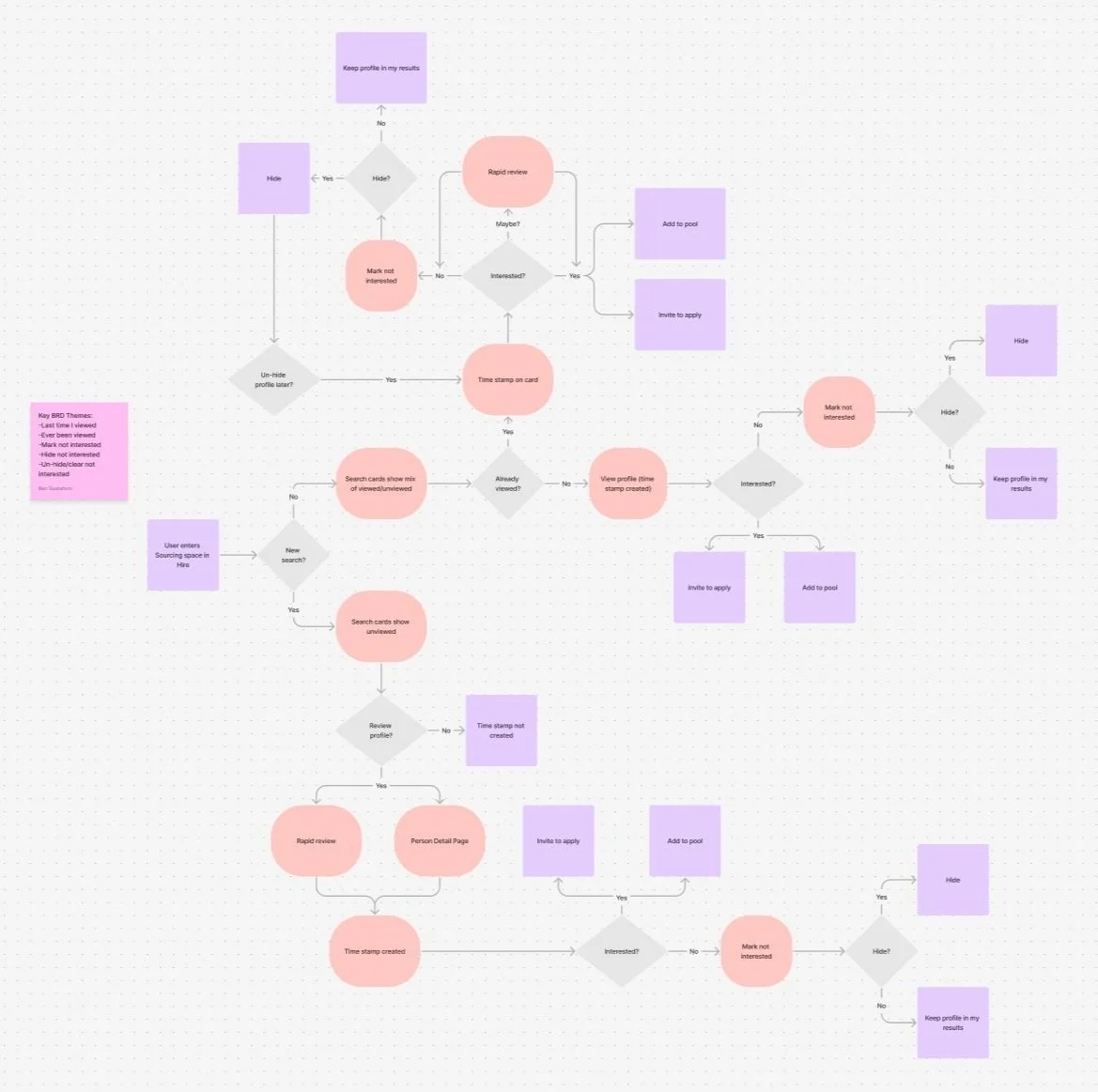
The journey map highlighted that critical workflow decisions occurred directly within search result and profile review moments, guiding exploration around visibility of prior activity and mechanisms for managing unwanted candidates.
Early Exploration:
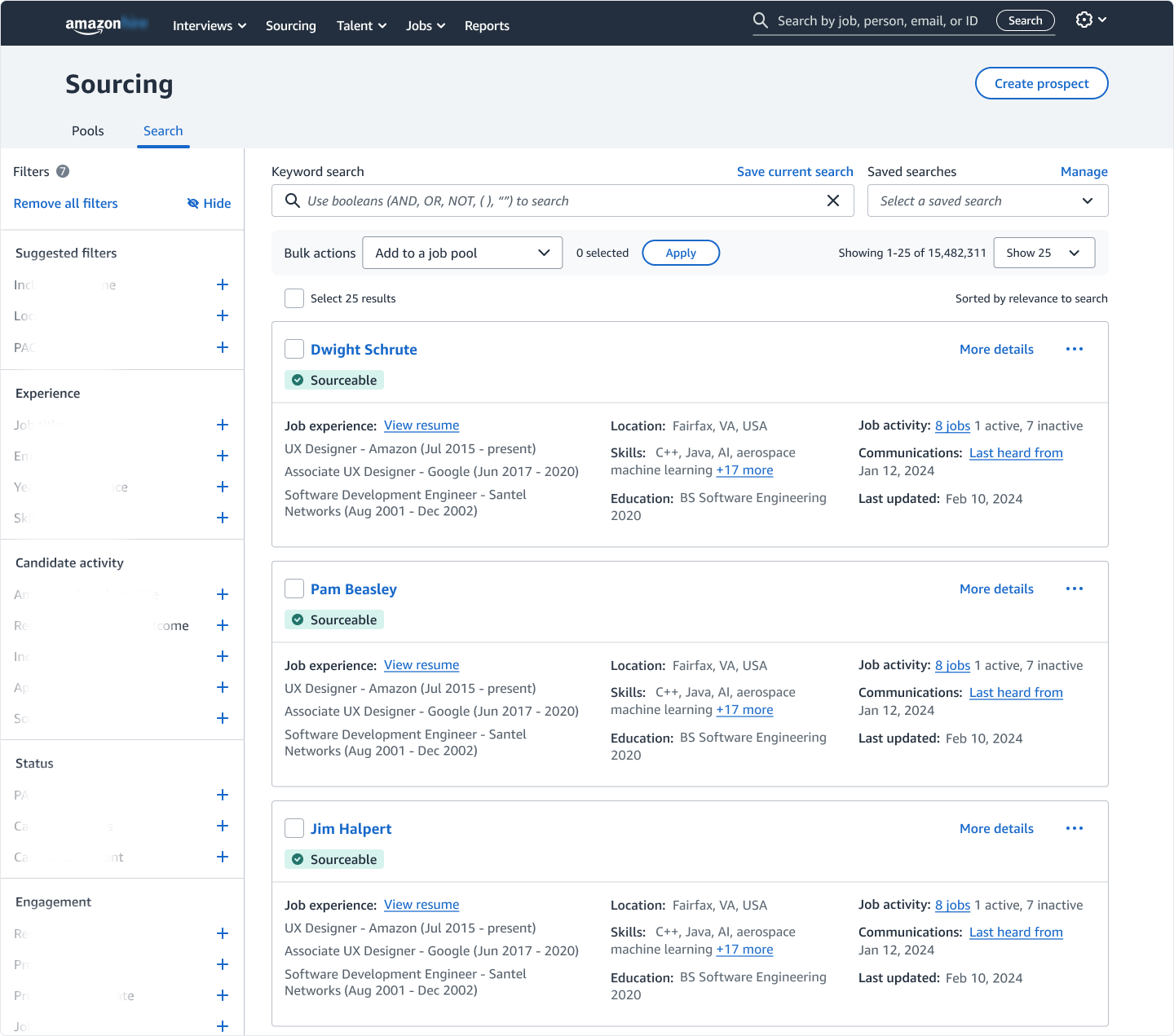
The existing sourcing engine page displayed candidates as individual cards, which are surfaced from recruiter searches. Each card consolidated key candidate information used for rapid evaluation during high-volume sourcing (sensitive details are blurred for confidentiality).
Because recruiters primarily evaluated candidates directly from these cards, they became the natural interaction point for addressing the problems identified earlier. This presented an opportunity to explore how prior-view visibility and candidate management actions could live within the card itself, without disrupting the recruiter’s scanning behavior.
Previously Viewed:
I designed initial concepts around two key user needs: accessibility and rapid scanning during high-volume sourcing. Timestamp information needed to be communicated both visually and programmatically to support screen readers. Recruiters also needed this information surfaced prominently in the hierarchy for fast scanning. The following concepts explore these approaches:
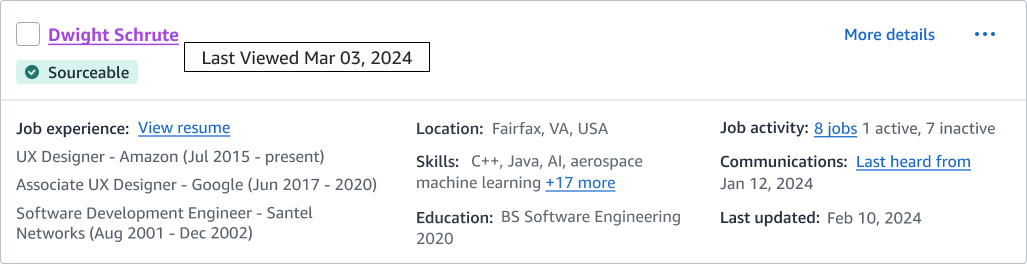
Candidate name hyperlink changes from blue (Default) to purple after viewing, providing a lightweight visual indicator of prior interaction. A tooltip reveals the exact last-viewed date on hover.
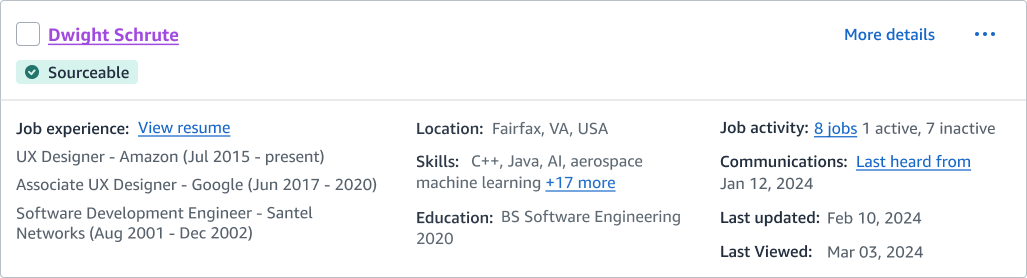
Candidate name hyperlink changes from blue (Default) to purple after viewing. Also adds a persistent "Last Viewed" timestamp within the candidate card, ensuring prior interaction history remains visible during rapid scanning without hovering or additional interaction.
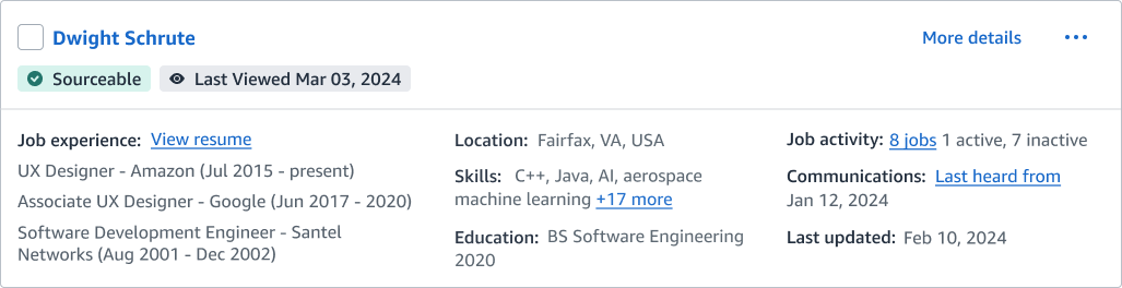
Surfaces the "Last Viewed" timestamp as a status chip beneath the candidate's name for quick scanning and accessibility. Unlike previous concepts, the candidate name styling remains unchanged to reduce visual noise.
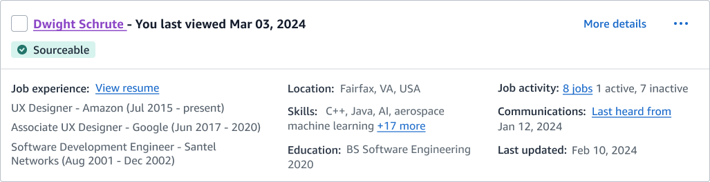
Candidate name styled as underlined hypertext; Last Viewed date displayed inline next to the name for immediate visibility during scanning.
Not Interested:
I took a similar approach as with the Previously Viewed concepts, focusing on accessibility and placing the information prominently in the hierarchy for quick scanning. The following concepts explore these approaches:
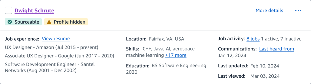
Added a "Profile hidden" chip to clearly communicate when a candidate was removed from the search results, while retaining the timestamp for historical context.
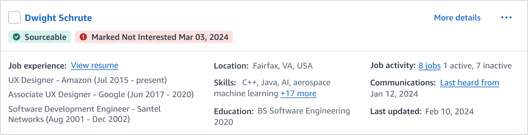
Added a "Marked Not Interested" status chip to make rejection decisions immediately scannable and reduce repeat evaluation during high-volume sourcing.
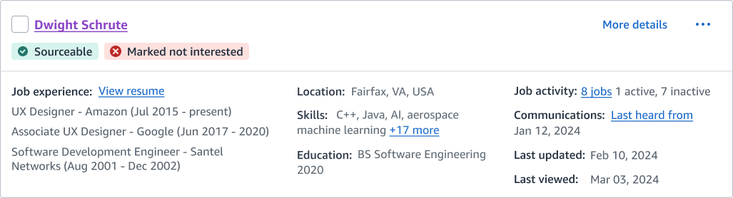
Explored a persistent "Not Interested" status that keeps rejection decisions visible with a quick glance, helping recruiters avoid re-evaluating candidates. The timestamp information is nested in the card to balance detail with fast scanability.
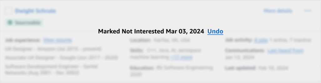
Explored a reversible "Not Interested" blurred state to reduce visual noise while foregrounding an undo option, balancing fast scanning with low-risk decision making.
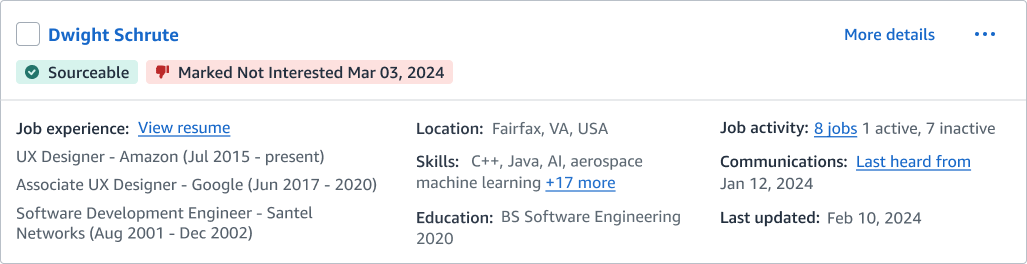
Explored a stronger negative state signal using iconography in conjunction with timestamping to clearly distinguish rejected candidates during high-volume scanning.
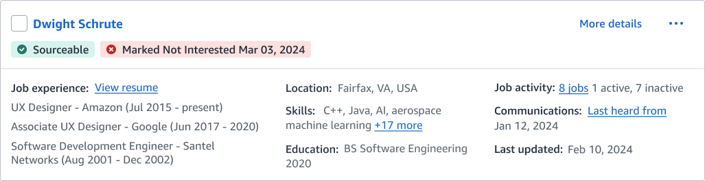
Explored another variation of a persistent "Not Interested" state combining iconography and timestamping to quickly reinforce decision history during high-volume scanning.
First Review:
My first design review was held with the UX Lead and UX Manager for the sourcing engine. After walking them through the user journey and early concepts for Previously Viewed and Not Interested states, I received validation on several directions along with constructive feedback.
Pros:
User Journey: My UX partners validated the journey map as thorough, well-structured, and representative of recruiter workflows.
Hypertext Change: The hyperlink color change was well received as a familiar interaction pattern that clearly signaled prior engagement.
Last Viewed Field: The added timestamp improved scanability by surfacing decision history without disrupting the existing hierarchy.
Cons:
Chips: My UX partners were concerned that the timestamp and Not Interested chips could overcrowd the hierarchy and increase visual noise during rapid scanning.
Blur Concept: Although conceptually interesting, the blurred card approach conflicted with the existing design system and was considered too costly to implement.
Following the review, we aligned on moving ahead with the hyperlink change and adding the Last Viewed field within the candidate cards, while reserving the chip concepts for future usability testing. The next phase focused on expanding ideation across the broader sourcing workflow in preparation for review with our Product and Engineering stakeholders.
Second Ideation:
In this phase, I explored how timestamps and “Not Interested“ actions would function across the broader sourcing workflow. I mapped the primary paths recruiters use to view candidates- identifying where a profile view should generate a timestamp and where hiding actions should live without disrupting scanning behavior.
Recruiters would create a timestamp through two primary entry points: Rapid Review and the candidate’s Profile Detail Page (PDP). Designing for both ensured interaction consistency regardless of how recruiters accessed a profile.
Creating Timestamp- Rapid Review:
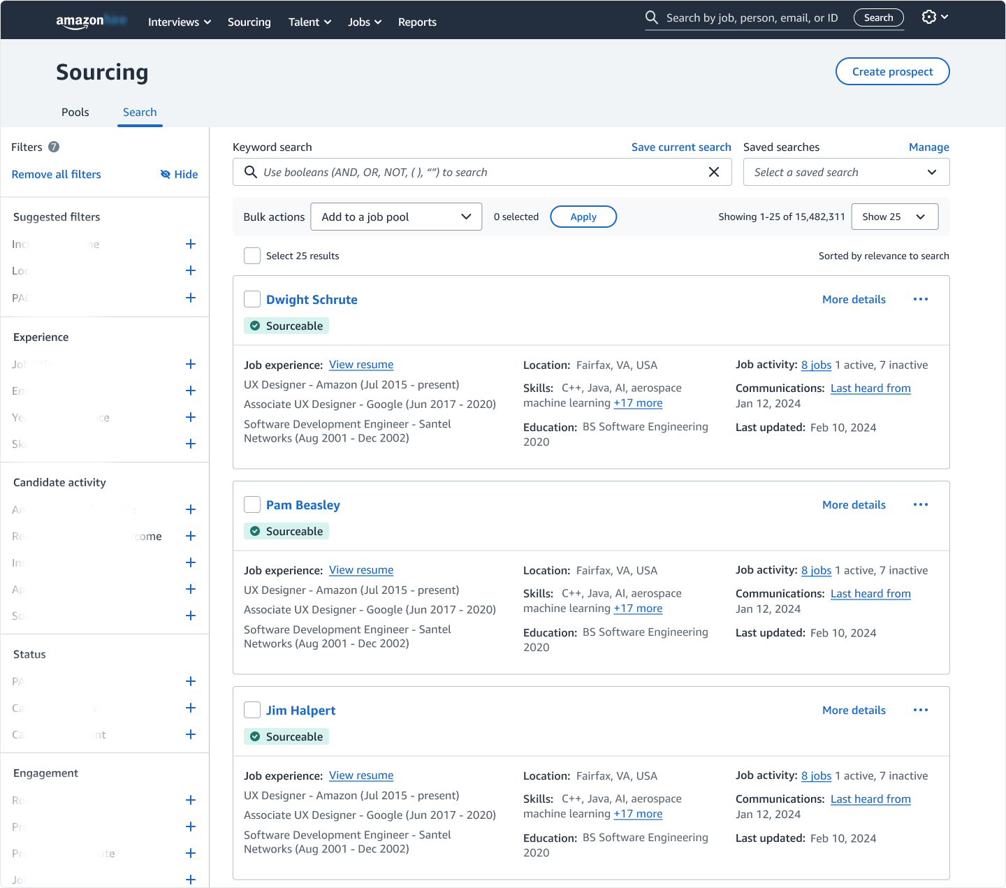
Starting point: recruiters begin in the search results- the primary workspace for sourcing and candidate evaluation.
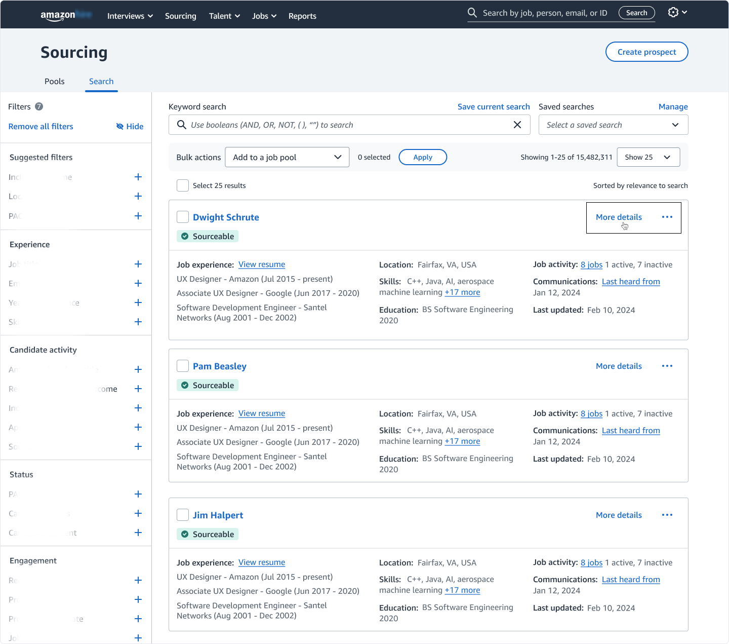
Recruiters initiate a Rapid Review by selecting "More details" (highlighted), transitioning from scanning to evaluation.
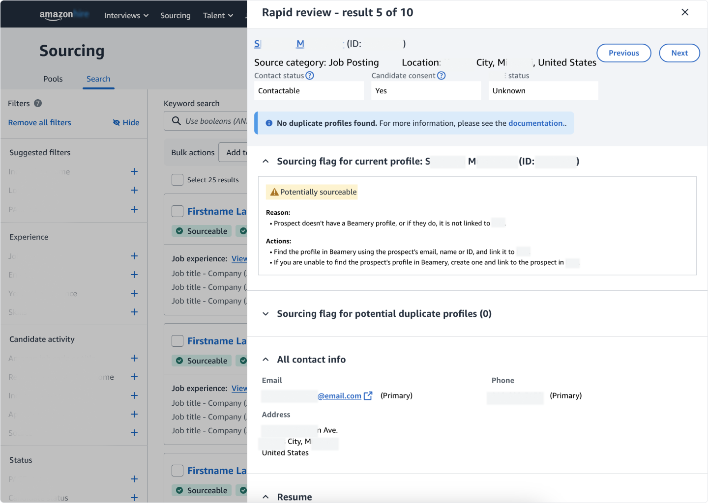
Rapid Review opens with candidate details surfaced for quick evaluation. Please note- sensitive information has been intentionally blurred to protect privacy.
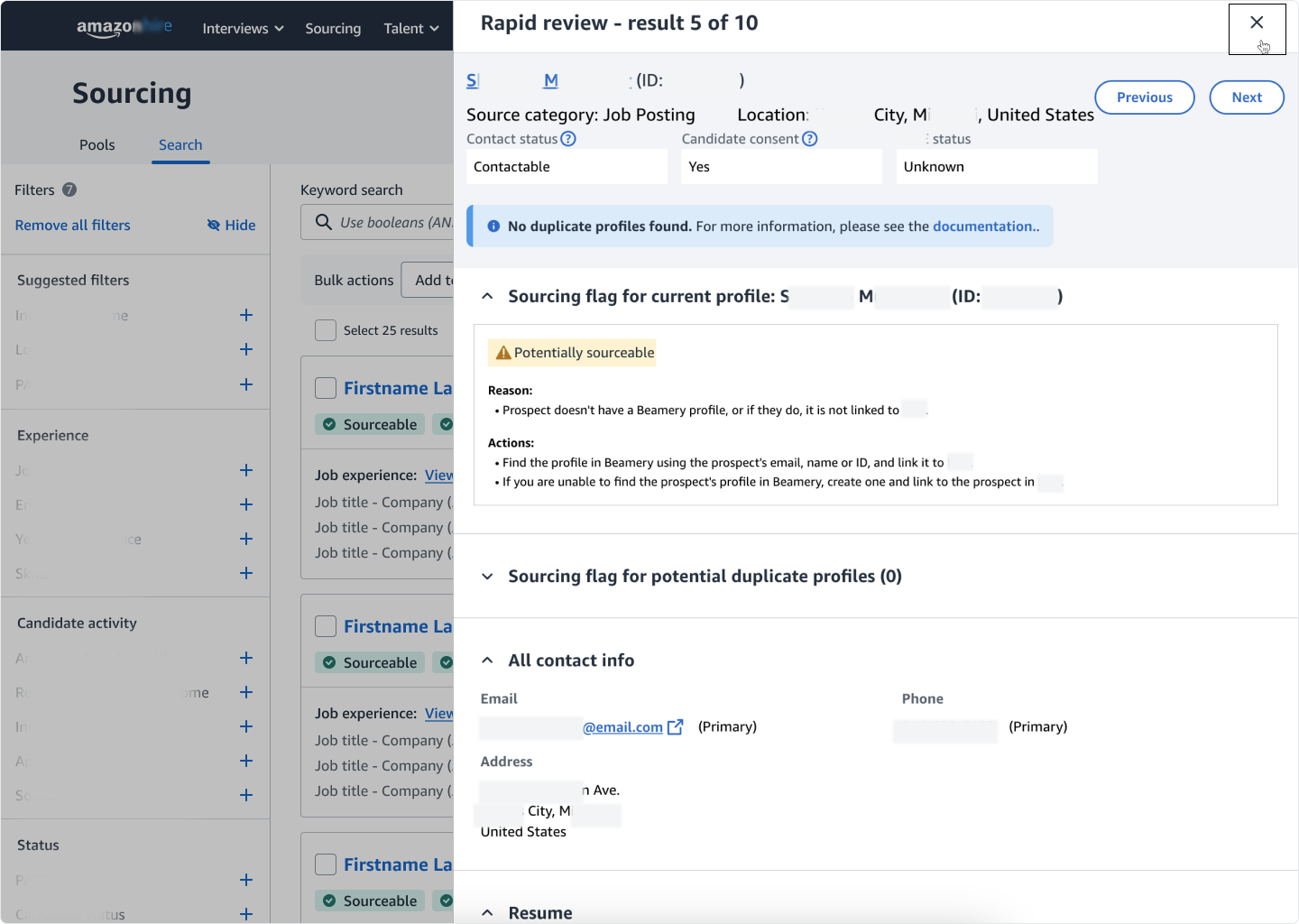
The user exits the Rapid Review (highlighted), returning to the search results after reviewing the candidate.
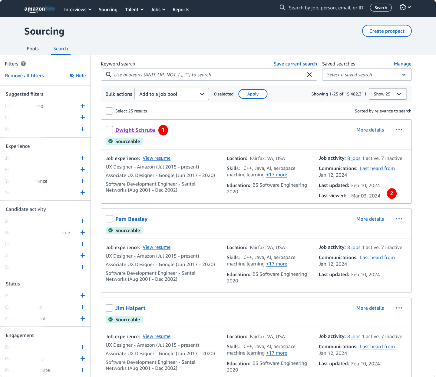
Back in the search results, prior interaction is clearly signaled through a visited link state (#1) and a Last Viewed timestamp (#2) to support rapid scanning.
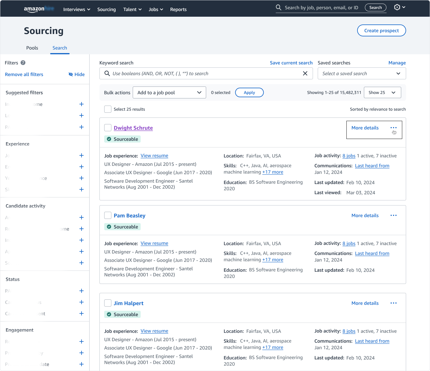
With the timestamp now created, recruiters can choose to hide a candidate from their search results via the 3-dot menu (highlighted).
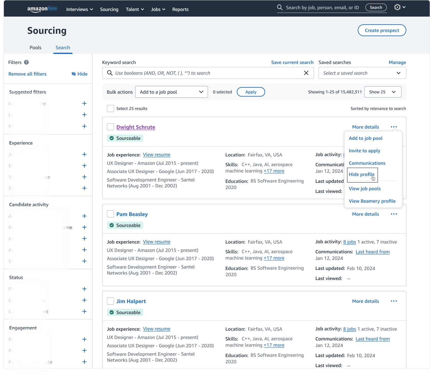
The overflow menu surfaces a "Hide profile" action (highlighted), allowing recruiters to remove a candidate from the search results without leaving the page.
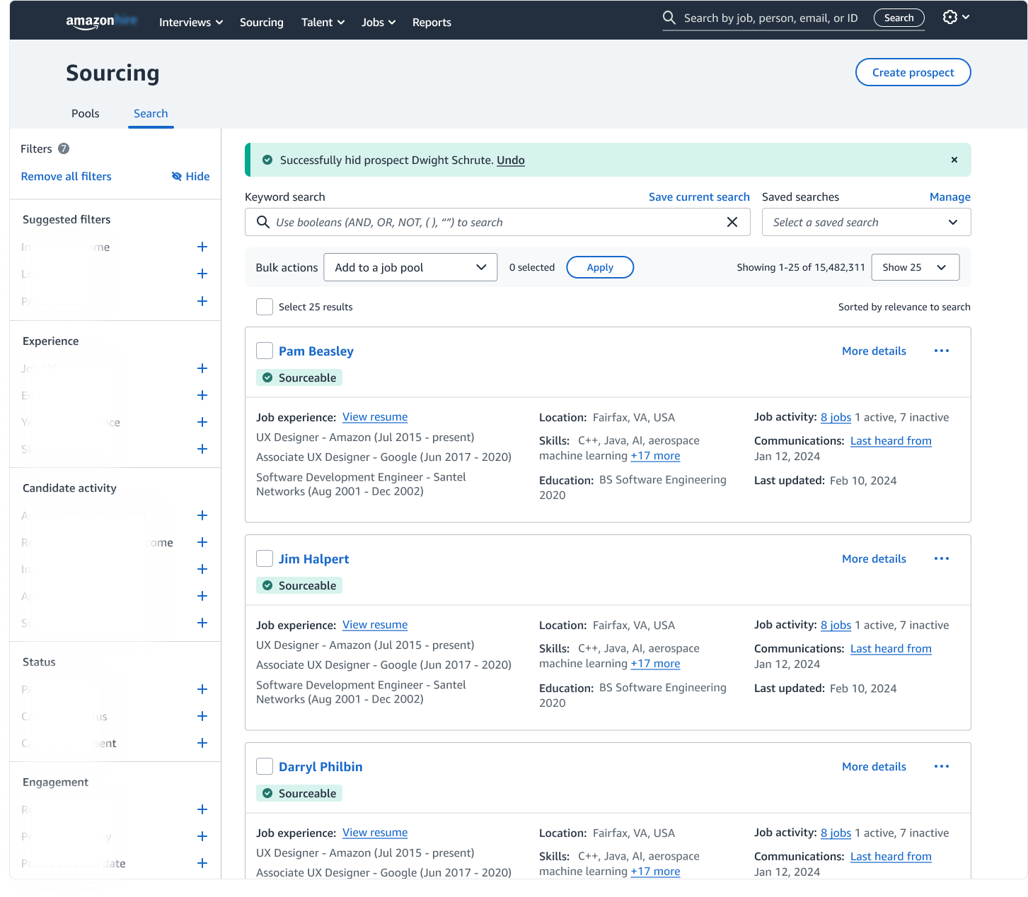
A confirmation banner provides immediate feedback, and the candidate is removed from the search results.
Creating Timestamp- Profile Detail Page:
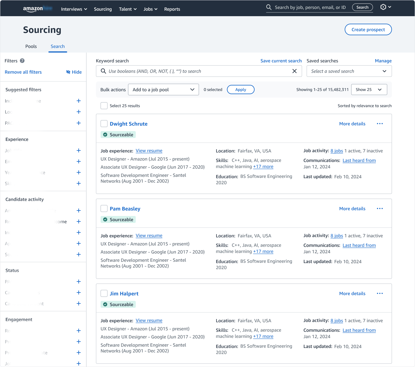
Starting point: recruiters begin in the search results- the primary workspace for sourcing and candidate evaluation.
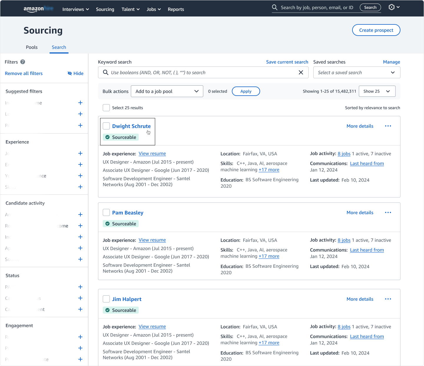
Recruiters can also evaluate a candidate by visiting their Profile Detail Page (PDP) by clicking the candidate's name in the search results (highlighted).
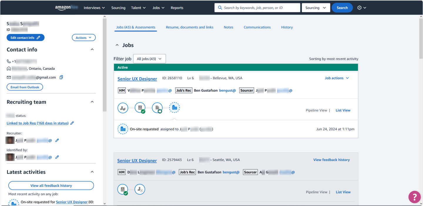
The Profile Detail Page (PDP) surfaces comprehensive candidate information. Visiting the PDP generates a timestamp (Please note: sensitive items have been blurred to protect confidentiality).
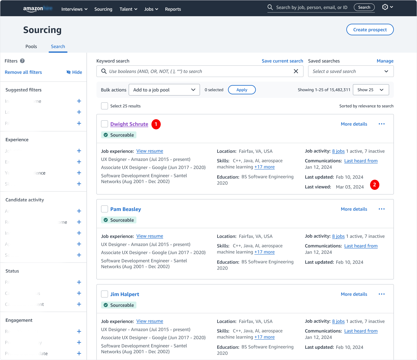
Back in the search results, prior interaction is again signaled through a visited link state (#1) and the Last Viewed timestamp appearing (#2).
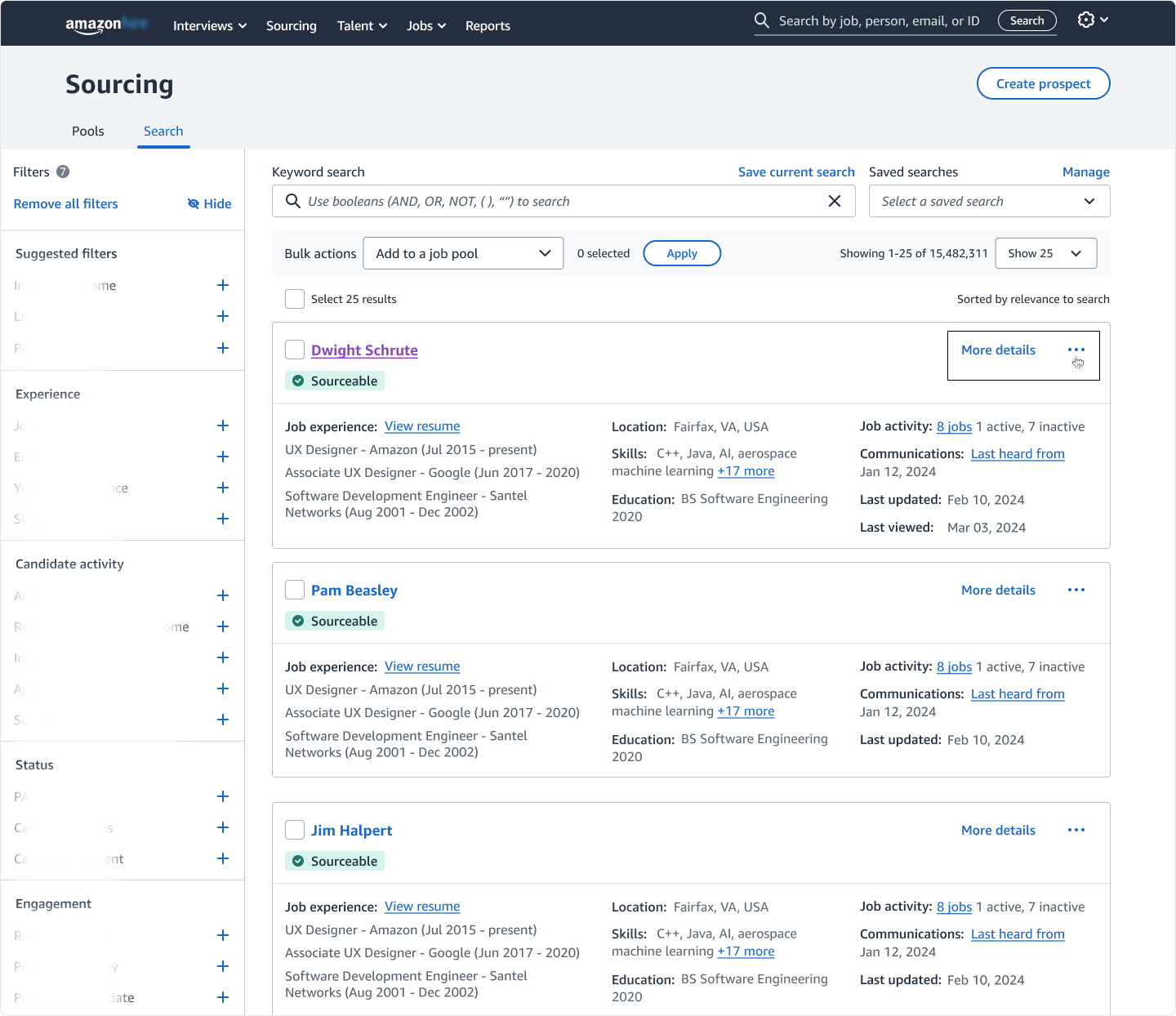
The Hide workflow remains consistent across both entry points- recruiters access the same 3-dot menu to manage candidate visibility.
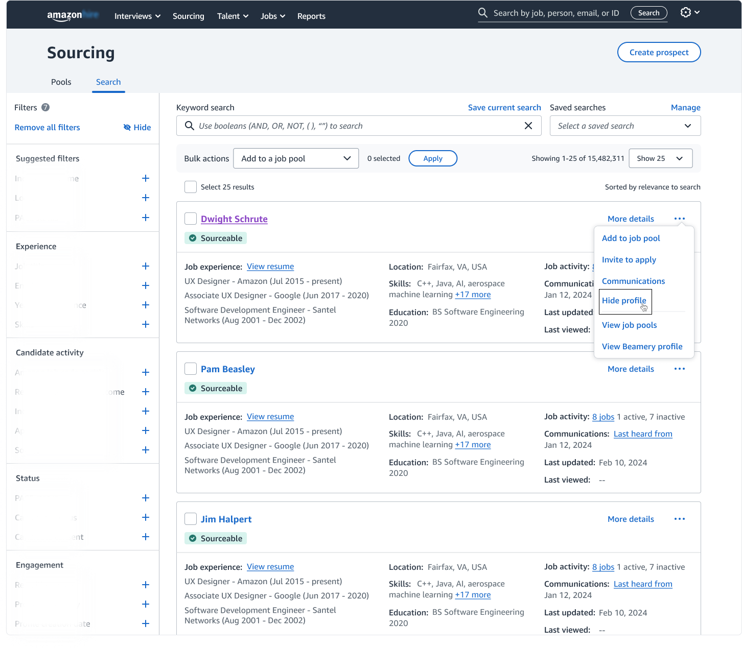
The same "Hide profile" action is available here, reinforcing a consistent interaction pattern regardless of how the recruiter viewed the candidate.
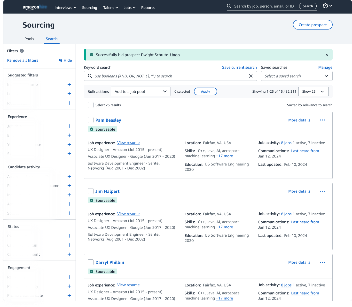
A confirmation banner acknowledges the action and reassures recruiters the profile has been removed without interrupting their workflow.
To support high-volume sourcing workflows, I also explored ways recruiters could hide candidates in bulk. Two approaches emerged: using the existing bulk actions menu, and introducing a filter designed to streamline repeated cleanup tasks.
Bulk Actions Dropdown:
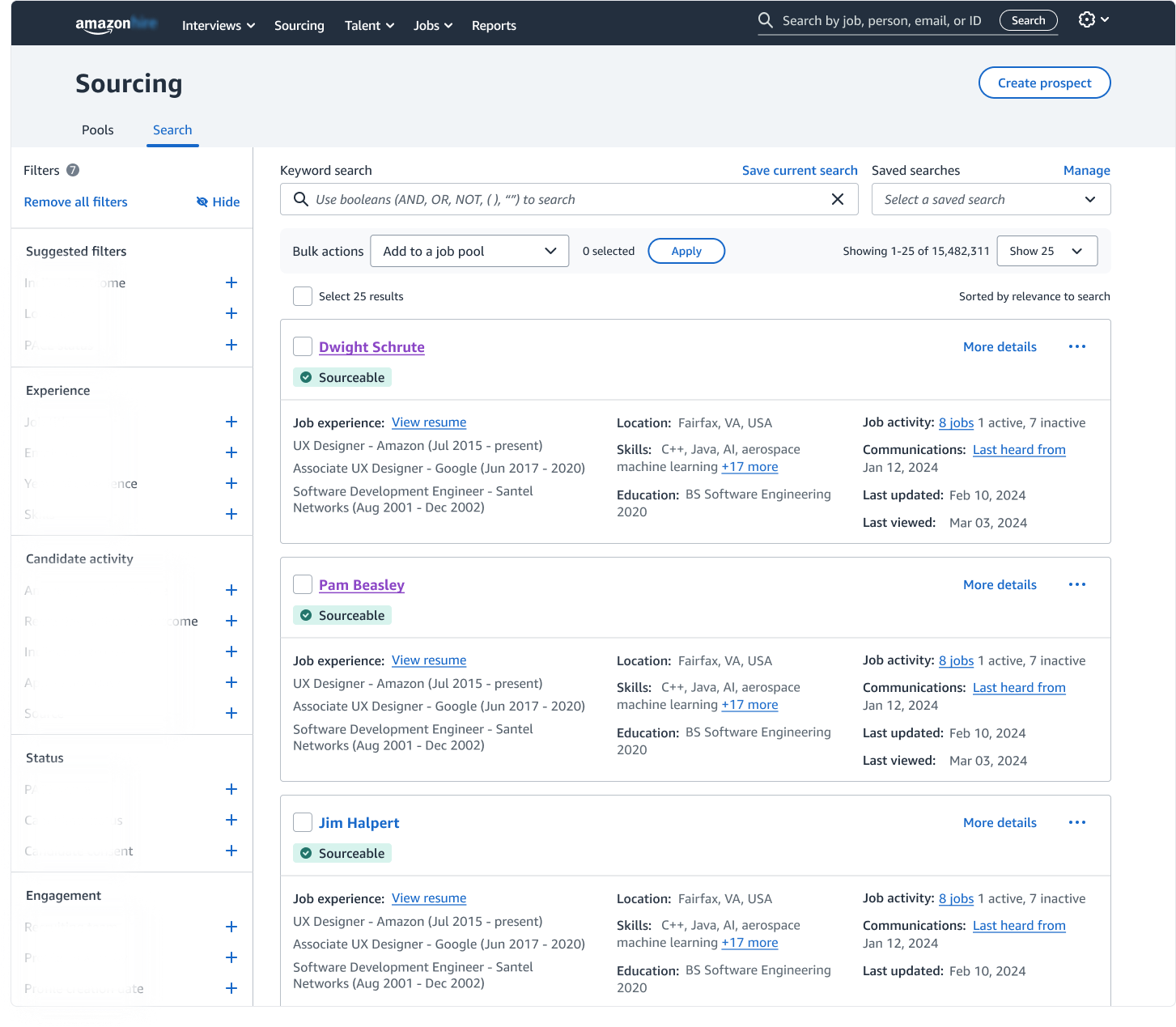
After reviewing multiple prospects through Rapid Review or the candidate's PDP, recruiters often need a faster way to clean up the search results in bulk.
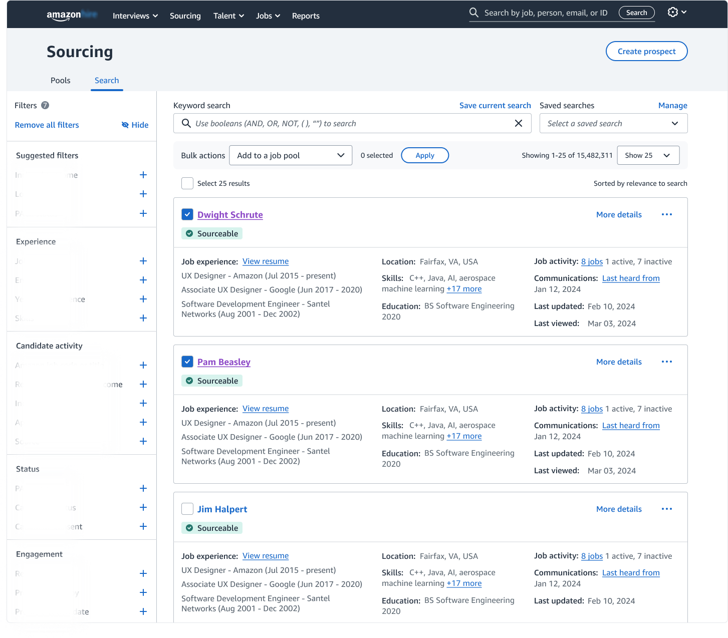
Multiple candidates can be selected from the search results to enable bulk actions.
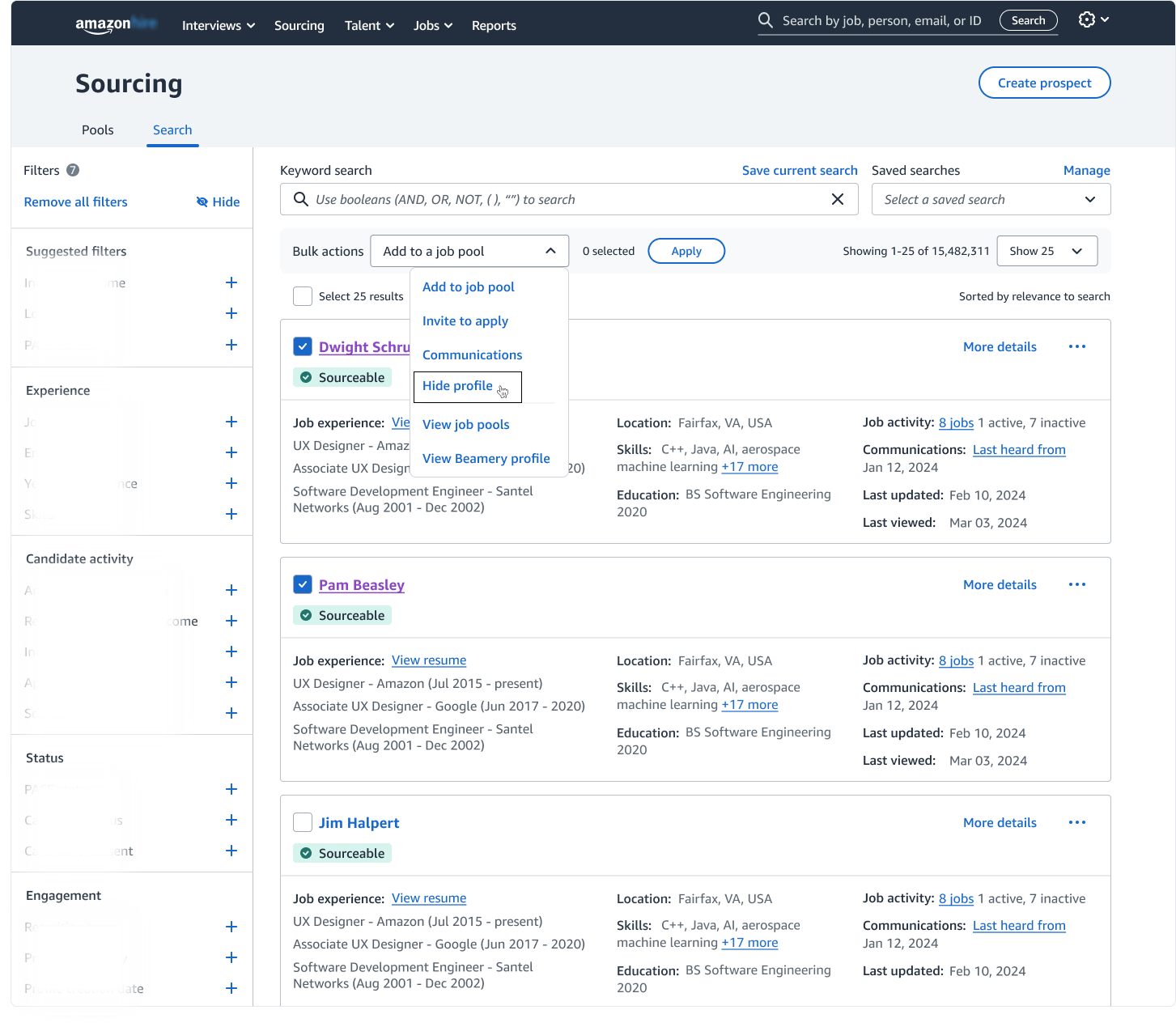
The "Hide profile" action (highlighted) within the Bulk Actions menu allows recruiters to hide multiple candidates at once, reducing repetitive individual actions.
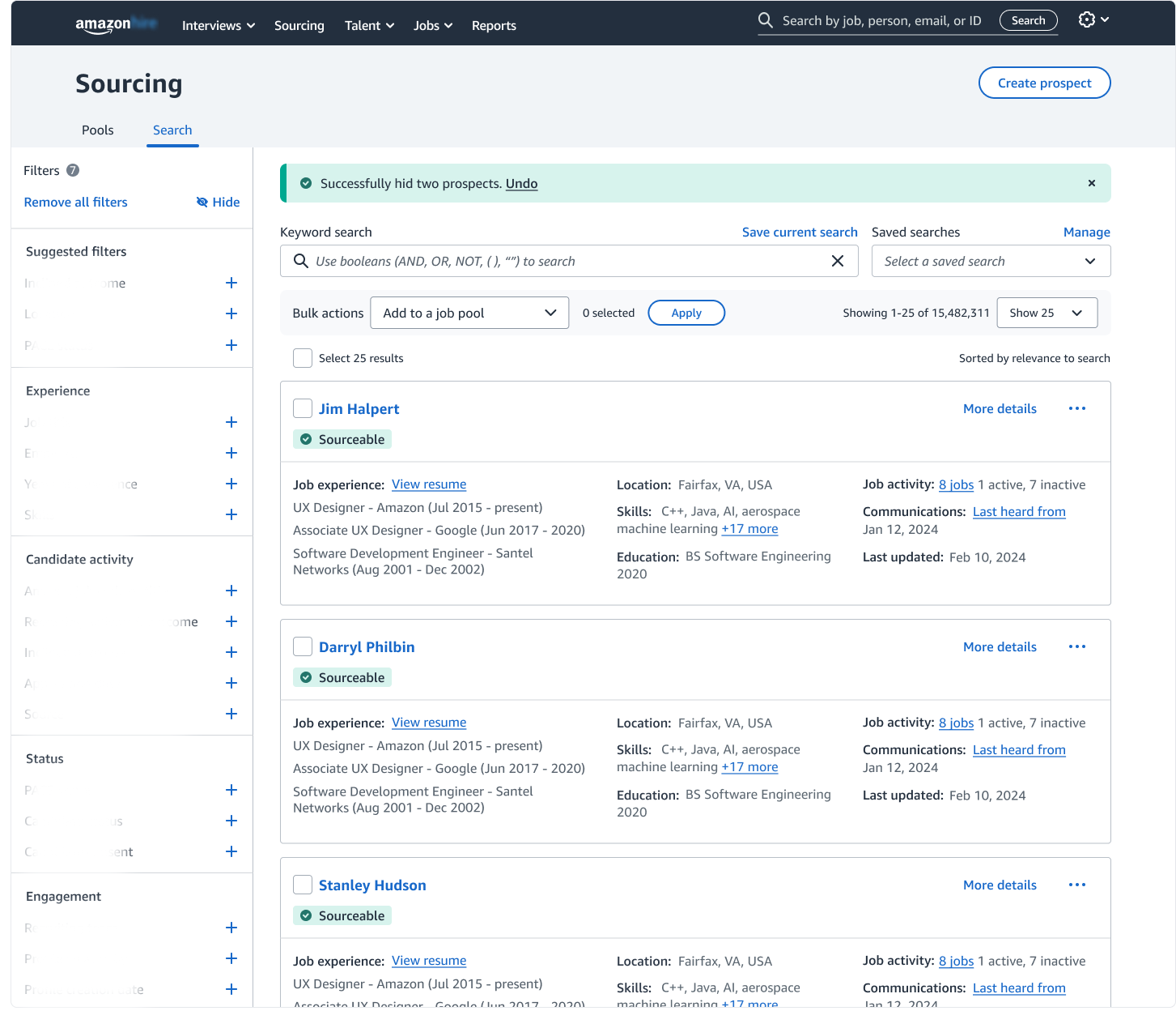
A confirmation banner provides immediate feedback that the selected candidates have been successfully hidden.
Filters:
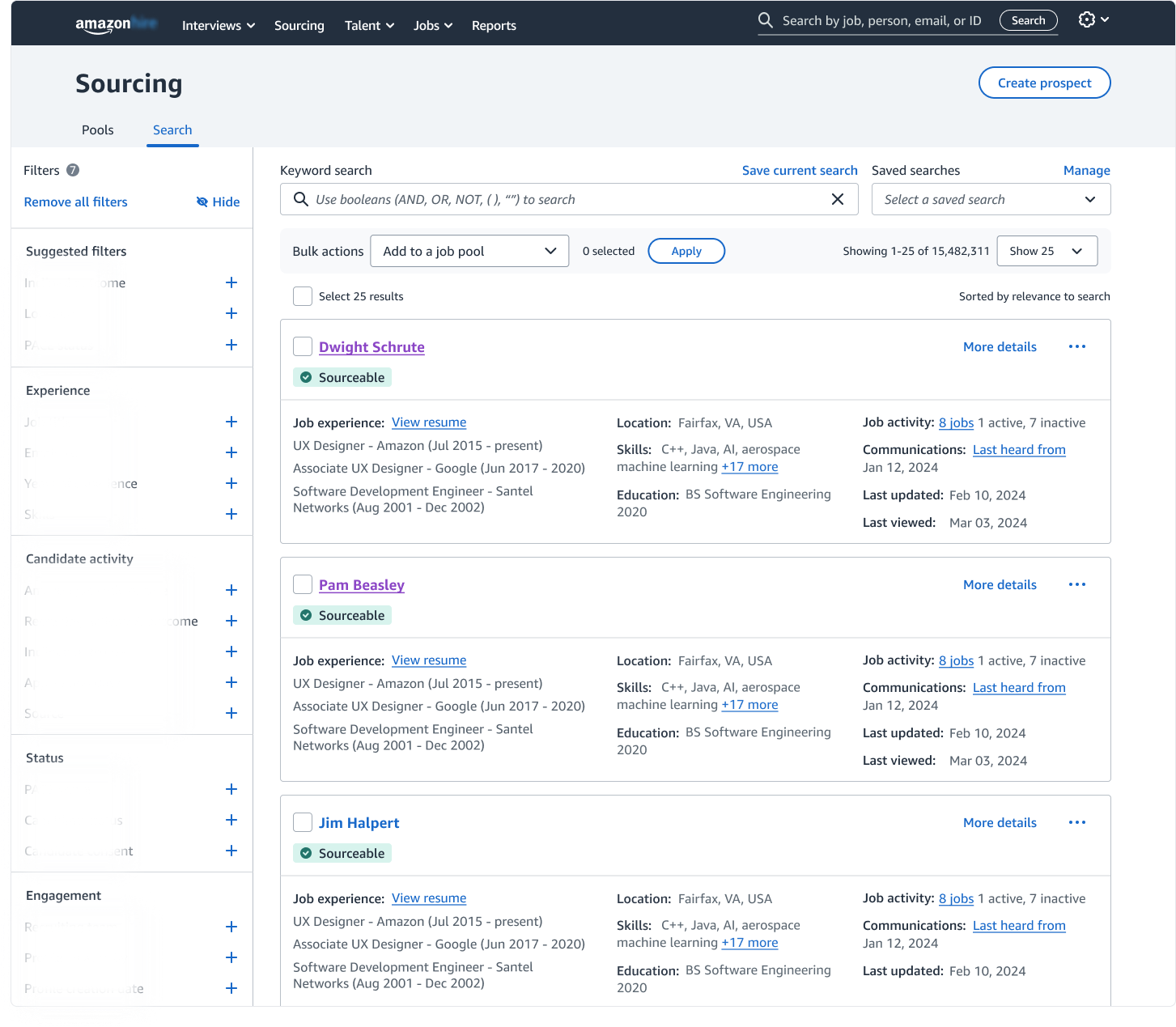
After evaluating several candidates, recruiters may choose to narrow down their search results using bulk actions.
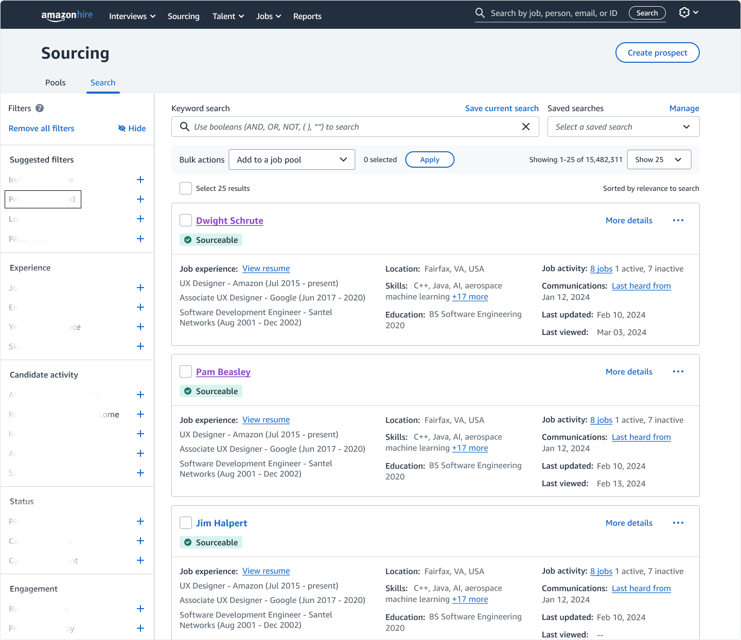
The "Previously Viewed" filter is engaged from the filter panel (highlighted). Please note: parts of the filter panel are intentionally blurred for confidentiality.
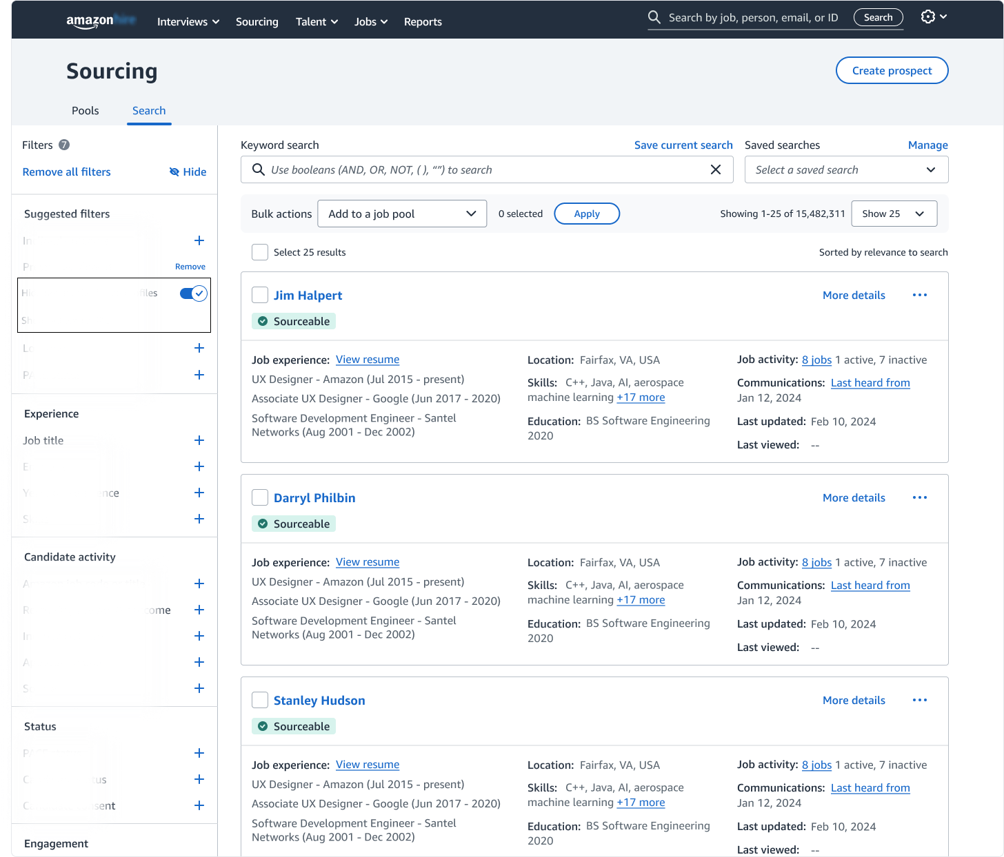
Enabling the Previously Viewed filter (highlighted) automatically removes candidates the recruiter has already reviewed, helping maintain a clean, focused search workspace.
Stakeholder Alignment:
The second review brought UX, Product, and Engineering stakeholders together to evaluate the proposed workflows end-to-end. I walked the group through solutions addressing both user problems and gathered structured feedback on usability, feasibility, and scope.
Pros:
Workflows: Stakeholders responded positively to the end-to-end workflows, noting they felt comprehensive and aligned with real recruiting behaviors.
User Choices: Stakeholders valued giving recruiters flexibility to hide candidates individually or in bulk- reinforcing the importance of multiple paths to complete the same task.
Cons:
More Control: Stakeholders suggested recruiters should have greater control over how candidates are hidden and how long those decisions persist.
More Input Needed: Building on this, stakeholders recommended introducing clearer user input when hiding a candidate (e.g., temporarily vs. permanently hide, current search vs. all searches).
Discussion concluded with alignment on validating these decisions through usability testing. Based the stakeholder’s feedback, I proposed evaluating the following areas:
Discoverability: Can users find the timestamp within two seconds?
Ease of Use: Can recruiters confidently hide candidates without additional guidance?
Terminology Clarity: Do “Previously Viewed“ and “Hide“ communicate clear and predictable outcomes to recruiters?
Validation & Insights:
I led usability testing to validate the key workflow decisions I’d made, conducting five 60-minute interviews with recruiters. I recruited the participants, designed the discussion guide, facilitated the sessions, and synthesized the findings into actionable insights, which I shared with the UX leadership.
Participants rarely noticed the hypertext change unprompted, but unanimously approved it once discovered.
80% of participants preferred the timestamp presented as a chip beneath the candidate’s name over the “Last viewed“ field.
When asked how they would hide a candidate, all participants used either the 3-dot menu or the Bulk Actions menu. Only 40% of participants independently discovered the “Previously viewed“ filter.
60% of participants preferred placing the toggle near the Bulk Actions menu- indicating a mental association between filtering and bulk management.
While “Hide“ was clearly understood, 60% of participants expressed confusion about “Previously viewed“ (e.g., whether it referred to their activity or another recruiter’s).
Participants strongly rejected permanently hiding a prospect- indicating a preference for reversible or temporary actions.
Survey:
Following my usability testing sessions, UX Research folded my questions into a broader survey, which allowed us to validate the findings with a larger user sample before finalizing the designs.
Validated:
The hypertext update was positively received by a strong majority of respondents.
The filter was not widely discovered organically, but was well understood conceptually once introduced.
Respondents consistently requested clearer meaning for “Previously viewed“.
Permanent hiding received decisive negative feedback.
Disconfirmed:
Testing the timestamp chip versus the “Last viewed“ field produced no clear preference.
Users preferred the toggle switch remain nested within the filter, rather than near the Bulk Actions menu- reinforcing expectations around filtering controls.
These insights directly informed the final interaction model and terminology decisions described below.
Final Design Decisions:
Following usability testing, I refined the designs to reflect the validated insights and presented the final iteration to stakeholders for approval. The following decisions were approved for the build:
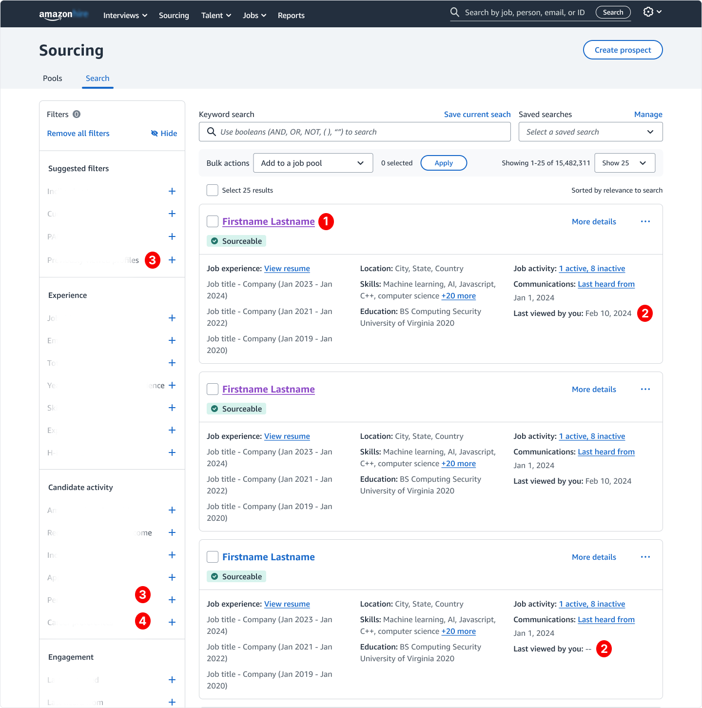
Final search results page updates: 1. The hypertext change was retained due to strong user approval. 2. The "Last updated" field was replaced with "Last viewed by you" to clarify ownership of activity. 3. The filter was renamed "Previously viewed profiles" and surfaced in an additional location to improve discoverability. 4. A new "Hidden profiles" filter was added to support clearer search results management.
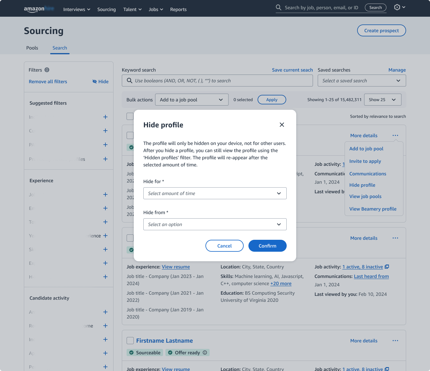
Selecting "Hide profile" opens a confirmation modal with supporting copy and background dimming to reinforce action clarity and helping prevent unintended changes.
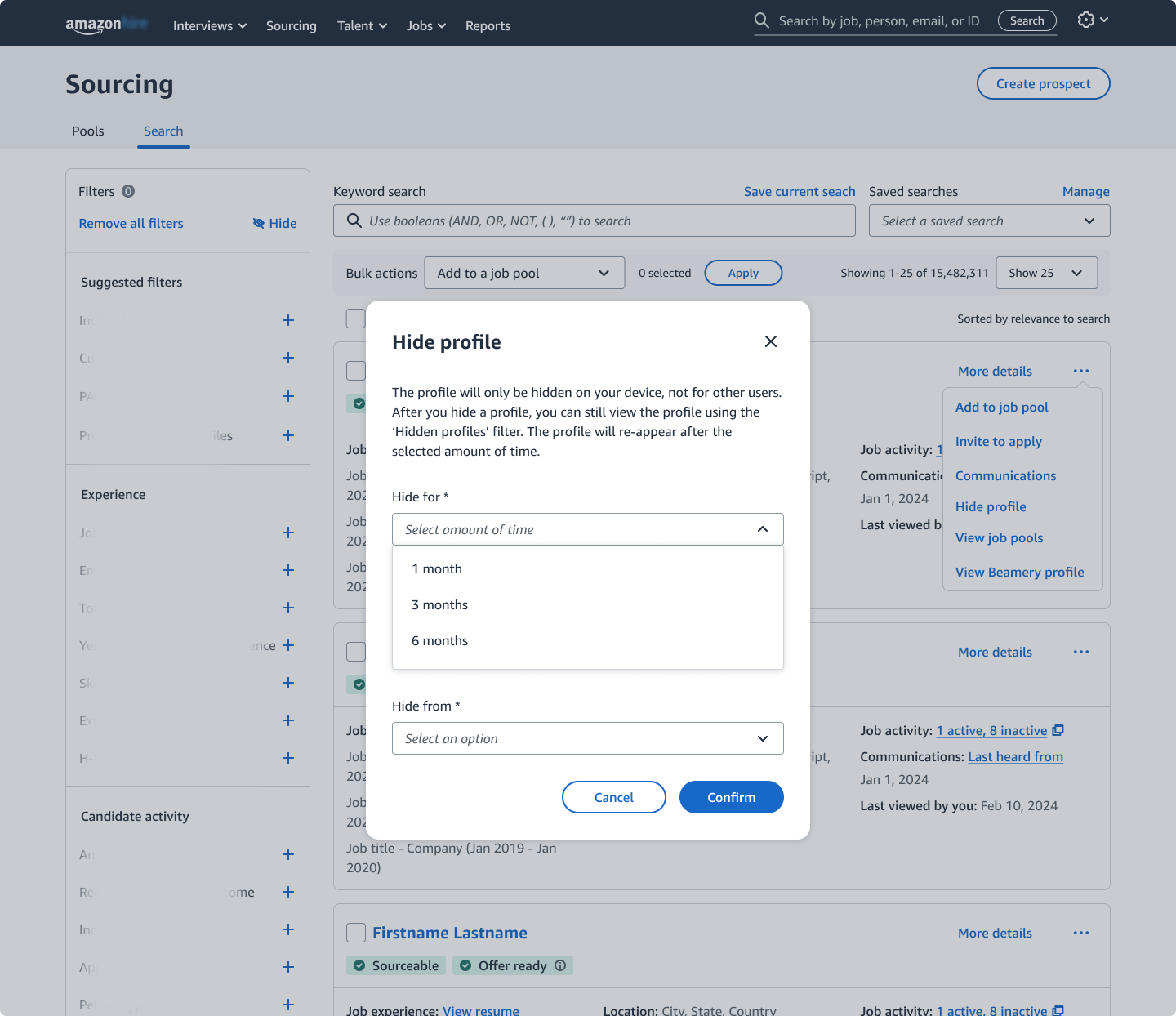
Recruiters select how long to hide a candidate- introducing flexible control accommodating differing review timelines.
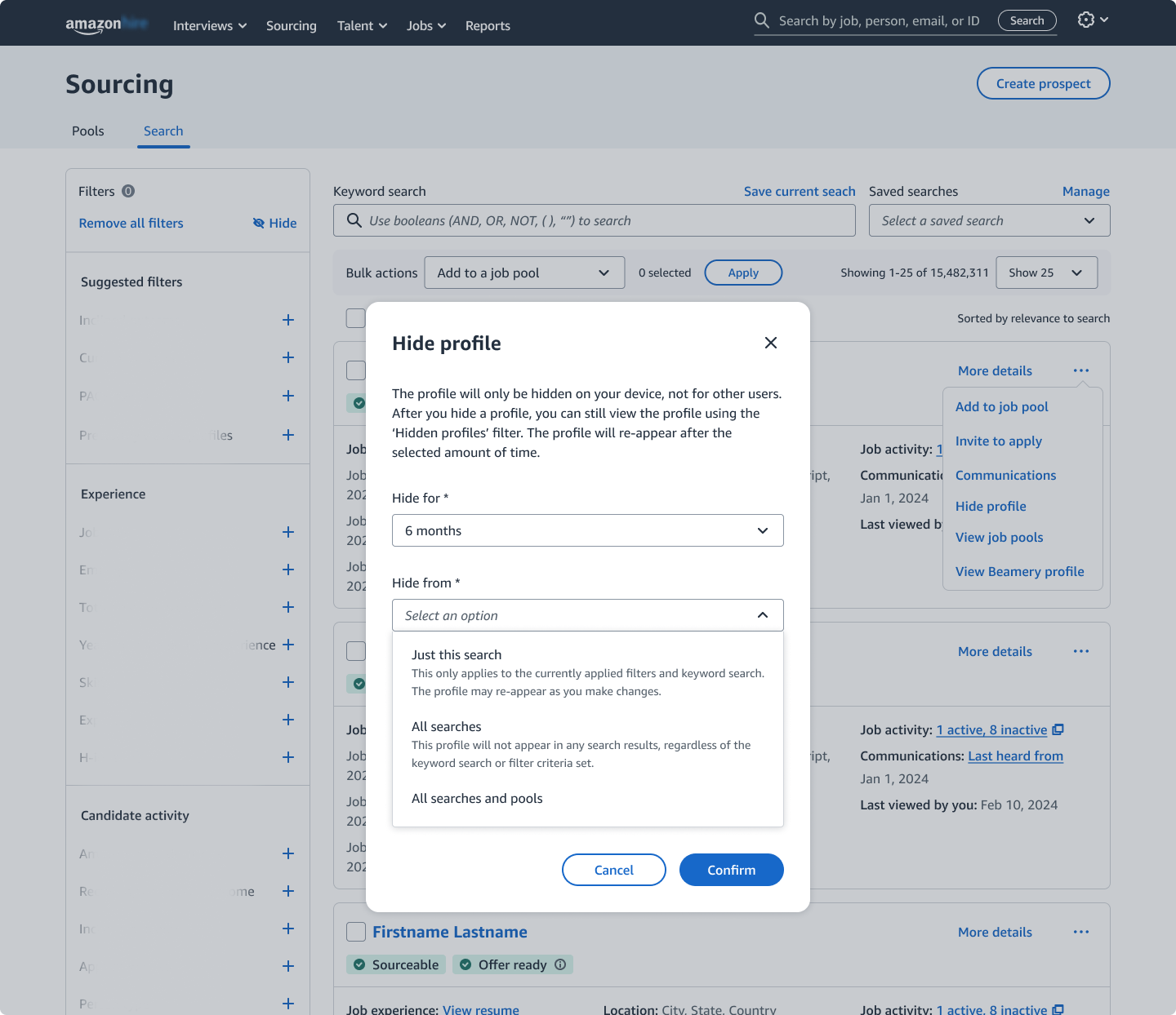
Recruiters choose the hiding scope- allowing candidates to be removed from a single search or across all searches for greater control over visibility.
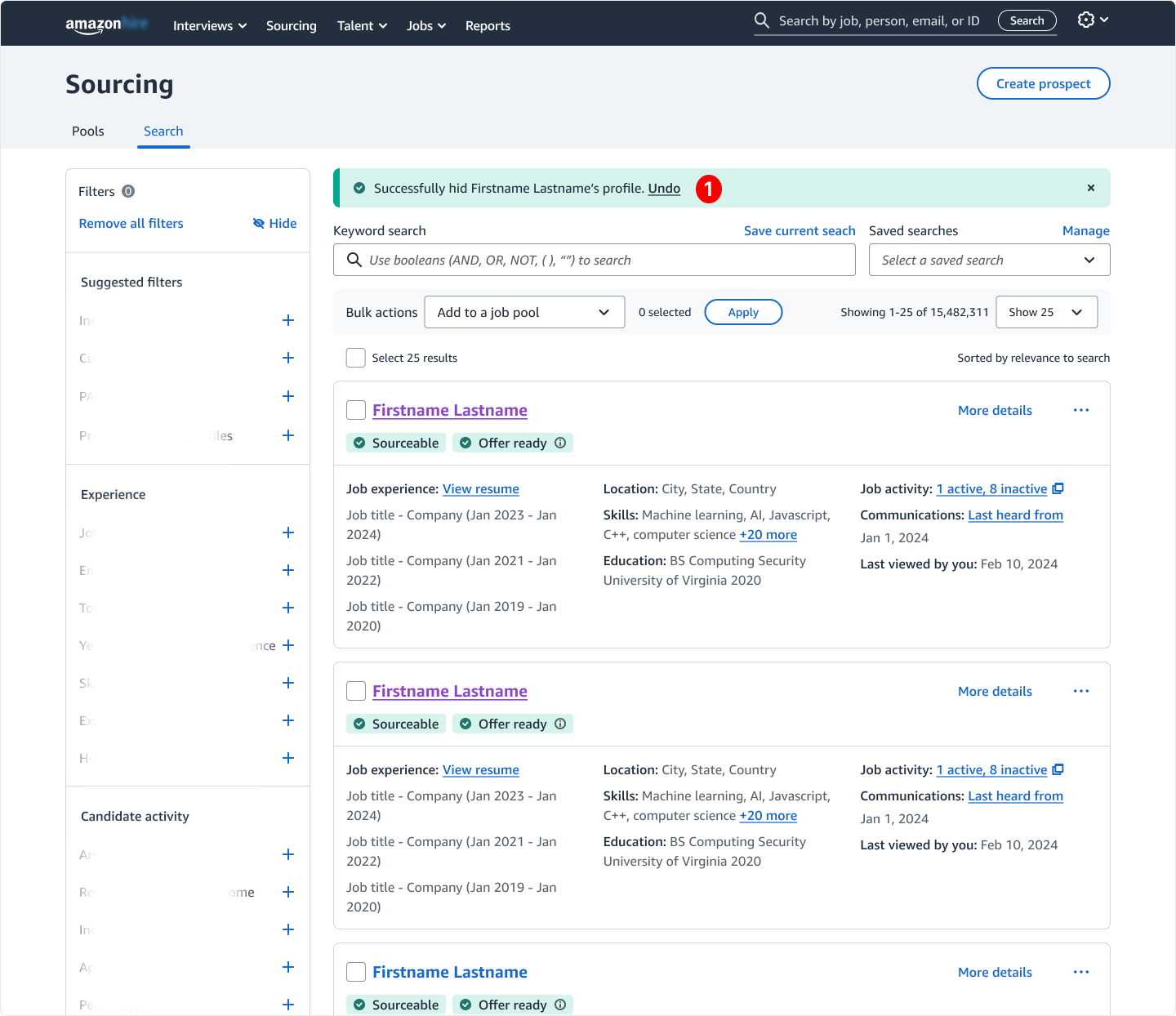
A success banner provides immediate confirmation and an undo option- reinforcing system feedback and recruiter control (#1).
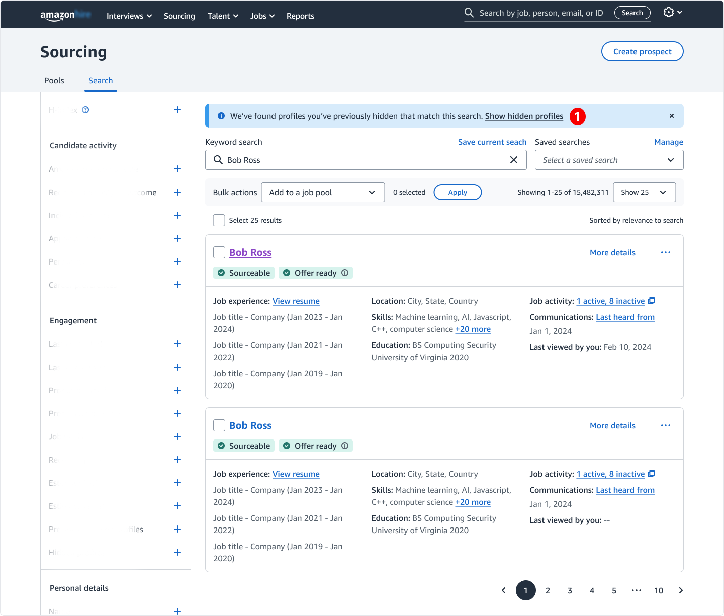
An informational banner (#1) notifies recruiters when there are profiles they've hidden from a search, and provides a fast way to reveal them- preserving awareness and control.
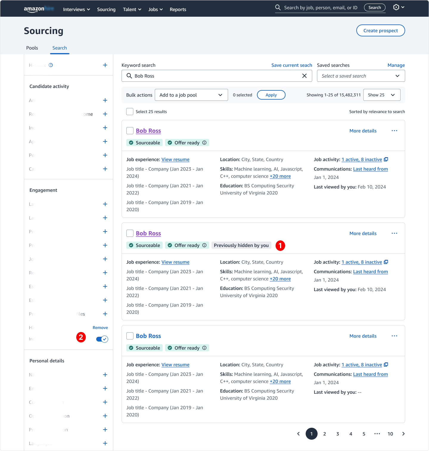
Selecting "Show hidden profiles" restores hidden candidates to the search results. A "Previously hidden by you" chip (#1) provides visibility into their status, while the "Hidden profiles" filter (#2) activates automatically to maintain context and control.
Impact:
After final stakeholder sign-off, I prepared the designs for handoff to Engineering. The Hide and Previously Viewed features launched in September 2025. Sixty days post-launch, the Sourcing UX team conducted a measurement study to evaluate adoption and impact.
Within the first measurement period, 187 recruiters had already hidden over 2,500 profiles, indicating early adoption of the new workflows.
Early qualitative feedback suggested the features improved recruiters’ ability to manage search results, with recruiters describing them as “Super useful!“ and “Long overdue“.
Reflections:
Looking back, a few lessons shaped how I approach complex product work:
Start With a Plan: Creating a work-back plan aligned stakeholders and kept execution stable, even as timelines evolved.
Mentorship Strengthens Outcomes: Ongoing guidance from my UX Lead and UX Manager improved the product decisions I made and fostered my growth as a designer.
Data-driven Design: This project reinforced my approach to data-driven design- pairing measurable user behavior with stakeholder alignment to deliver changes that ship.