Background:
Webex is a video-conferencing (VC) tool from Cisco. I worked with a team of three other UX Designers to complete a project for Webex via SVC. Our stakeholders were a Cisco UX Manager and Sr. UX Designer assigned to Webex. Our task was to build a feature for Webex.
My Role:
Client Liaison
Concept Sketching
User Journey Mapping
UX Research
Usability Testing
Timeframe:
10 weeks (AUG-NOV 2023)
Stakeholders:
Cisco UX Manager & Sr. UX Designer
Customer:
Webex enterprise users who schedule & attend meetings.
Goal:
Increase meeting productivity so teams meet less.
Problem:
Our Webex stakeholders supplied my team with the problem statement for they were looking to solve:
“How might we increase productivity and efficiency in real-time meetings, so that teams can meet less and do more?”
Constraints:
Webex gave my team three constraints we had to factor in to any design solution.
Rebranding the core Webex logo was out of scope.
It was preferred solutions were built with Webex’s current visual design system.
We could not remove, replace or modify the Signature “OBTP“ (One Button to Push)- aka “the big green button“- as this was a significant brand element.
Clarifying the Problem:
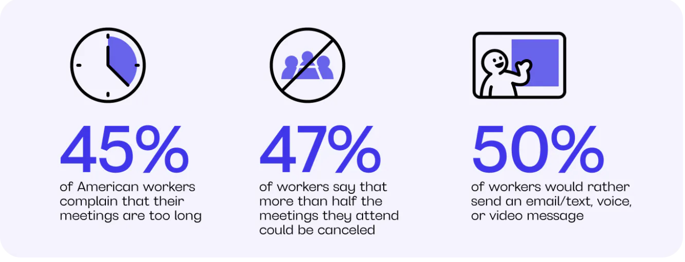
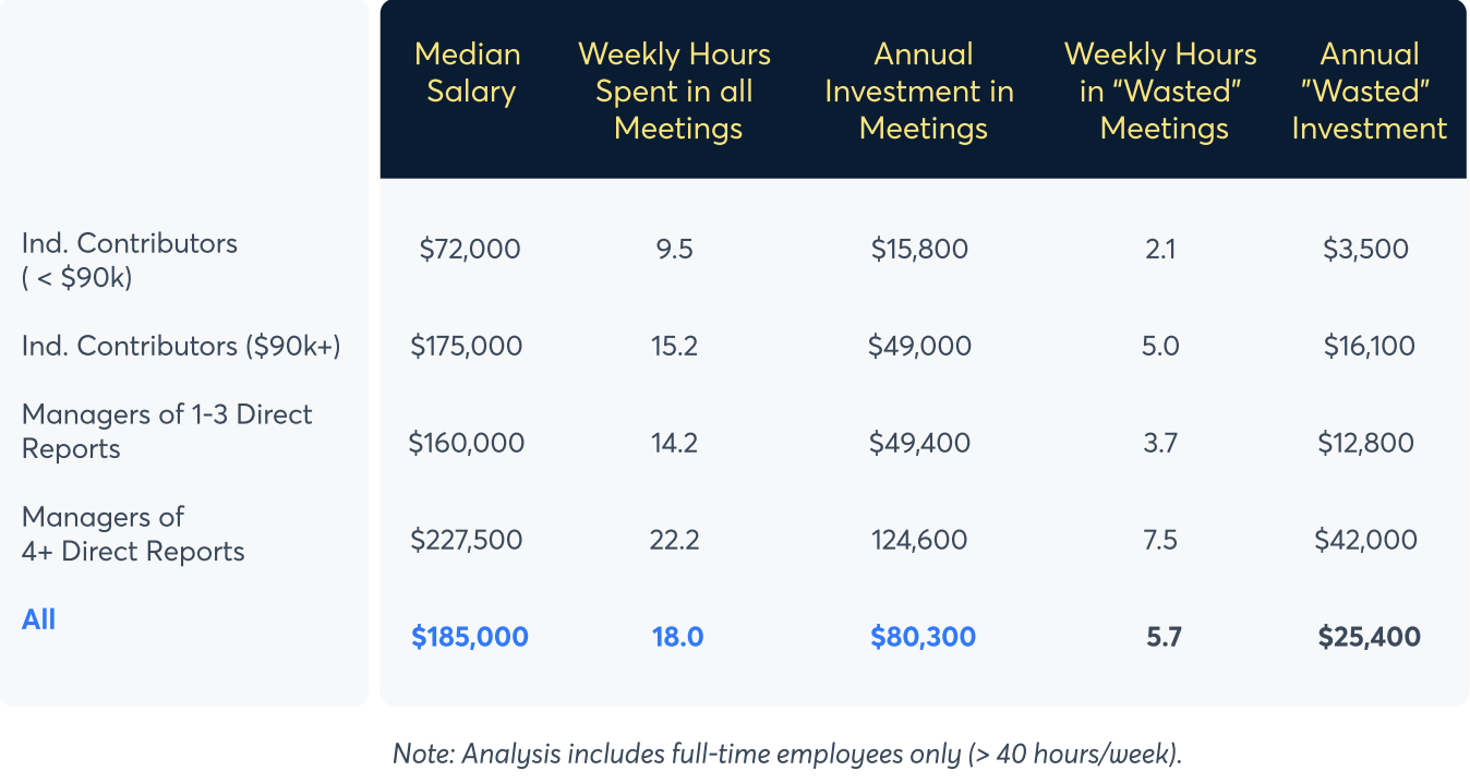
During the kick-off meeting, I asked the stakeholders if they had any generative data they could share with us- something to give us a heading or direction. They provided us various articles detailing the human and fiscal costs of virtual meetings. After consuming the data, I learned this was a multifaceted problem:
User Problem:
Too many virtual meetings leads to fatigue and reduced productivity.
Business Problem:
Meetings are expensive! Unnecessary meetings waste company money.
Webex Problem:
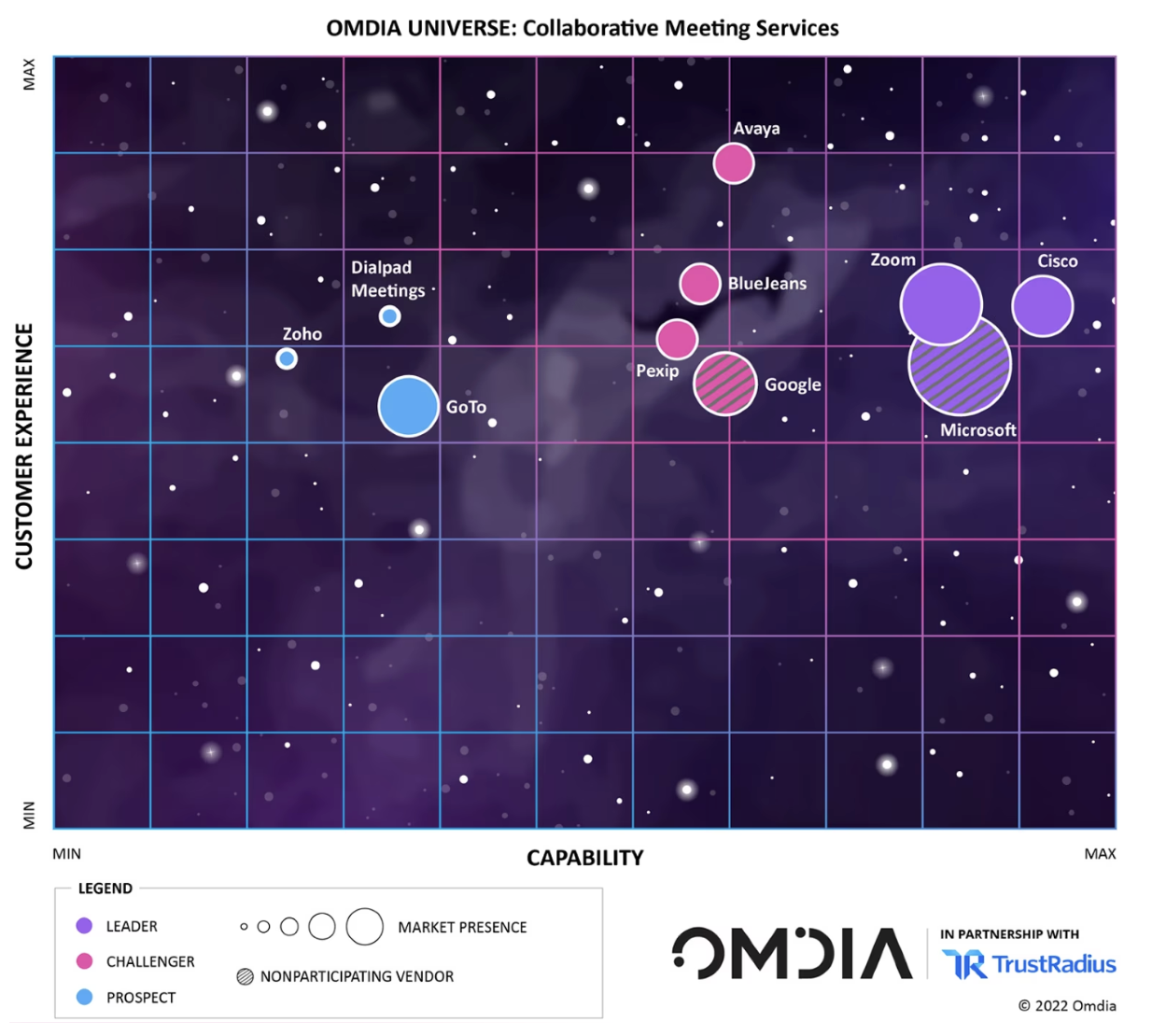
Cisco has a smaller market share percentage behind their competitors Zoom, Microsoft Teams, Google, etc.
This information helped clarify the problem. Webex could increase their market share if their product made meetings shorter and more enjoyable. This insight helped my team refine the problem: How might we minimize both meeting frequency and duration so Webex can offer businesses a cost-effective solution?
Recognizing the necessity to better understand users’ challenges with virtual meetings, I aimed to gather more data. This approach would enable my team to methodically work backwards towards the most effective solution, directly addressing user pain points.
User Research:
Our team had ~six days to conduct research and analyze the data. I understood we needed data from participants specifically around a few things:
-Average time per day spent in meetings.
-Pain points around virtual meetings.
-What VC tools they use + what their likes/dislikes are for those tools.
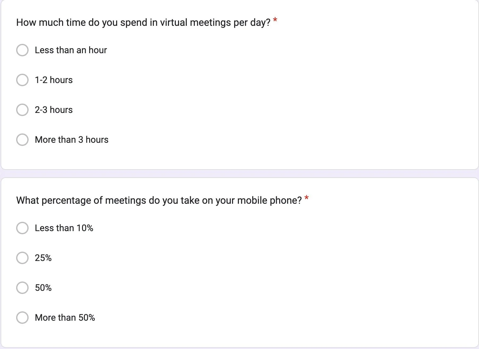
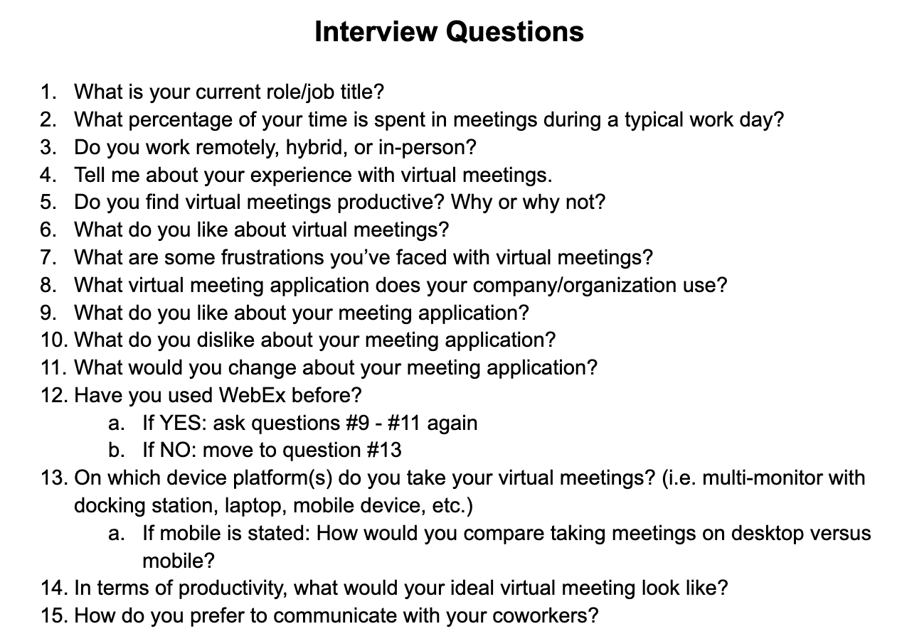
I co-authored a 10 question survey our group could email to participants. I also co-authored our question script for one-on-one interviews. At the close of our research window, my team collectively achieved 23 survey responses and conducted nine one-on-one interviews.
Snippet of the survey questions
“70% of my meetings aren’t productive.”
Questions for the 1-on-1 interviews
Research Insights:
User feedback was striking. These are verbatim quotes from our participants:
“They’re kind of painful.”
After synthesizing the data, the research yielded four key insights what users liked and disliked about VC tools and virtual meetings.
Pros:
Interactivity & Multitasking:
Participants appreciate interactive features like raising hands, polls, Q&A’s, etc. which encourage engagement during meetings.
Chat for Sharing Links & Docs:
Participants value a chat box for sharing links & documents with fellow attendees before, during, and after meetings. This allows real-time analysis and collaboration. Additionally, it provides an information exchange record, making it easier to retrieve past discussions when necessary.
“It’s so difficult to have back-to-back meetings for large chunks of your day. You’re never fully prepared. It leaves you drained even if you have a small break.”
Cons:
Fewer or Shorter Meetings:
Nearly all participants expressed an ideal vision of meetings lasting 30 minutes or less. Many cited the challenge of maintaining attention during virtual meetings due to short attention spans. Some participants felt certain meetings were redundant or time-wasting when information had been re-covered or discussions went amok.
No Agendas:
Participants highlighted the value of a clear agenda to guide meetings, ensuring that everyone stays informed and enabling an efficient discussion, which could lead to shorter, more focused meetings.
Solution:
Our users’ voices guided us directly to the solution: Create an agenda feature in Webex. Meetings can go too long, some items may be rushed, conversation goes off topic, all leading to further meetings. Based off our UX Research, having an agenda will resolve those issues, thereby increasing productivity & efficiency in real-time meetings, so teams can meet less & do more.
Early Concepts:
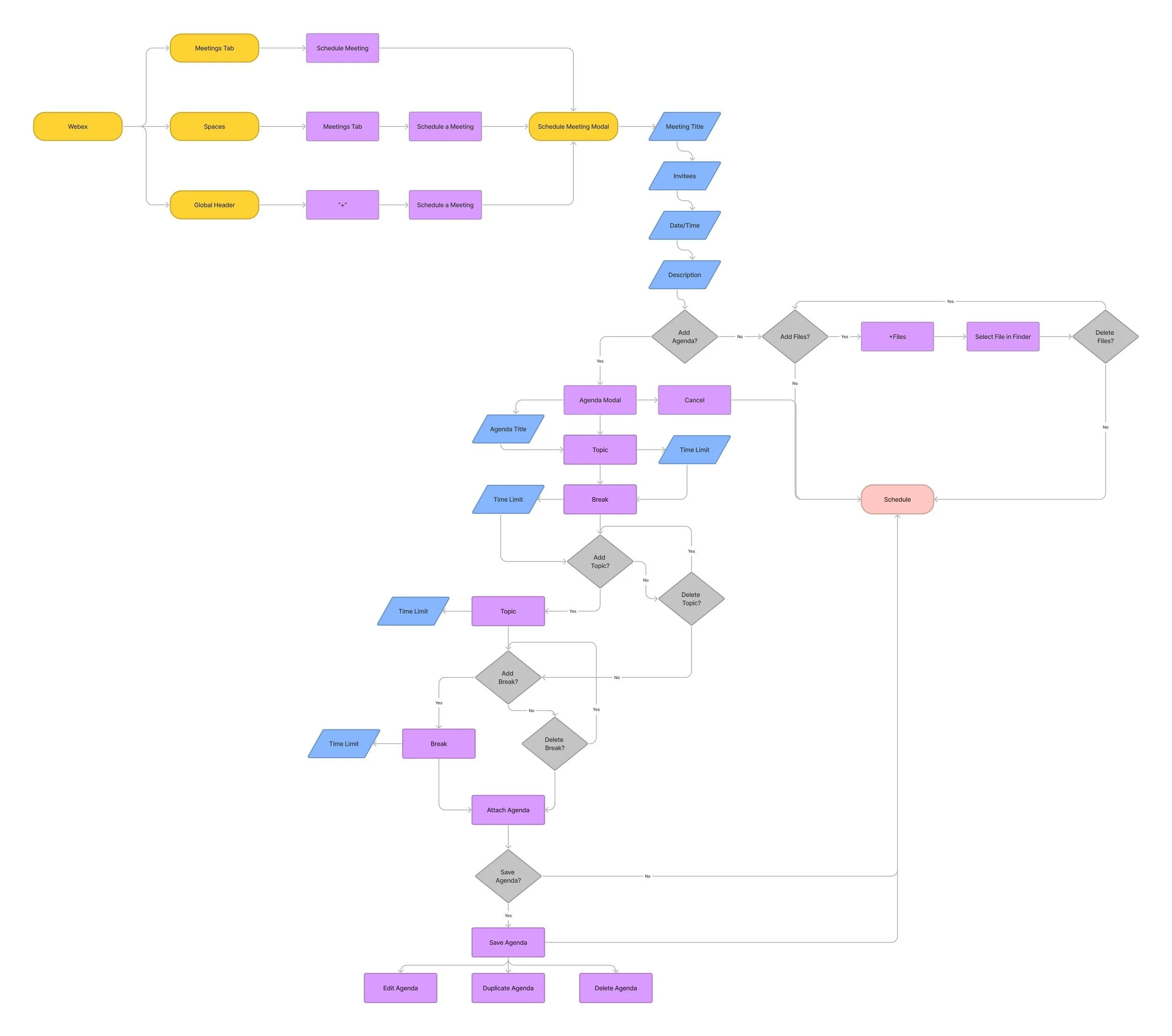
User Flow:
There are three definitive segments of the meeting experience my team had to incorporate into this feature- before, during, and after a meeting.
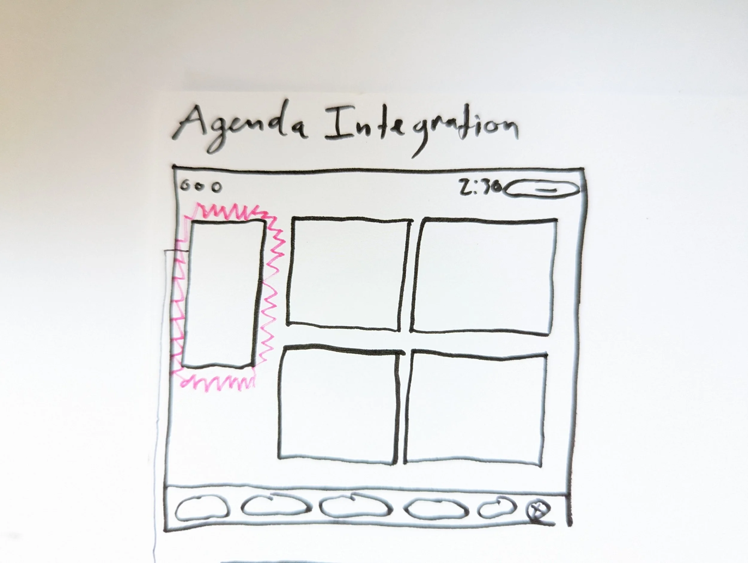
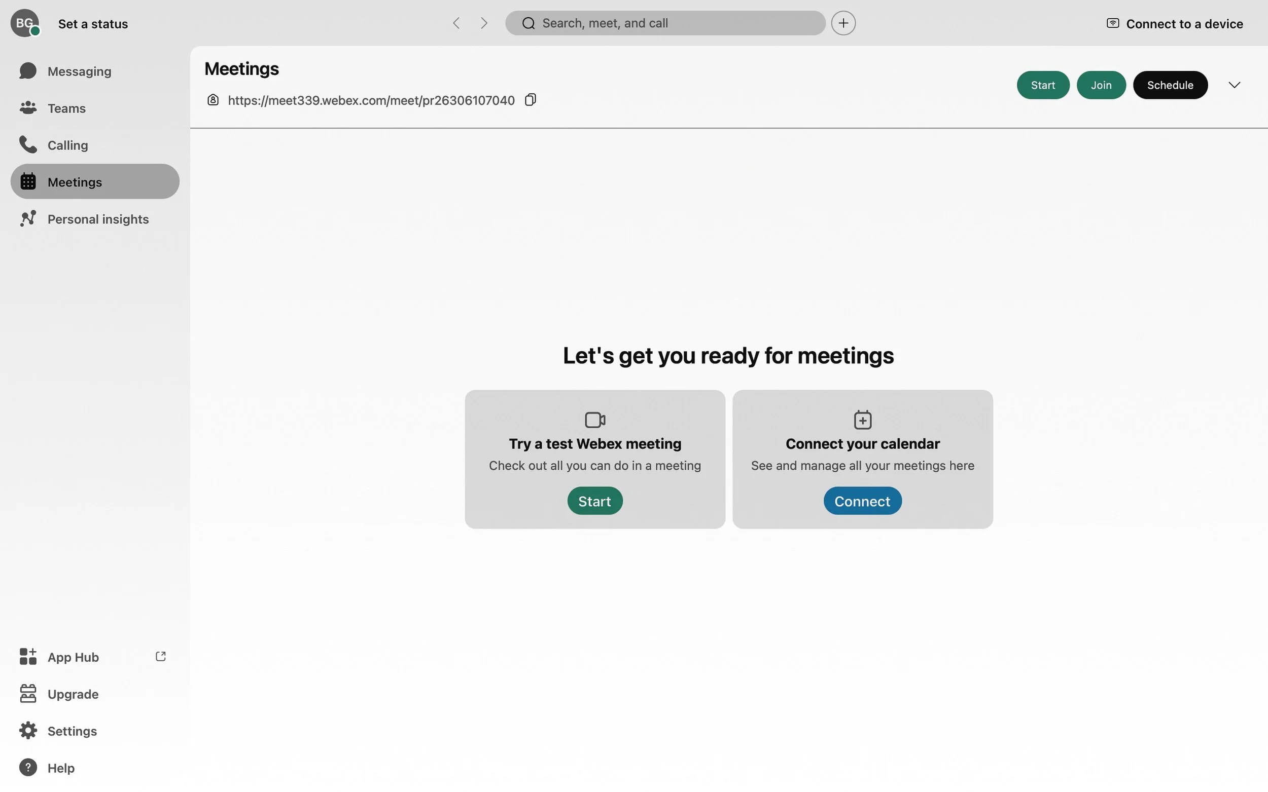
Building our agenda feature into an existing Webex product meant there was already an established user flow to schedule meetings, so where to place the feature was an important decision. There were two sensible entry points for this feature. The first would be in the left-side navigation in the Webex home dashboard- outlined below in dashed red.
Users could begin building an agenda through this navigation menu on the home dashboard.
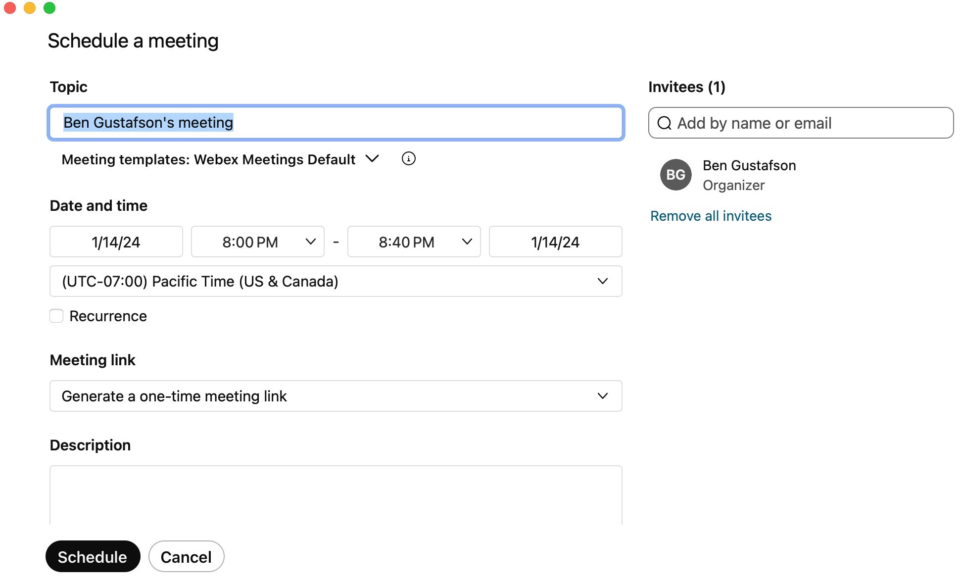
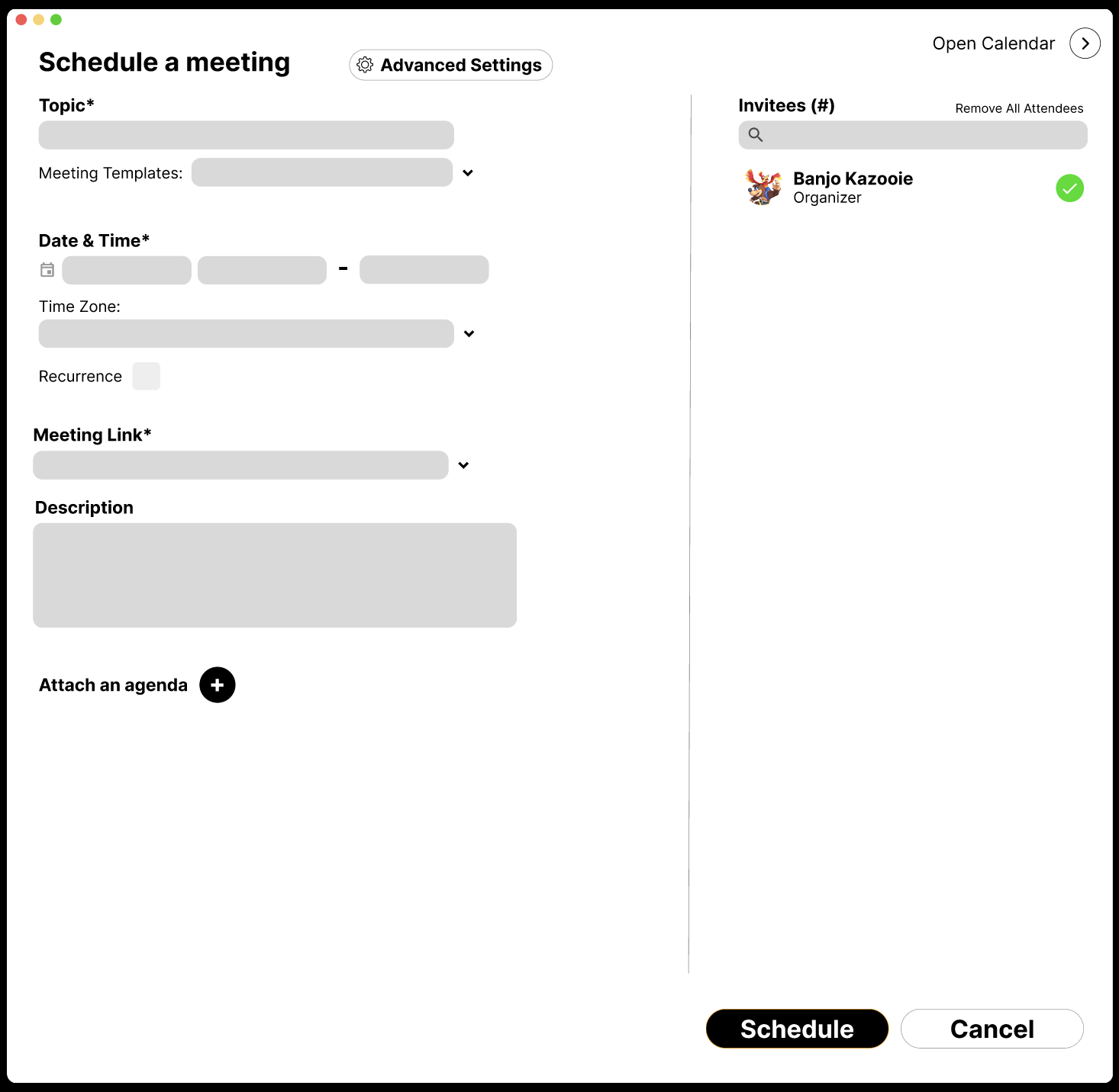
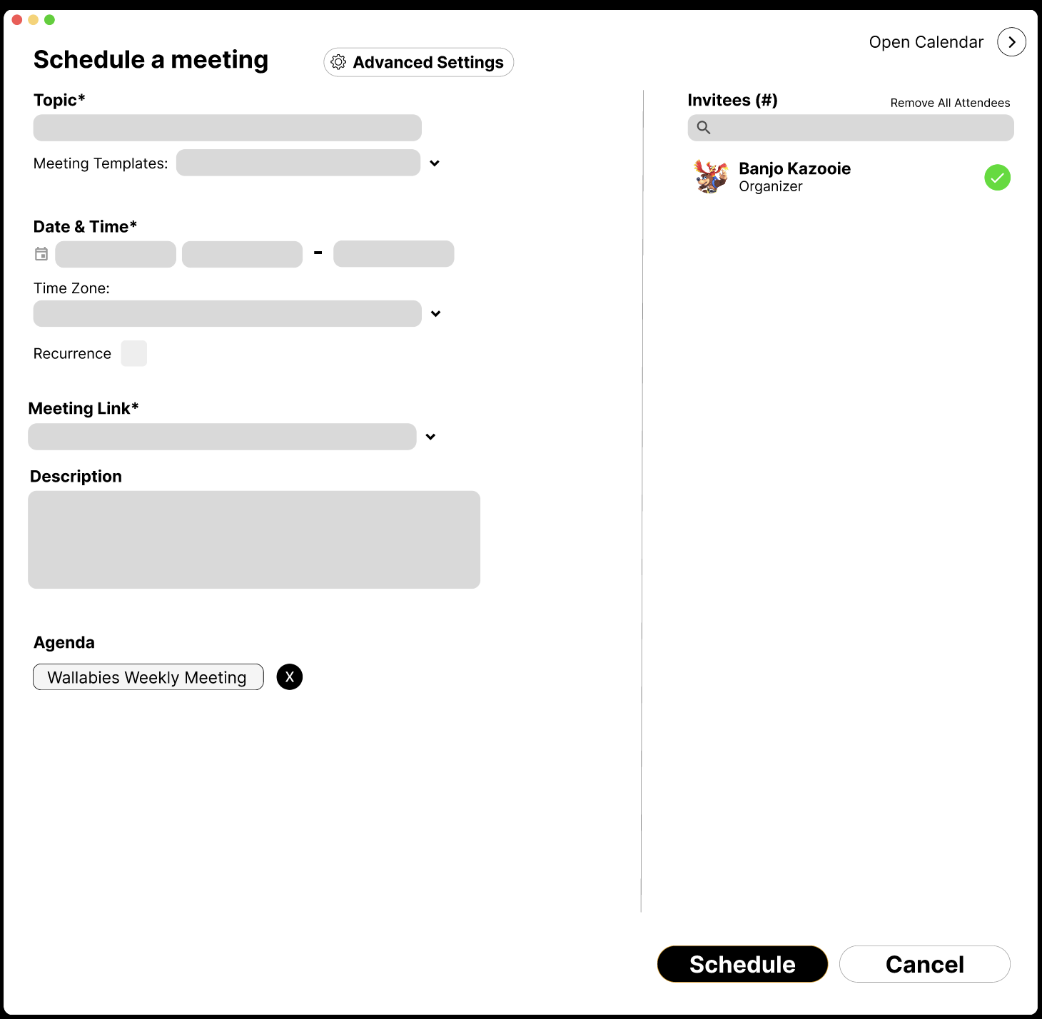
The second would be in Webex’s current scheduling modal, since users had to enter information here anyway to schedule a meeting.
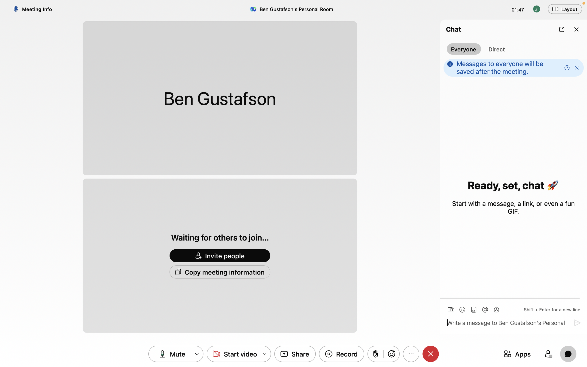
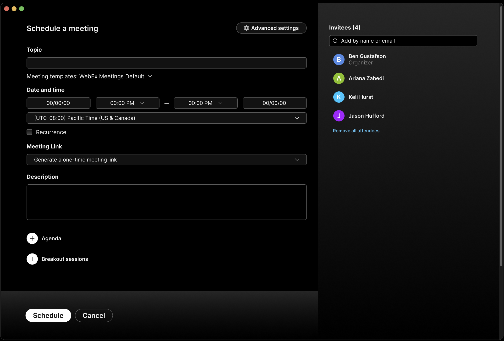
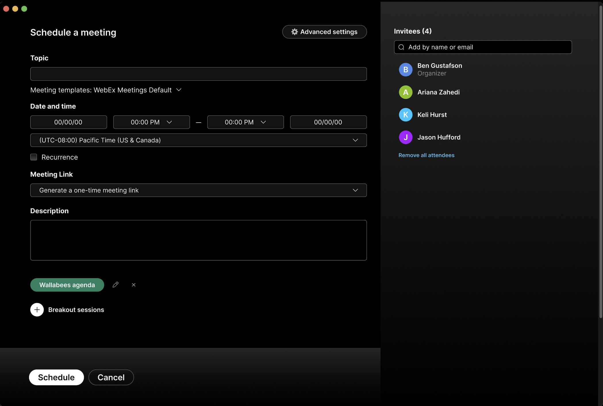
This is the current scheduling modal in Webex.
Pre-Meeting:
I created this user journey map to show how users would build out an agenda to attach for their meeting.
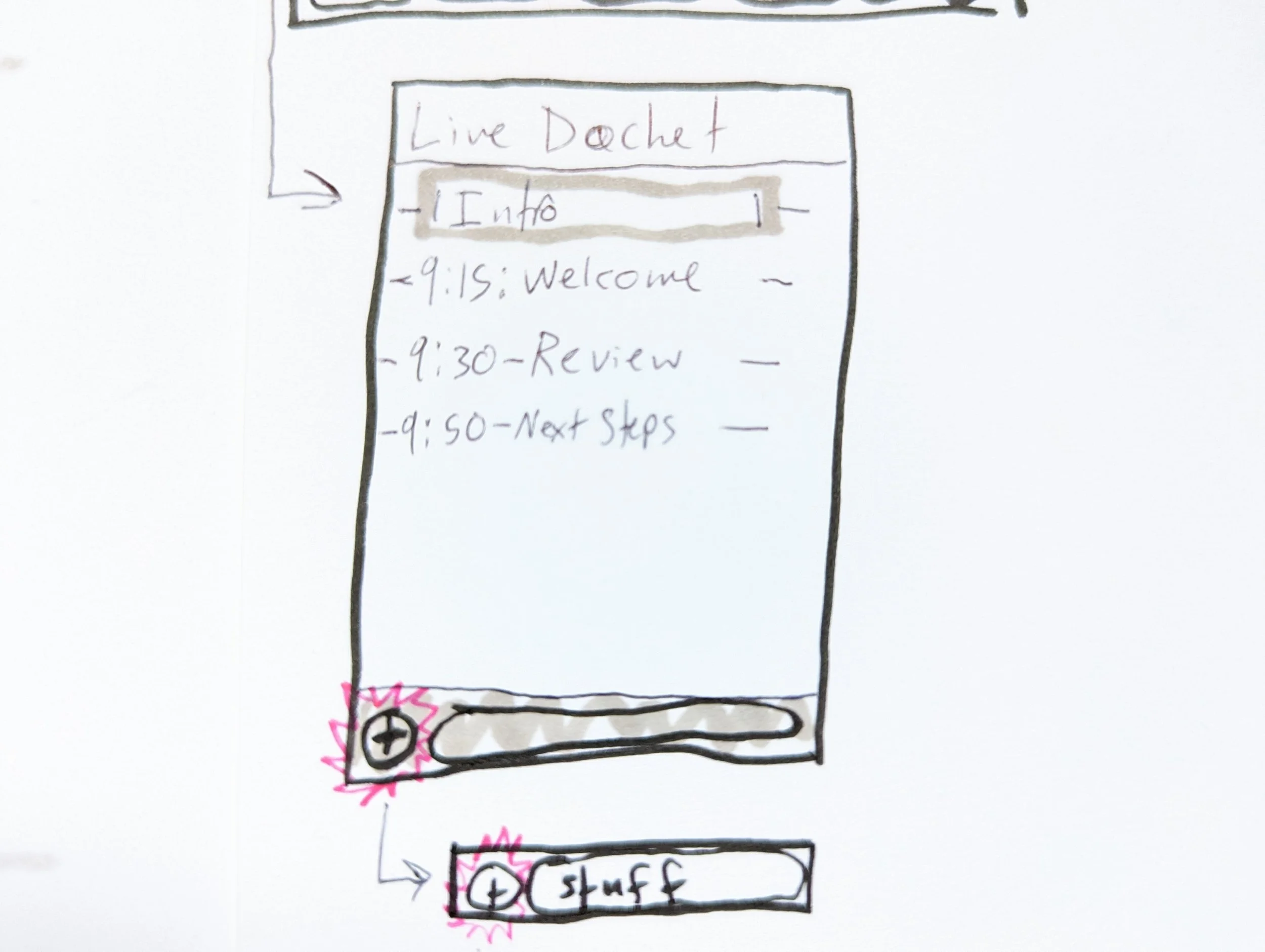
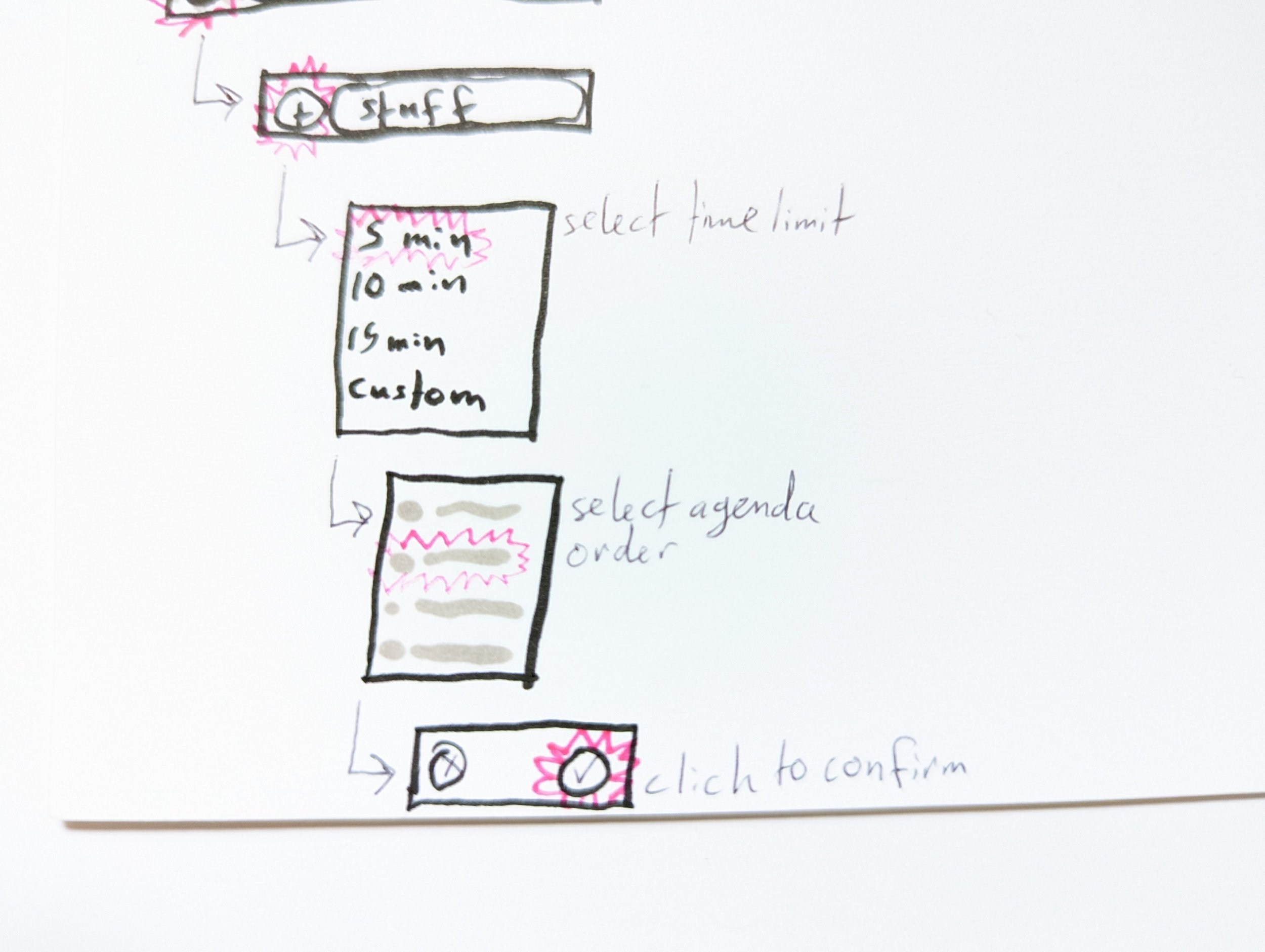
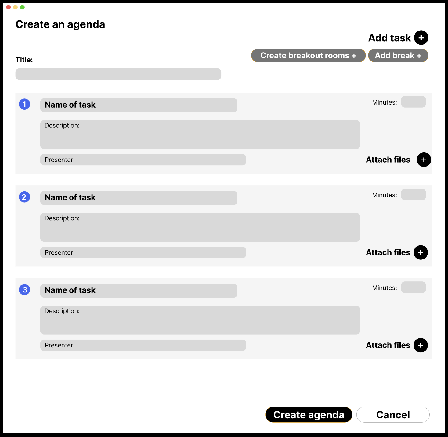
Here are some lo-fi wireframes ideating on the pre-meeting experience building out the agenda.
Step One: Users would begin the agenda creation by clicking “Attach an agenda“
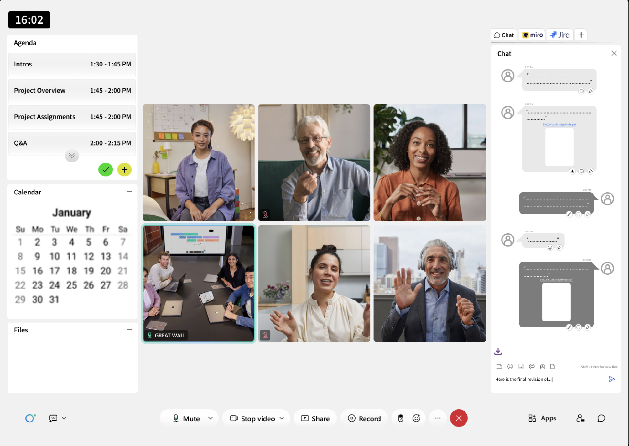
Meeting timer
Agenda topics
Files pane
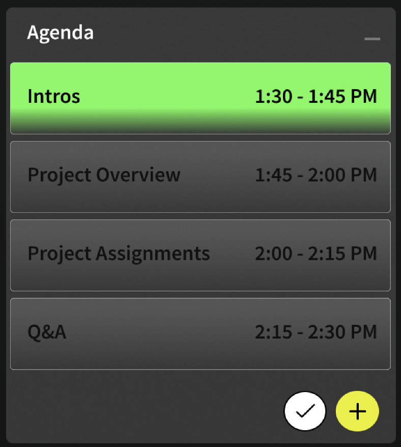
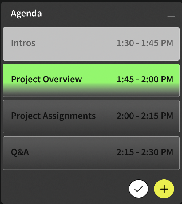
To help users track which topic was currently being discussed and topics where discussion had finished, I introduced a color-coding system in the agenda pane.
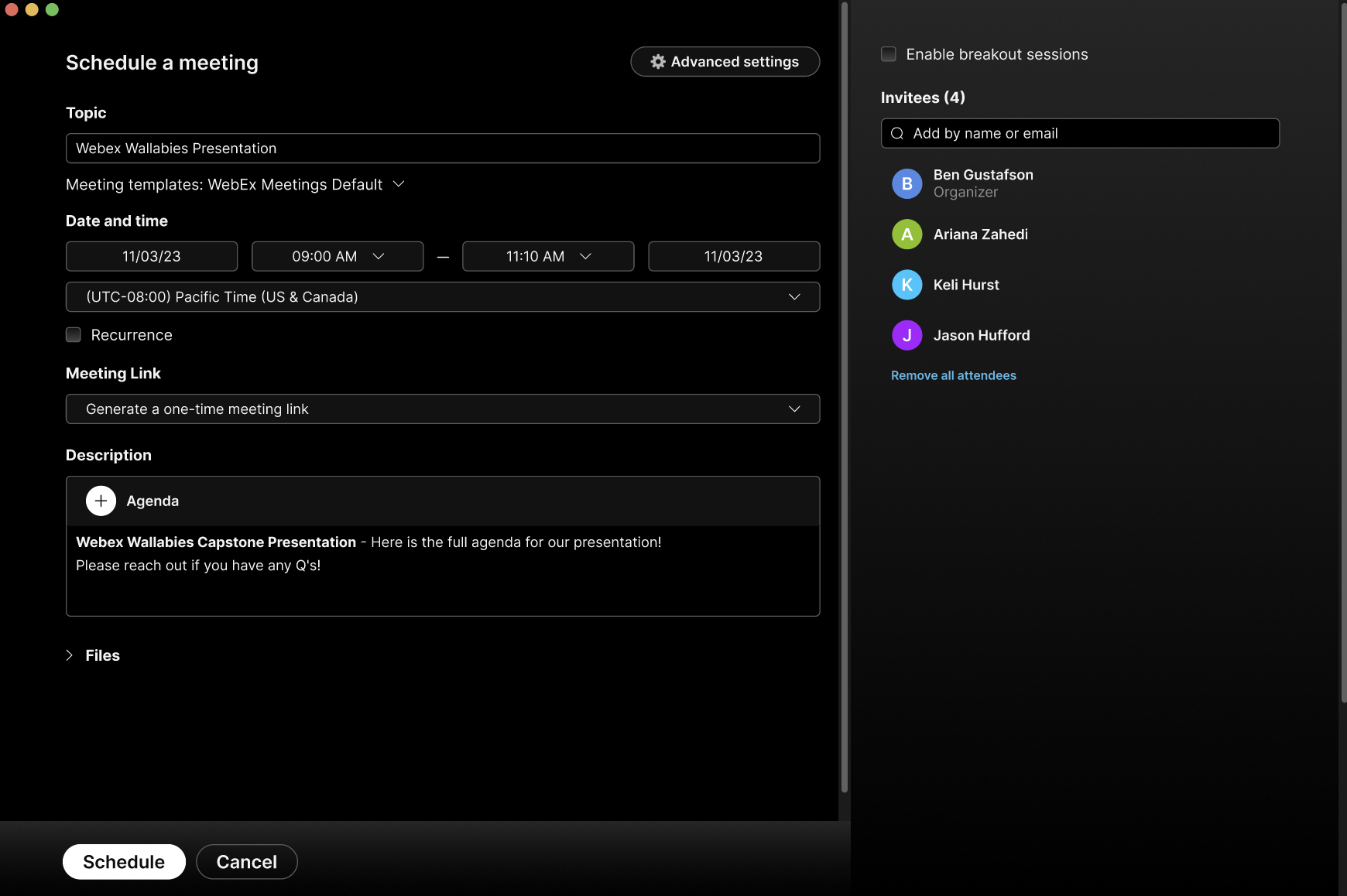
Current agenda topic is highlighted in green.
Attached file.
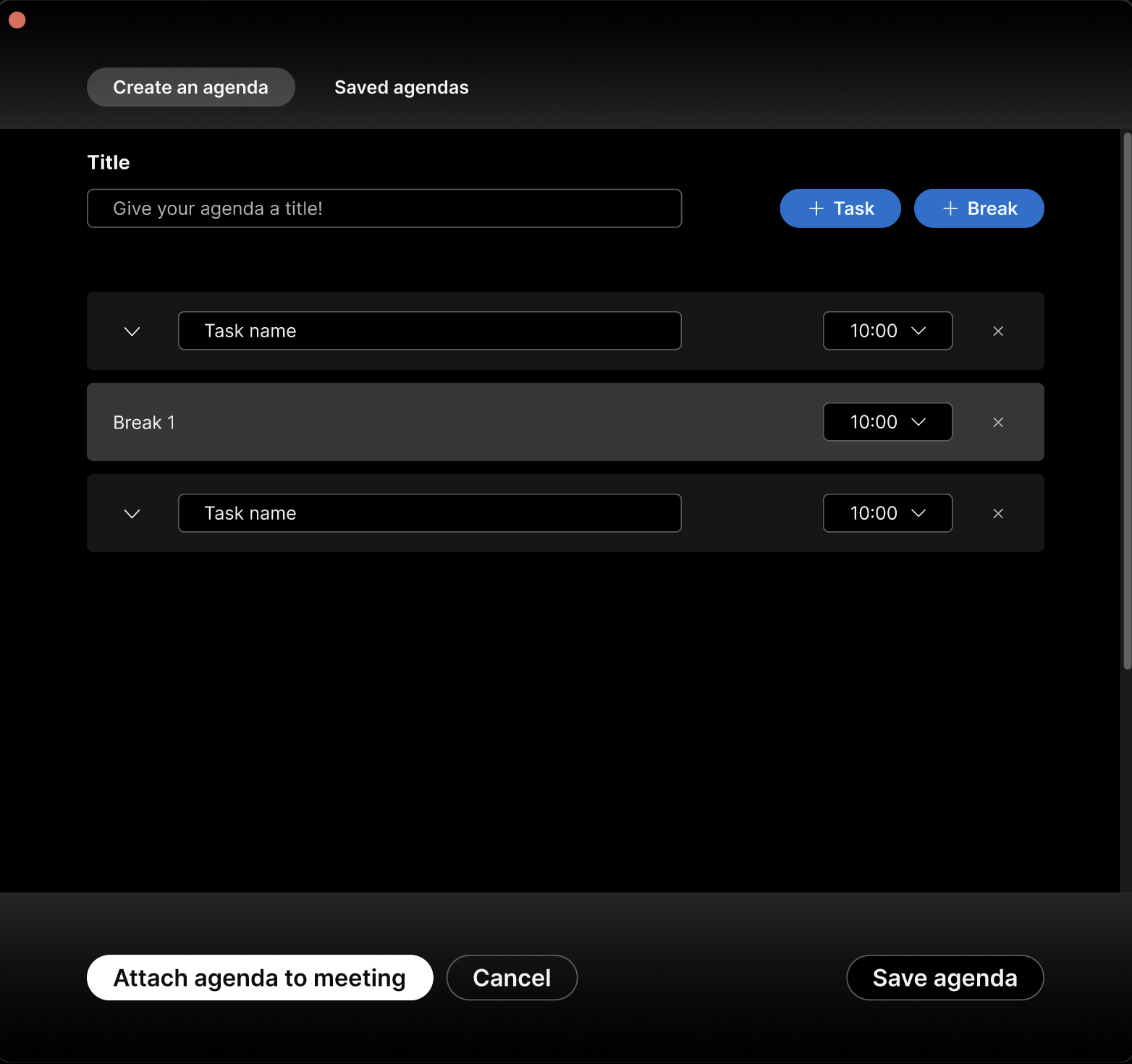
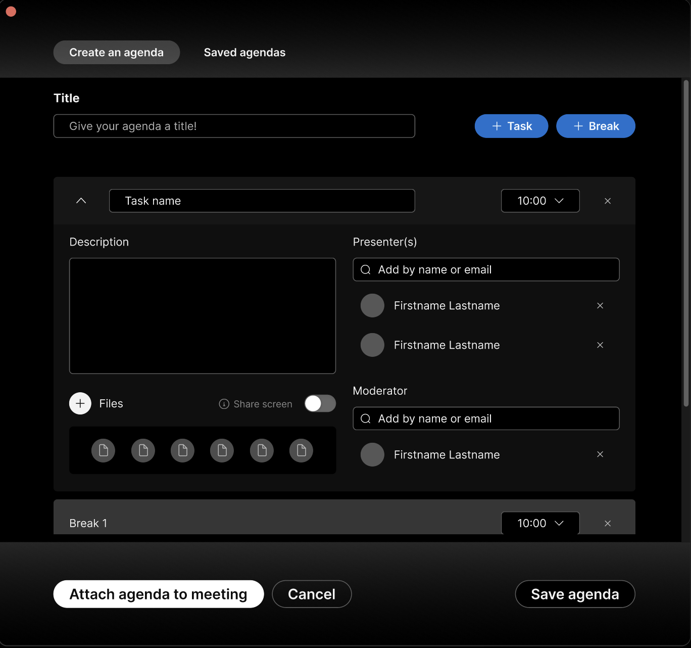
Step Two: Here, users could fill out or add tasks, attach files, and add breaks into the schedule.
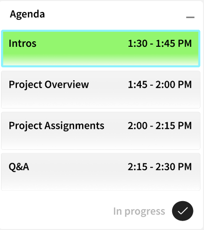
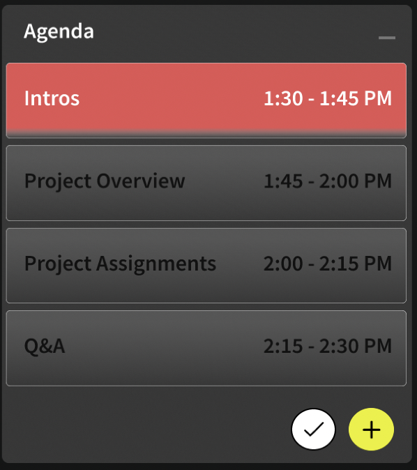
When the topic is two minutes away from its’ end time, the highlight color changes from green to red. The color change signals to begin wrapping discussion of that topic.
Post-Meeting:
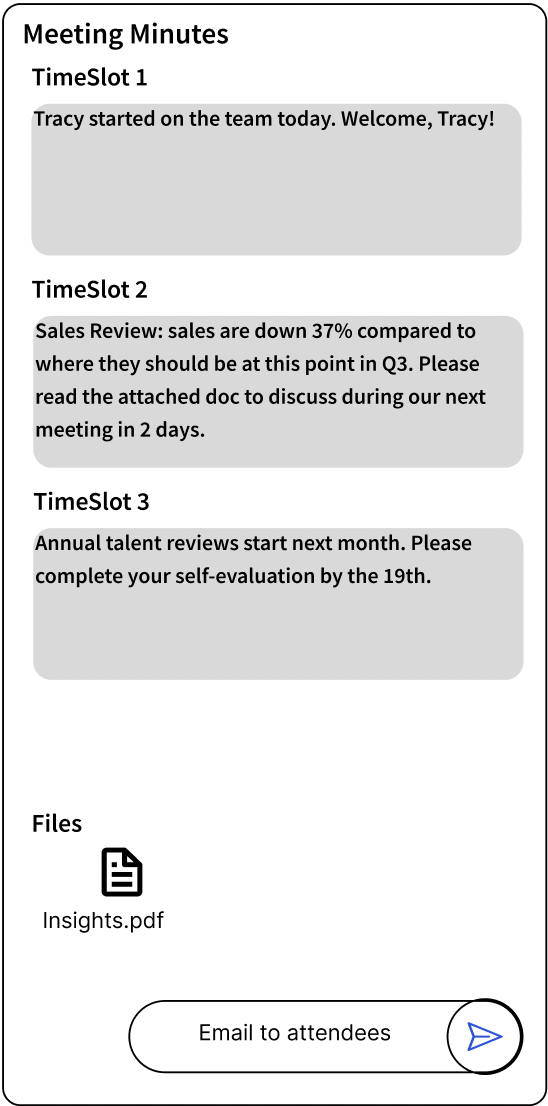
To ideate on the post-meeting experience, I created this lo-fi wireframe of a “Meeting Minutes“ concept- where a meeting summary (notes taken or files shared) could be emailed to attendees.
We built a new navigation bar with “Agendas“ added in.
Completed topics are shaded light gray to indicate discussion has finished. There’s now a different topic being discussed, again highlighted in green.
Topic notes taken.
Click send button to send summary to all meeting attendees.
Step Three: After compiling the agenda, users see it successfully attached to the meeting.
In-Meeting:
This lo-fi wireframe shows ideation on the in-meeting experience- displaying the agenda the user built earlier on. Any files the user attached would also appear here.
Calendar
Mid-point Check In:
I scheduled a check in with our Webex stakeholders six weeks in to run them through our user journey and lo-fi prototype.
After a 20 minute presentation, our overall concept was met with positive initial feedback from the stakeholders. They explained what they liked about our concept, and gave us some constructive criticism too.
Pros:
Scale: The stakeholders told us they appreciated the large scale of what we were going after. They praised our agenda initiative as “a big idea”. They felt this was something that could make a big impact.
Breaks: Giving users the ability to incorporate breaks into the agenda was appreciated.
Color Coding: The stakeholders praised our color-coding system to indicate which topic was being discussed.
Cons:
Dual Entry Points: Our decision to add the agenda button in the left-hand navigation wasn’t understood. Our stakeholders felt primary tasks (making a call, scheduling a meeting, chats, etc.) should be nested there and viewed making an agenda as a sub-task of scheduling a meeting.
Post-Meeting: My concept for the post-meeting experience of disseminating meeting minutes was viewed as duplicative of functionality currently within Webex.
Second Ideation:
While my team was certainly delighted getting validation and positive feedback about our general concept and some of the features in it, we wanted to make a second pass on what our stakeholders gave us constructive feedback on to deliver the best experience for customers.
Dual Entry Points:
We agreed with our stakeholder’s view of agendas being a subtask of scheduling a meeting. The agenda entry point in the left-hand navigation was removed.
Before
After
Post-Meeting:
We were surprised to learn this feature I was working on was already in Webex. After some further research, I discovered Webex has an AI-powered feature that can disseminate a meeting transcript plus all chat entries and shared links to attendees. I informed the team of my discovery and advocated discontinuing work altogether on the post-meeting experience.
Hi-fi Prototype:
After the mid-point check in with our stakeholders, we planned to do our usability testing. In-between the check in and testing, we completed our hi-fi prototype. The in-meeting experience screen remained unchanged, but here are some screens showing the pre-meeting experience.
Usability Testing:
We had three days to conduct usability testing. I constructed my team’s testing plan to have three team members (myself + two others) conduct two 30-minute testing sessions each. I also drafted the testing questions. We wanted to test both the pre and in-meeting experiences, as well as for general intuitive use across the user journey. After synthesizing the data, we made the following discoveries:
Pre-Meeting Testing Results:
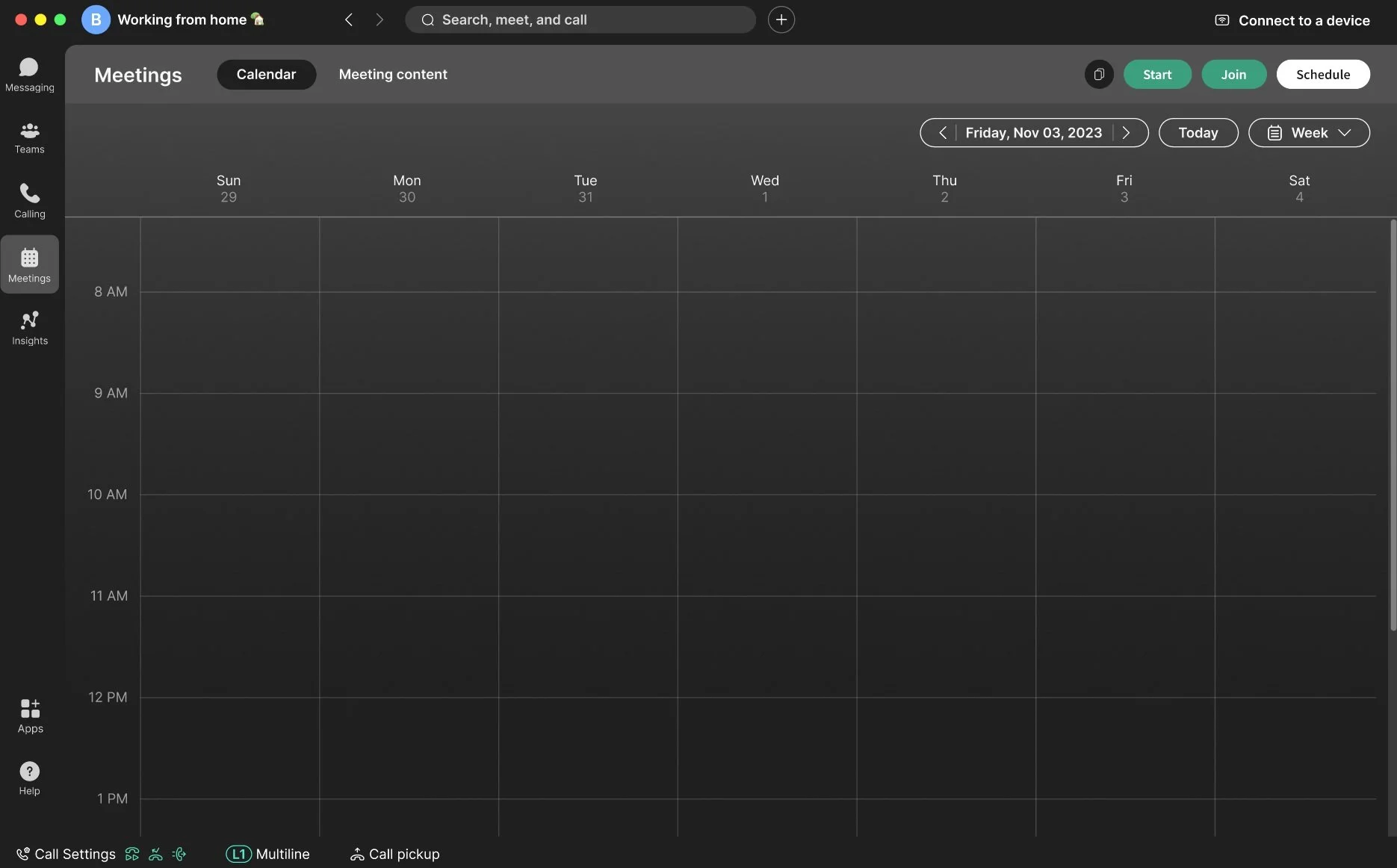
Users wanted the ability to schedule meetings through the calendar. Users felt this was a comfortable pattern set by other tools (Outlook, for example).
Users struggled to find where to attach files to the agenda.
We received feedback our 10 minute time intervals per topic wasn’t flexible enough. Users wanted smaller increments and the option to type it out.
In-Meeting Testing Results:
Our color-coding concept received universal praise from participants, but there was ambiguity what each color signified.
Final Ideation:
Taking our users feedback to heart, we iterated on the design one more time to finalize it.
Pre-Meeting Solutions:
A path was built to give users the option to schedule meetings from a calendar.
Step One: Users can click a date on the calendar to begin the scheduling process.
Step Two: After clicking on a date, users are brought to the common scheduling modal.
I moved the Files CTA to the main scheduling modal for easier discovery.
Before: The CTA to add files was in each topic dropdown in the agenda builder modal.
After: The CTA for files was bubbled up to the main scheduling modal so users could find it easier.
We decreased the intervals to 5 minutes and added the choice for users to type it out.
Before: Time allotments were in 10 minute intervals.
After: Time allotments were reduced to five minute intervals.
In-Meeting Solutions:
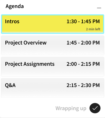
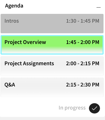
I used the analogous experience of traffic lights. We maintained green as the card color for current discussion, and changed the Warning color from red to yellow. To give additional clarity, I added an outline around the current discussion card and added a small piece of copy in the corner indicating discussion progress.
Results:
My team presented our final product on the 10th week to our original two stakeholders (UX Manager; Sr. UX Designer) in addition to three Sr. UX Researchers- all of whom support Webex. The stakeholders responded positively to our product; giving us the following points of qualitative feedback:
“I don’t think we’ve ever considered this type of user before.”
“I love the iteration you did on the in-meeting experience.”
“I think you guys did really well to scope down extra stuff to really focus on what was important for the user.”
Reflections:
Looking back on this project, there are few things I learned:
User Data is King: On a couple occasions, the group disagreed about certain design decisions. I found working backwards from the data we had about our customer’s needs, and helping your peers understand that connection, helps break the deadlock.
Harmonize Early: My team worked fabulously together. Truly, I couldn’t have asked for better peers for this project! But, I think if we would’ve taken time early on to hammer out SOPs on version control, organizational hygiene, common workspaces, etc., we could’ve been even more effective.
Additional Stakeholder Check-Ins: One mid-way check-in was scoped for this project. But in hindsight, I should’ve offered additional check-ins to our stakeholders. It could only serve to benefit the team and bring tighter alignment with the stakeholders & their vision.
Future Concepts:
The team had multiple ideas for additional features we could build out in the pre-meeting and in-meeting experiences if we had more time. You can see them here!
Productivity Tabs:
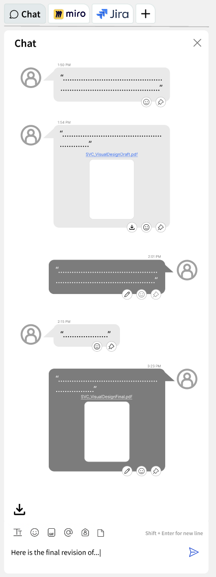
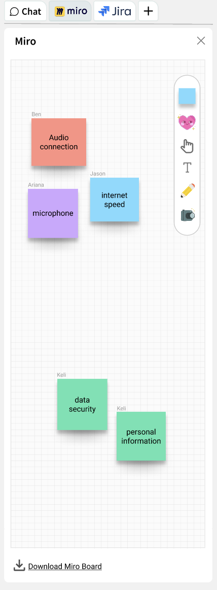
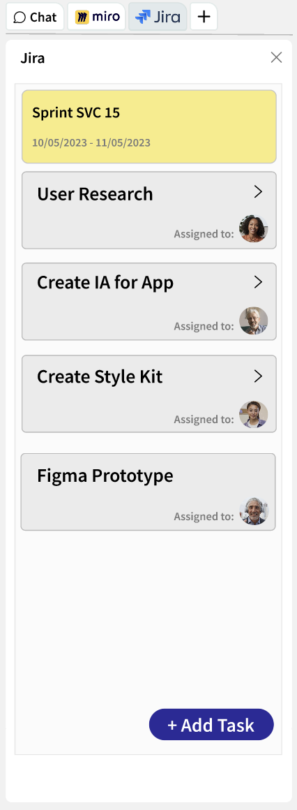
I saw an opportunity that the right-side chat pane could have tabs for additional productivity apps or tools. This concept below shows toggling tabs between chat, Miro, and Jira.
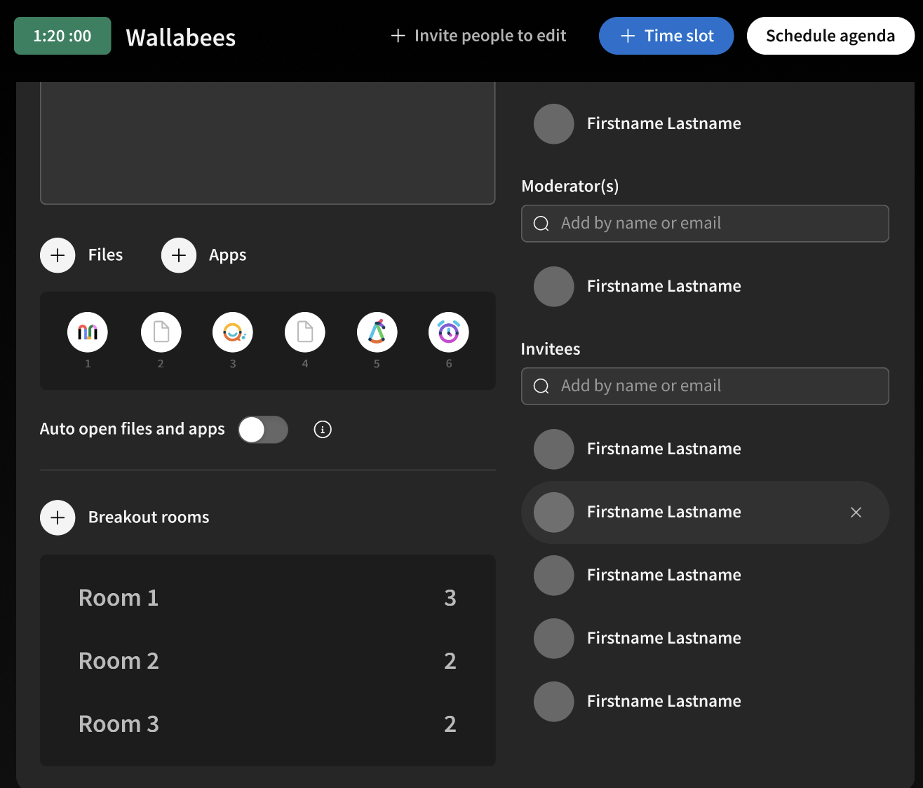
CTA to add breakout rooms
Asynchronous Joining + Breakout Rooms
We had a concept built into our early prototype to set up breakout rooms in the agenda building phase. We also had a concept to set up asynchronous joining for attendees. We removed these features mid-stream to narrow our focus, but if we had more time, we would’ve loved to find a way to incorporate those.
Asynchronous joining- adding attendees for specific topics if they don’t need to attend the whole meeting.
