Casino Operations Platform
Designed a partner operations platform for casino organizations to manage promotions, analytics, and multi-location operations.
Please note: Due to NDA constraints, visuals and labels have been redacted or modified. I can share further details in conversation.
Background:
A Southeast U.S.-based casino operator engaged my company to concept a new online social gaming platform, called The Game. As part of the broader experience, I designed a partner operations platform that enabled casino organizations to manage promotions, monitor performance, and administer day-to-day operations.
I independently defined the platform requirements, information architecture, workflows, and interface design.
My Role:
Requirements Definition
Information Architecture
Systems Design
Prototyping
Interaction Design
Timeframe:
1 week
Stakeholders:
CEO
Sr. Product Manager
Target Users:
Casino administrators and operations staff.
Goal:
Consolidate promotions, analytics, and operations into a unified platform.
Problem:
Partner casinos needed a way to create, manage, and track rewards offered to players through The Game. As requirements evolved, it became clear that promotions were only one part of a larger operational workflow. This created an opportunity to expand the platform into a broader operations product capable of supporting analytics, organizational management, communications, and other daily business functions.
Outcome: Designed a scalable operations platform that supported partner casino promotions, analytics, and organizational management while exploring its viability as a standalone product.
Requirements Gathering:
As the platform evolved from a rewards management tool into a broader operations platform, I needed to define the capabilities required to support our partner organizations. To identify features and patterns most common across the market, I began with a competitive analysis.
Competitive Analysis:
To better understand feature offerings across the market, I analyzed nine products in this niche: Meta Business Suite, LinkedIn Campaign Manager, Google Analytics, Moxo, Impartner, Partner.io, PartnerStack, Channelscaler, and Hivebrite.
After cross-analyzing these product suites, the following insights emerged:
Control Over Customization: Platforms gave users significant control over branding, dashboard configuration, and workspace customization.
Desktop Majority; Mobile Minority: Most platforms prioritized desktop experiences, reserving mobile support for limited workflows due to the breadth and complexity of the tasks they supported.
Analytics as the Default View: Analytics dashboards commonly served as the primary landing experience, surfacing key metrics immediately upon login.
Centralized Communication & Content: Many platforms included content publishing and customer communication tools, reducing the need for users to switch between systems.
Similar Layout Across Platforms: Despite stylistic differences, most platforms followed a similar information architecture, typically using left-side navigation and analytics-focused landing pages.
Design Objectives:
Weighing the task and my competitive analysis findings, I defined these design objectives:
Enable users to tailor dashboards, branding, and alerts to their operational needs.
Consolidate promotions, analytics, communication, content, and admin tools into a unified experience.
Design a scalable information architecture capable of supporting future feature expansion and potential product spin-off.
Design Principles:
Based on these objectives, these principles guided my design:
Flexibility Through Customization: Organizations operate differently. The platform should adapt to their workflows through configurable dashboards, branding controls, alerts, and content management tools rather than enforcing a single way of working.
Simplicity is Productivity: Users will visit our platform to complete tasks, not learn software. Navigation, workflows, and page structures should remain predictable and intuitive, minimizing friction and cognitive load.
Built to Scale: Our platform was designed to support a broader operational ecosystem. The IA and feature organization needed to accommodate current requirements while supporting future expansion.
Structuring the Platform:
Information Architecture:
One of the primary challenges was organizing a growing set of capabilities without overwhelming users. The navigation needed to remain approachable while accommodating several feature sets. To support both current requirements and future expansion, I organized the platform into a small set of clearly defined operational areas.
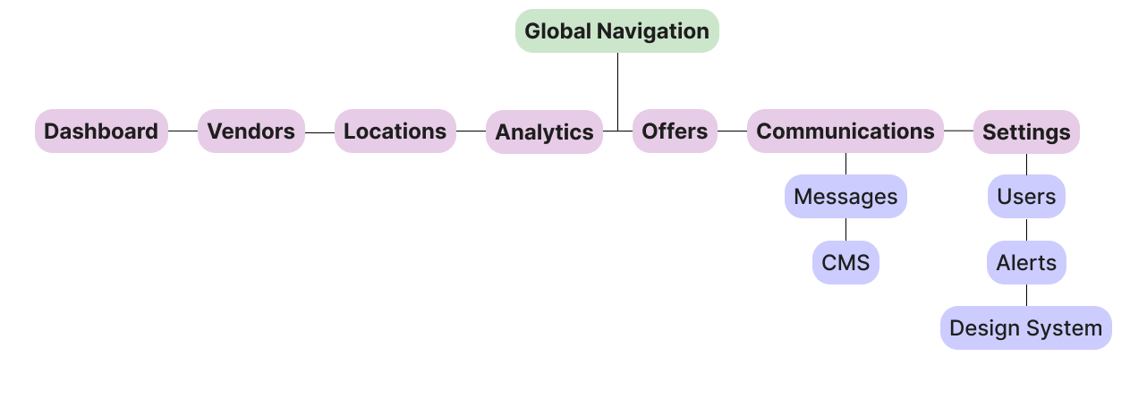
To keep navigation lean, related capabilities were grouped into shared functional areas. Communications housed both messaging and content management, while Settings consolidated admin tools such as user management, alerts, and branding controls.
Designing the Experience:
Dashboard Structure:
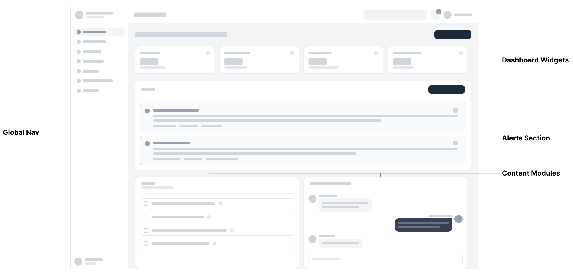
Global Nav: Organized into a small set of functional areas in a left drawer menu to accommodate platform growth without increasing navigational complexity.
Dashboard Widgets: Designed as modular components so organizations could prioritize their most relevant metrics.
Alerts Section: Elevated time-sensitive operational information to increase visibility and support quicker decision-making.
Content Modules: Lower dashboard modules designed as a flexible content area capable of surfacing tasks, communications, and other user-specific priorities.
Offers:
Offer creation and management was a core task flow for our partner organizations. Users needed to create, monitor, and update offers across locations while maintaining visibility into performance. To support this, I designed the experience around quick status recognition, filtering, and streamlined offer management.
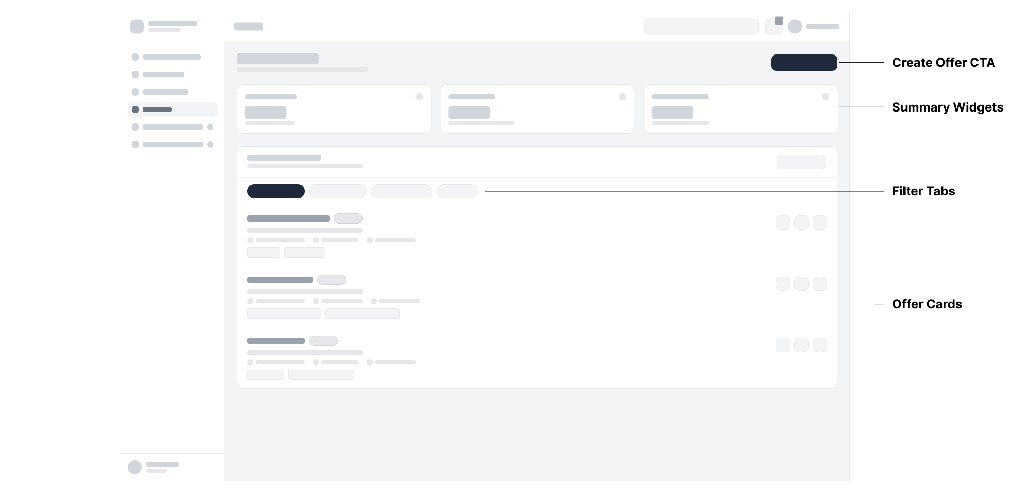
Summary Widgets: Critical metrics elevated to the top of the page for viewing at a glance.
Filter Tabs: Reduces cognitive load by separating offers into distinct categories.
Offer Cards: Consolidate offer details and actions into a scannable management interface.
Communications (CMS):
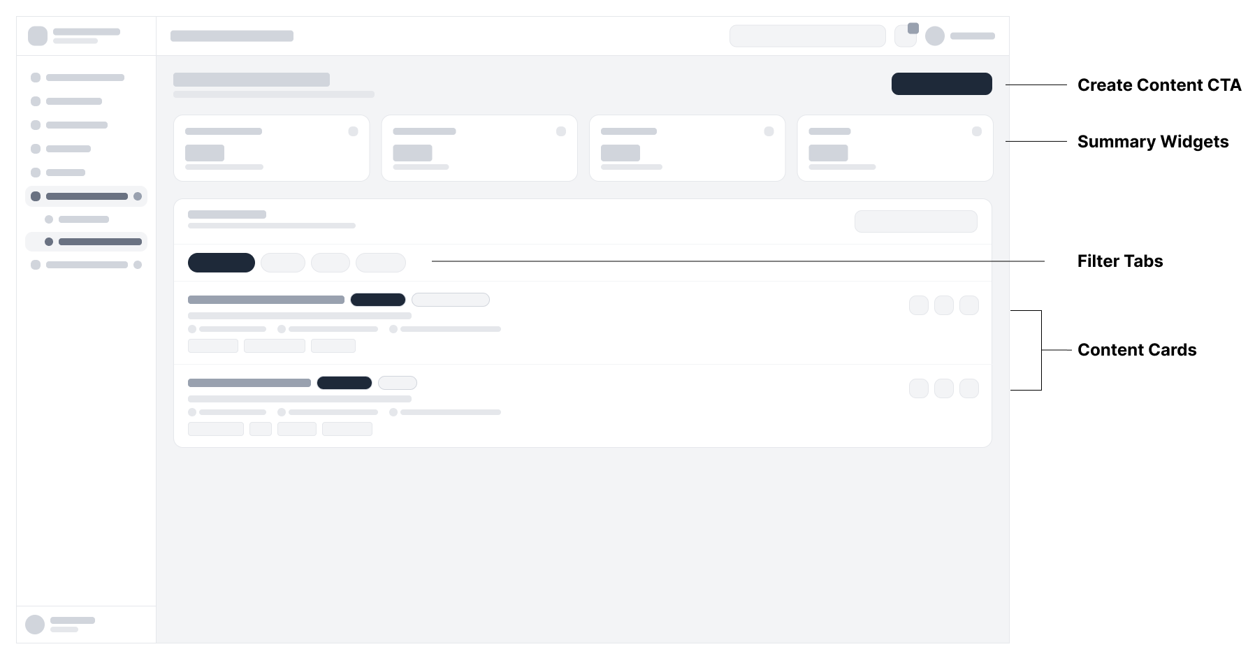
Summary Widgets: Content performance metrics elevated to the top of the page for quick visibility.
Filter Tabs: Reduces cognitive load by grouping content into distinct states.
Content Cards: Consolidates content details and actions into a scannable management interface.
Settings (Design System):
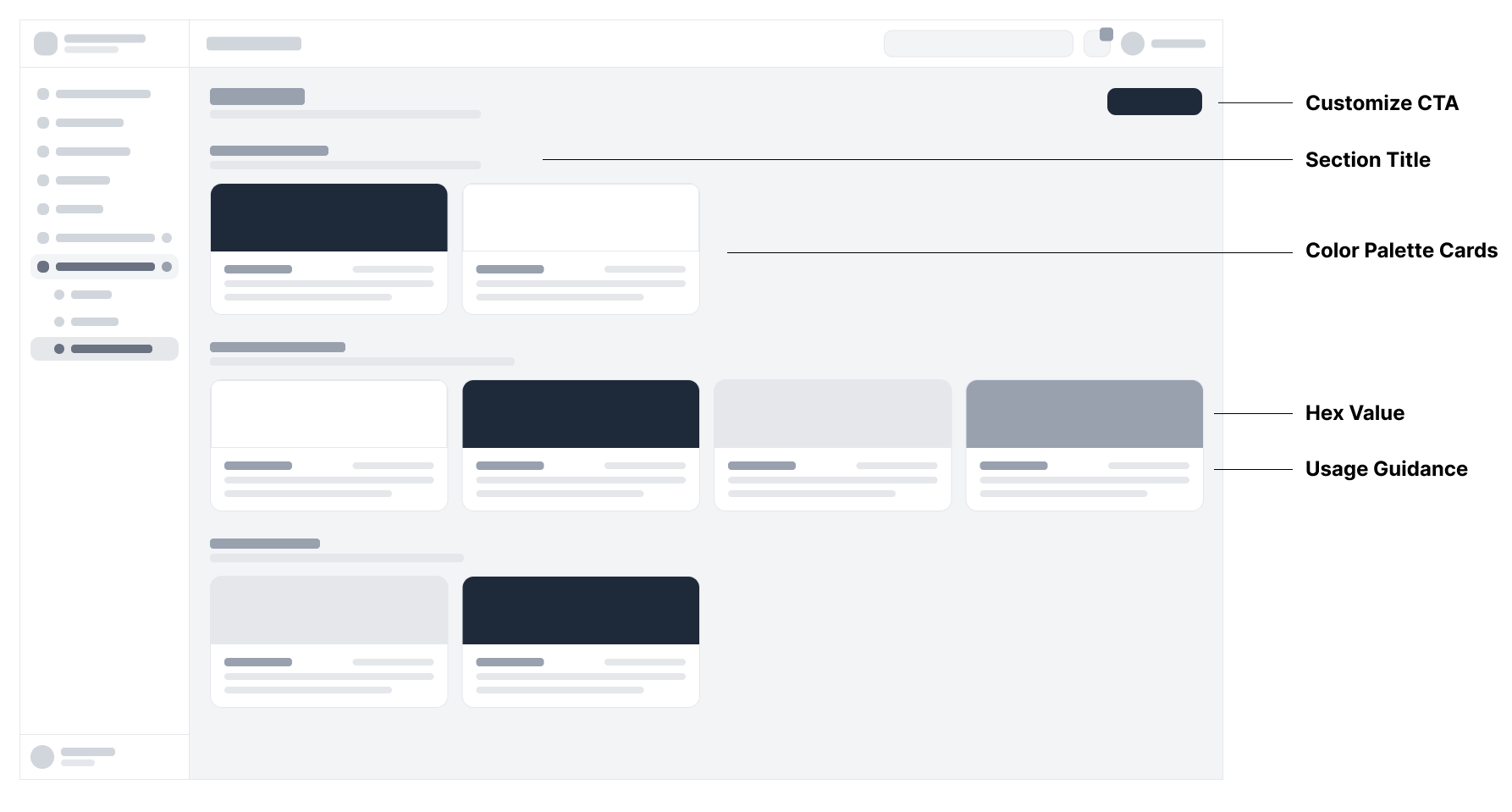
Section Title: Organizes customization controls into clearly defined categories.
Color Palette Cards: Enables organizations to tailor platform branding without requiring development support.
Hex Value: Establishes a single source of truth for brand colors.
Usage Guidance: Promotes consistency by defining how colors should be applied throughout the platform.
These wireframes established the structural patterns that guided the platform’s development. By prioritizing customization, clarity, and scalability across each core workflow, I created a foundation capable of supporting both current needs and future growth.
Final Design:
Through shared patterns, reusable components, and consistent workflows, the final experience brought all critical feature areas together into a unified product ecosystem.
Dashboard: The final dashboard transformed the lo-fi concept wireframe into a configurable operational workspace that balanced visibility with flexibility. Modular widgets and customizable layouts gave organizations the ability to prioritize the information most relevant to their daily operations while maintaining a consistent, scalable interface.
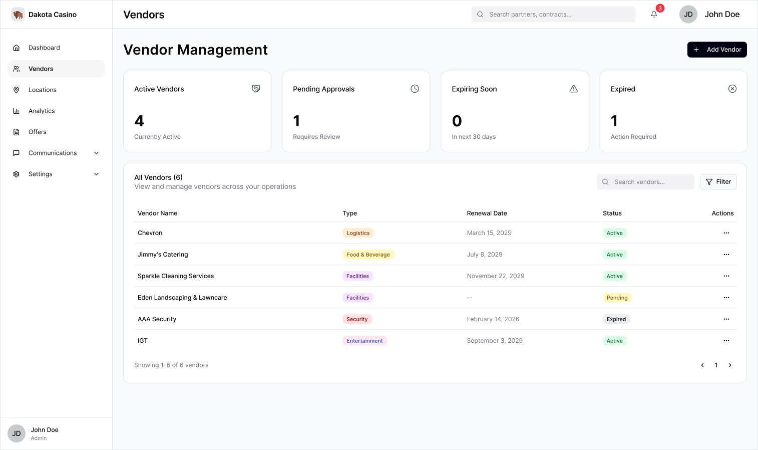
Vendors: The Vendor Management experience consolidated oversight into a single workspace, surfacing contract status, renewal timelines, and approval workflows while reducing the effort required to manage vendor relationships across multiple locations.
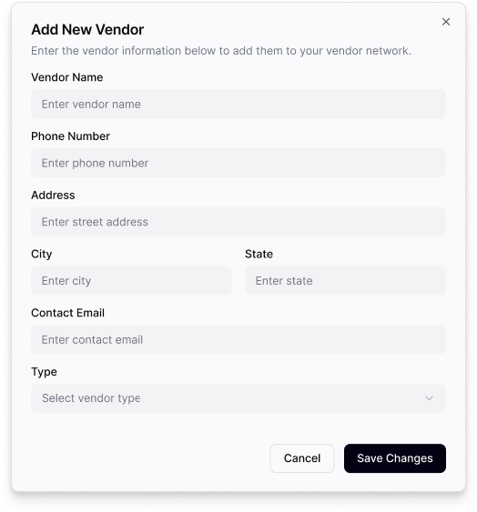
The Add Vendor workflow consolidates vendor onboarding into a single streamlined form.
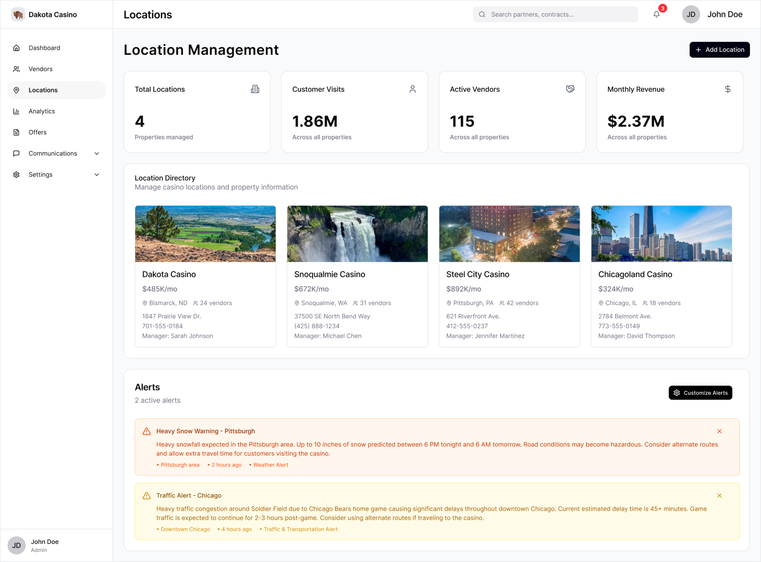
Locations: The Location Management experience brought property metrics, location details, and location-specific alerts into a unified workspace, giving users a centralized view of all casinos under their purview.
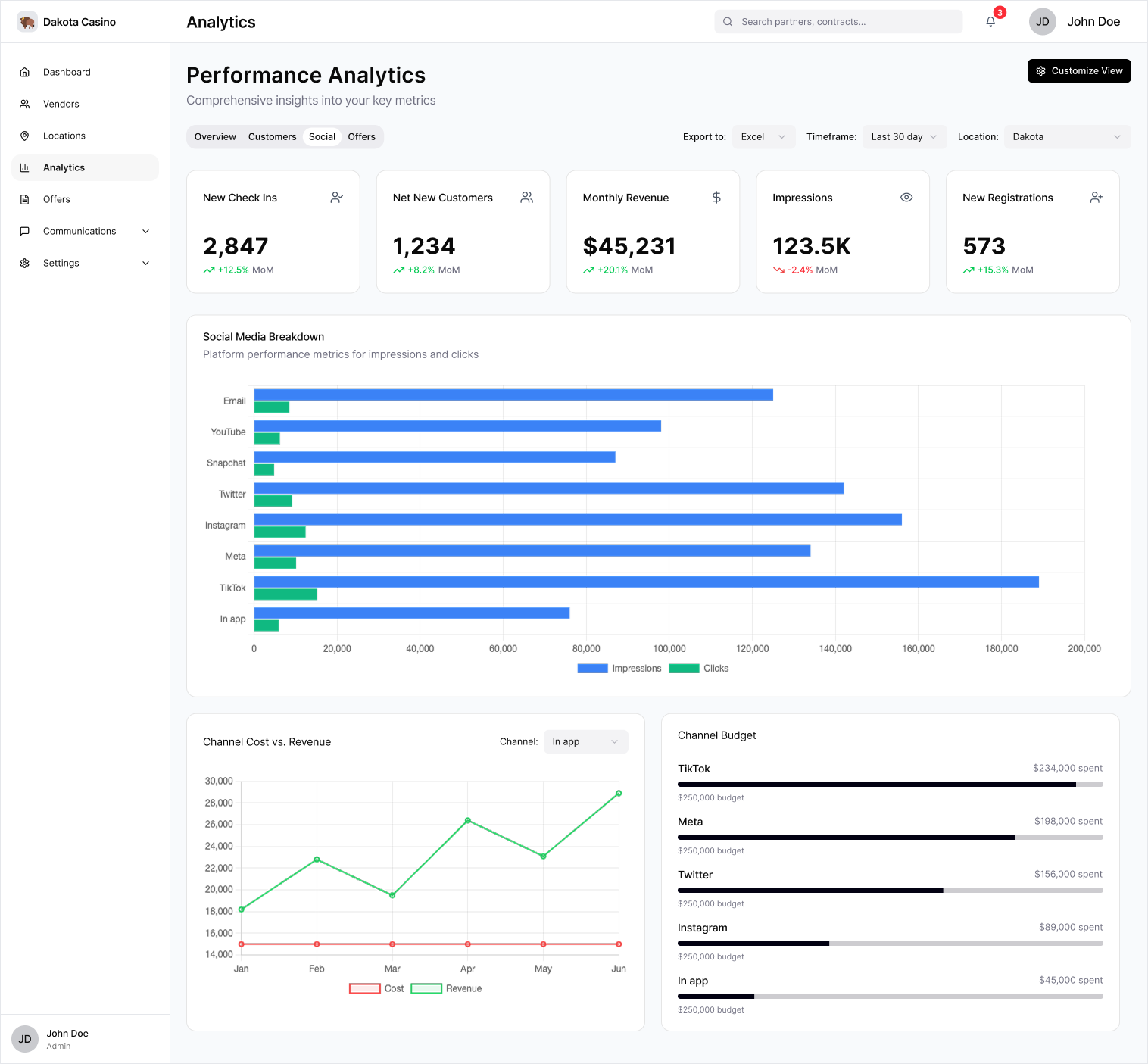
Analytics: The final Analytics suite harmonized business-critical reporting from across the platform into a seamless, customizable view- giving organizations a comprehensive visual understanding of operational performance.
Offers: The Offer Management page unified performance insights with offer creation and management workflows, giving organizations a central place to oversee every stage of an offer’s lifecycle.
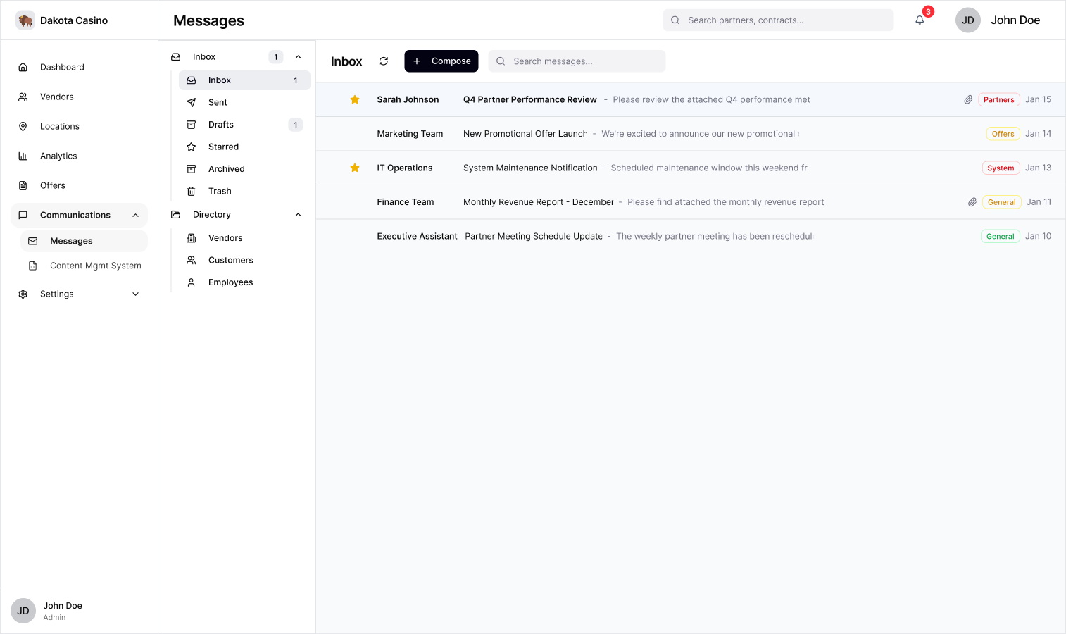
Communications: The Communications hub consolidated the email client and content management into a single workspace. Dedicated Messages and Content Management modules streamlined day-to-day communication and content publishing.
The integrated email client facilitates day-to-day communication within a familiar, enterprise-friendly interface.
Content creation, approval, storage, and publication all consolidated into a single workflow.
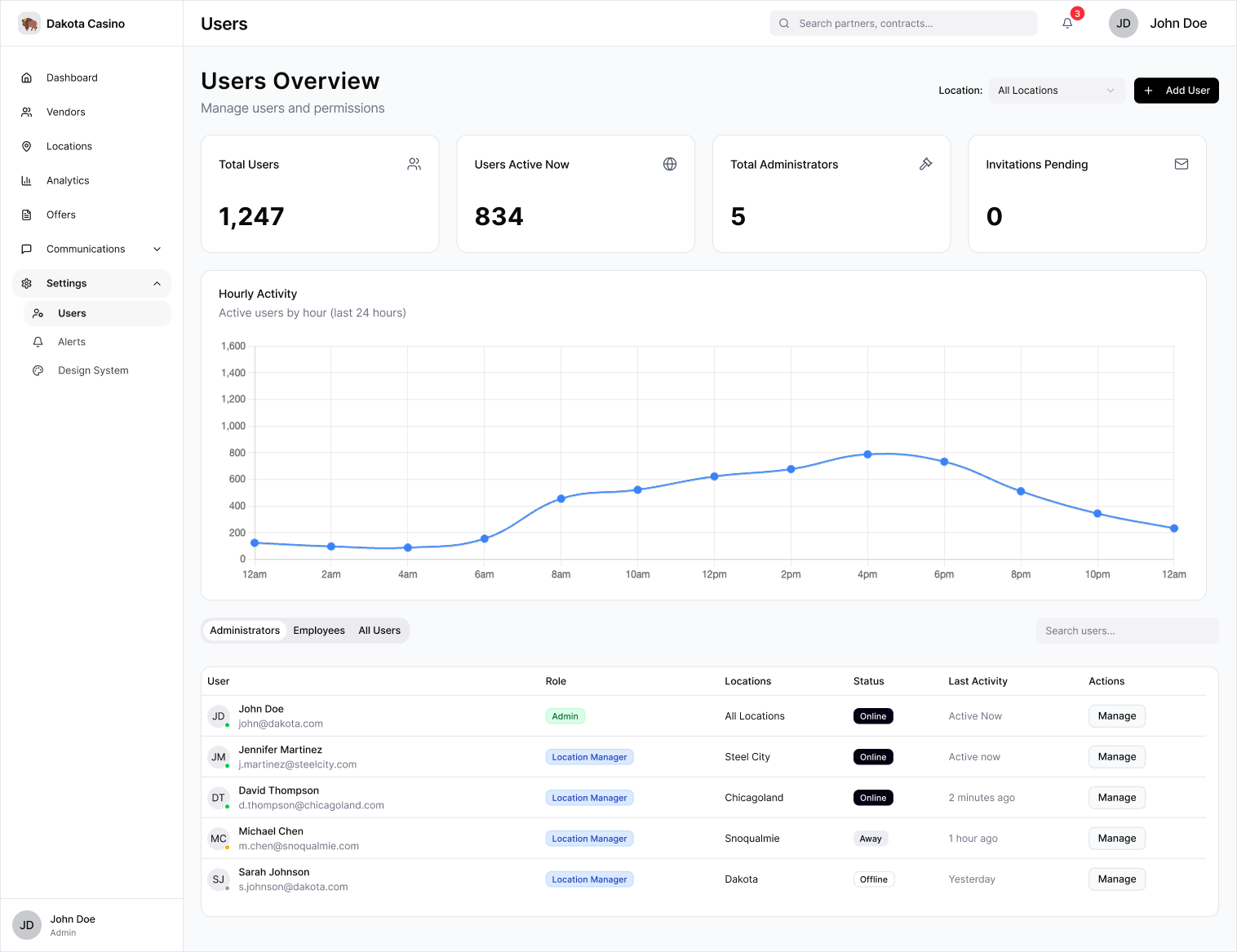
Settings: The Settings hub consolidated user management, alert preferences, and design system customization into one destination.
The Users Overview page surfaced important user status data and pending tasks at a glance while providing users a straightforward path to perform common CRUD actions.
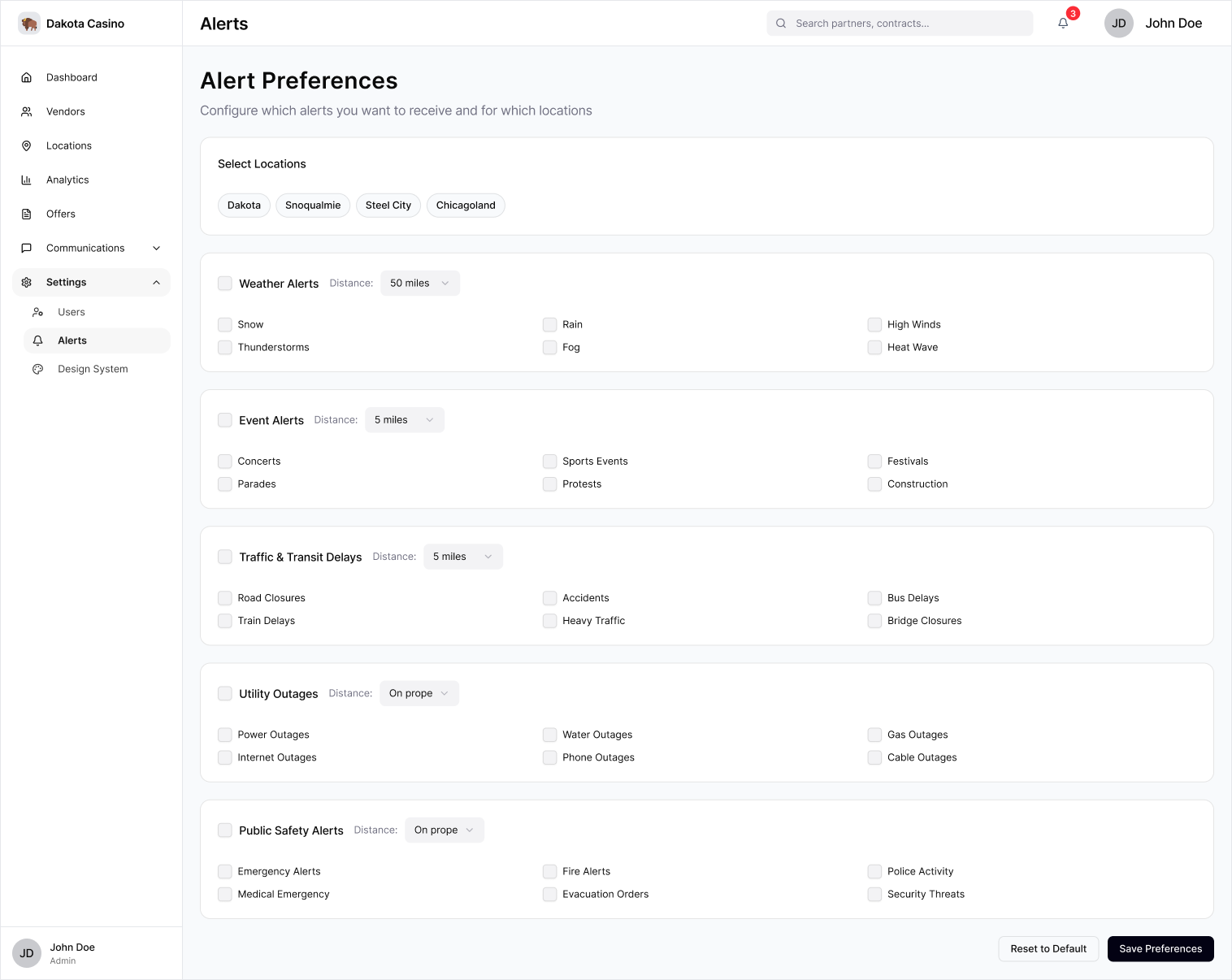
The Alert Preferences page let users configure location-specific alert settings to match each property’s operational needs.
The Design System page neatly catalogued the platform’s visual assets alongside their semantic roles, and gave users a simple workflow to customize them.
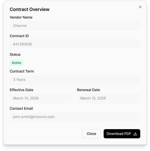
Key contract information is centralized in a dedicated view along with one-click PDF export.
Impact:
Although the game was shelved before development, I produced a complete enterprise platform that translated complex operational requirements into a cohesive, scalable product. The resulting design system, customization controls, and reusable patterns established a strong foundation for future expansion.
Reflections:
Reflecting back on this project, a few key lessons stood out:
Systems scale efficiently: Creating reusable components and shared patterns early made the platform easier to scale as new feature areas were introduced.
Information Architecture sets the ceiling: Organizing complex workflows before designing screens kept the experience coherent as the product expanded.
Prioritization, not simplification: For enterprise UX, the challenge wasn’t reducing functionality- it was presenting dense operational information in a way that remained discoverable and approachable.
Fidelity reveals systems thinking: Building an interactive prototype made it possible to evaluate the product as a connected system rather than a collection of static mockups.